Pairboard
The AI-powered to-do revolution.
An AI task manager that turns goals, emails and messages into organized tasks. Working solo, I created the brand, the marketing website and the web app, and all three went live in under a month.

One designer, three deliverables, one month.
Pairboard needed everything at once: a name people remember, a website that explains AI in plain words, and a tool that feels familiar on day one.
A logo and visual language built around the “ai” in Pairboard.
A landing page that sells “tell us your goals, AI does the rest.”
A web app for to-dos, files and 12 connected tools, with AI beside every list.
Work lives in a dozen tabs, and to-do lists don’t help.
People spend most of their day coordinating work instead of doing it, hopping between inboxes, chat and docs. A to-do app that waits for you to type every task only adds one more tab.
of the workday goes to “work about work”: status, searching, switching
Asana Anatomy of Work, 2023app and window switches a day for a typical knowledge worker
Harvard Business Review, 2022of the working year lost to toggling between apps
Harvard Business Review, 2022What that meant for Pairboard
Come to the user
Pull tasks out of email and chat instead of asking people to retype them.
Plan, don’t just list
Turn a goal into steps, so the list starts full.
Finish in one place
Write the email or the doc right inside the task.
Sources: Asana Anatomy of Work Global Index 2023; HBR study of 137 users at three Fortune 500 companies, via Reworked.
Three people drowning in the same tabs.
To keep every screen pointed at a real need, I worked from three proto-personas built around the problem.
Sara, startup founder
Three inboxes, Slack and WhatsApp
Shipped asLinked accounts · email-to-task · Connections
Omar, product manager
Big goals, many small steps
Shipped asAdd goal · Let AI generate tasks · Ask AI
Lina, freelancer
Clients, files and follow-ups
Shipped asInfo files & labels · work in place
Proto-personas are reconstructed for this case study, not taken from interviews.
Make AI feel like a colleague, not a feature.
Users don’t want to learn a new system. Pairboard had to feel instantly familiar while doing something new underneath. Four rules guided every screen.
Familiar first
RuleSidebar, list, search: nothing to learn
AI is a choice
RuleEvery goal: by hand, or let AI do it
Inputs from everywhere
RuleInbox and chat become tasks
Trust out loud
RuleSay where the data goes
From moodboard to live, in under a month.
I worked in one Figma file from the first reference to the last component, so the brand, the website and the product grew together instead of being designed in sequence by different people.
Moodboard
Dark, calm, fast products as references.
Brand
Name treatment, logo explorations, palette.
Product UI
42 screens: to-dos, AI, files, connections.
Website
Four landing-page iterations, built from real UI.
Live
Design system handed off; pairboard.com live.
Moodboard references
The “ai” was in the name all along.
Pair + board, with “ai” in the middle. The wordmark lifts the “ai” out in the brand gradient, and the mark is the one thing every to-do app promises: a checked box.
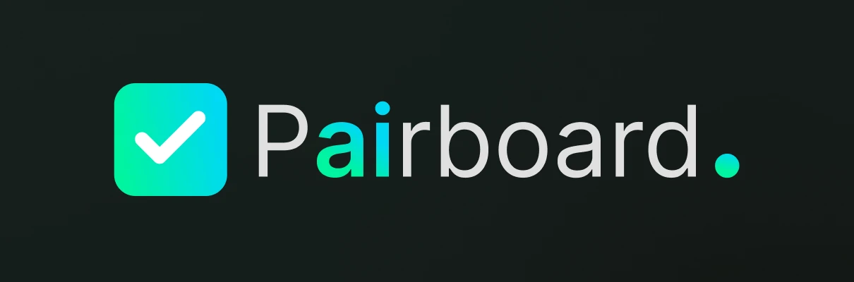
“ai” in the gradient
The brand’s promise, hidden in plain sight in its own name.
A checkbox mark
Green-to-cyan, rounded, readable from favicon to billboard.
The full stop
Pairboard. A small cyan dot that says “done”.
Visual language
Cyber Green on near-black, for long working sessions. A dark, low-glare base with one bright accent. Green marks progress and action; everything else stays gray so tasks stay readable.
One family for the brand, the website and the product: Regular, Medium and Semi-Bold.
- Heading 1Semi-Bold
- Heading 2Medium
- Paragraph / BoldSemi-Bold
- CaptionRegular

Tell us your goals, AI takes care of the rest.
The landing page explains the product in the order people ask about it: what it does, how AI helps, what it connects to, whether data is safe, and whether teams can use it. Every illustration is real product UI.
Scroll inside the frame to see the full page.
One promise
“Simplify goals with Pairboard. The AI-powered to-do revolution.”
Product as proof
Email-to-task, drag-to-reorder and team cards, cut from the real UI.
Trust, early
“Your data stays secure, powered by Google Vertex AI.”
Feature illustrations, built from product components

Four landing-page iterations sit in the file; this is the version that went live.
One sidebar, everything a click away.
The app keeps a familiar shape: a sidebar of places, the work in the middle, AI on the side. Linked accounts live in the sidebar, so it is always clear where a task came from.
- Home
- To-dosGoals, subtasks, Ask AI
- Calendar
- Notes
- Inbox
- ProjectsAdd project
- AI WorkspaceCreate workspace
- Linked accountsGmail, Outlook, Yahoo
- InfoFiles, folders, labels
- Connections12 tools
- Trash · Settings · Help
From sign-up to a finished goal.
The first session had to show value fast: get in, tell Pairboard about yourself, connect your tools, and watch a goal turn into a plan.
Sign up
Email or Google
Log in / Sign upGet to know you
Personal details, then preferences
OnboardingConnect
Inboxes and chat tools
ConnectionsPlan
Add a goal, let AI draft the tasks
To-dos · Ask AIFinish
Write the email or doc in place
Task panelPersonalization before productivity.
Before the first list, Pairboard asks a few questions: how you organize (by priority, date or category), what motivates you (rewards, deadlines or accountability) and how detailed reminders should be. The AI uses this from day one.
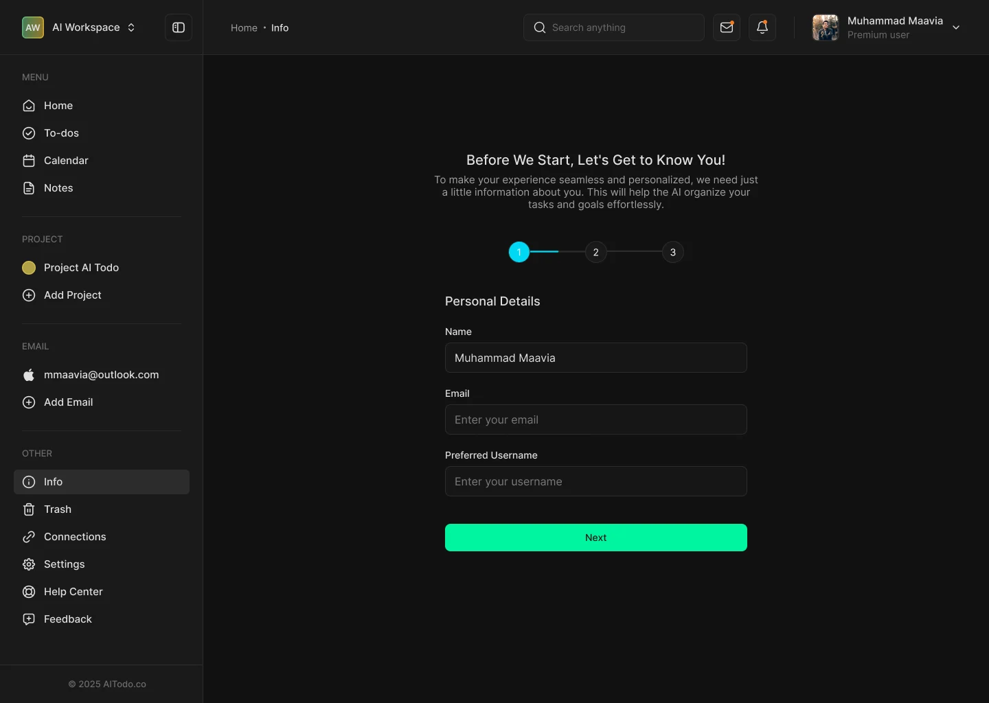

Three questions instead of a blank list
A new to-do app usually opens empty. Asking three quick preference questions gives the AI enough to organize and remind in the user’s own style, so the first session already feels personal.
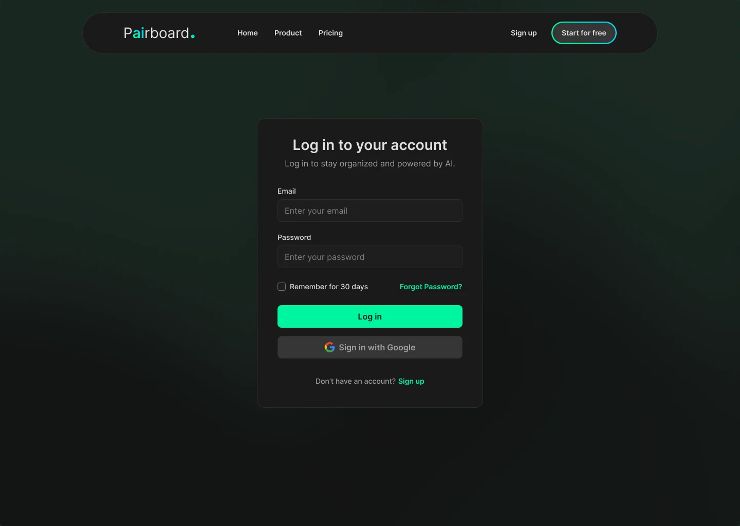
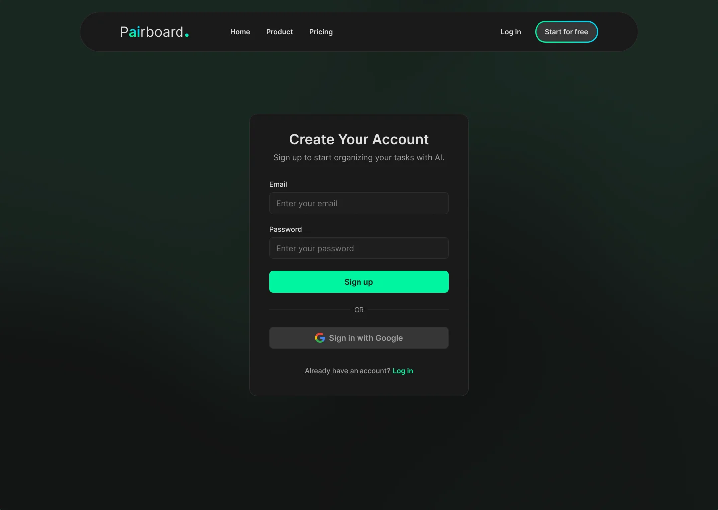
Sign up & log in
Two fields, one Google button. Getting in should take seconds. Email and password or Google, with the site navigation still visible so nobody feels trapped.
Goals on the left, progress at a glance.
Goals are grouped by day. Each one shows its progress, like 2/4, and opens into subtasks. When a goal is created, users choose whether to write the tasks themselves or let AI generate them.
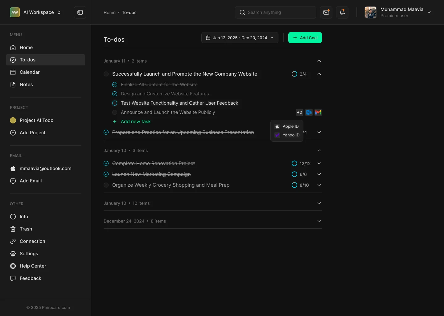
Progress on every goal
A ring and a count: 2/4, 12/12.
Manual or AI
“Create tasks manually” or “Let AI generate tasks”.
Linked accounts on tasks
Account chips show which inbox or tool a task belongs to.
Flow · create, break down, remove
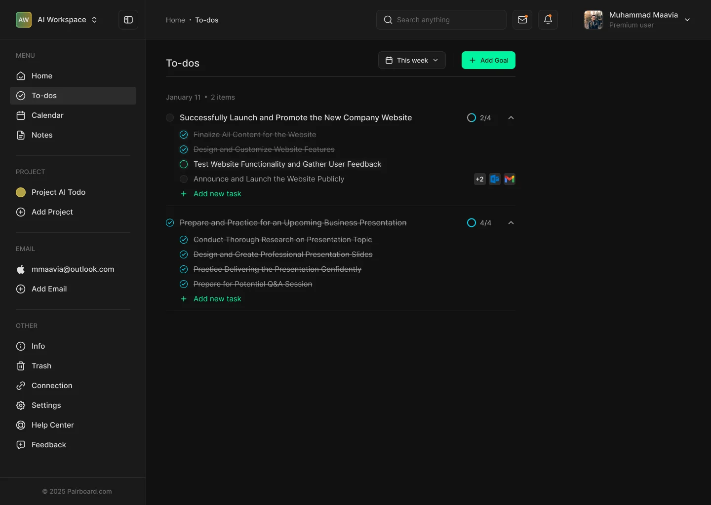
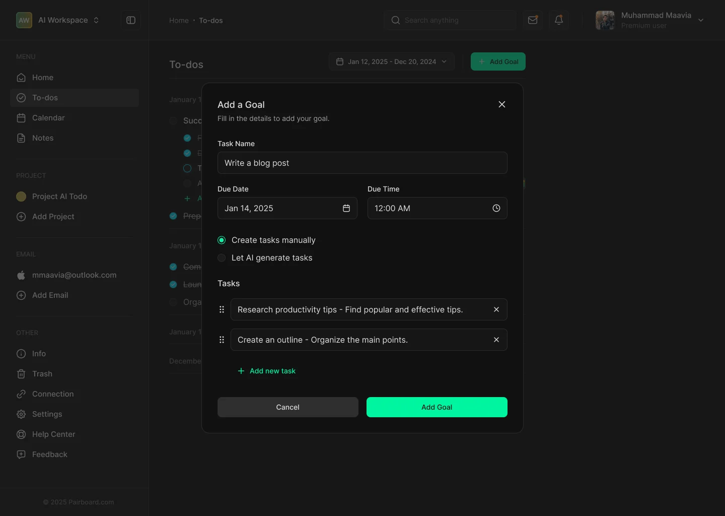
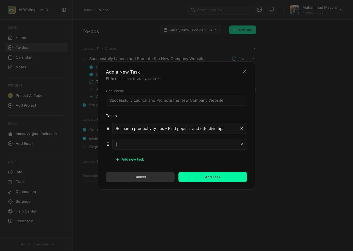
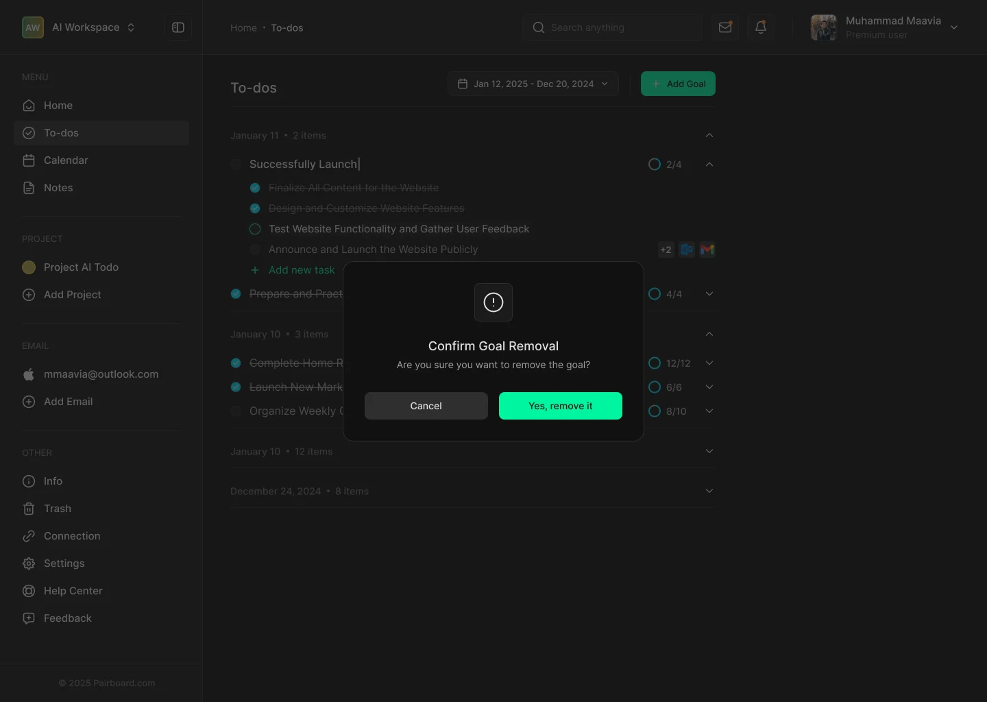
Scroll sideways for more screens.
Ask AI
An assistant that sits beside your list. Ask AI opens next to the to-dos, not on top of them. It answers with next steps that match the goal on screen, so the list and the conversation stay in sync.
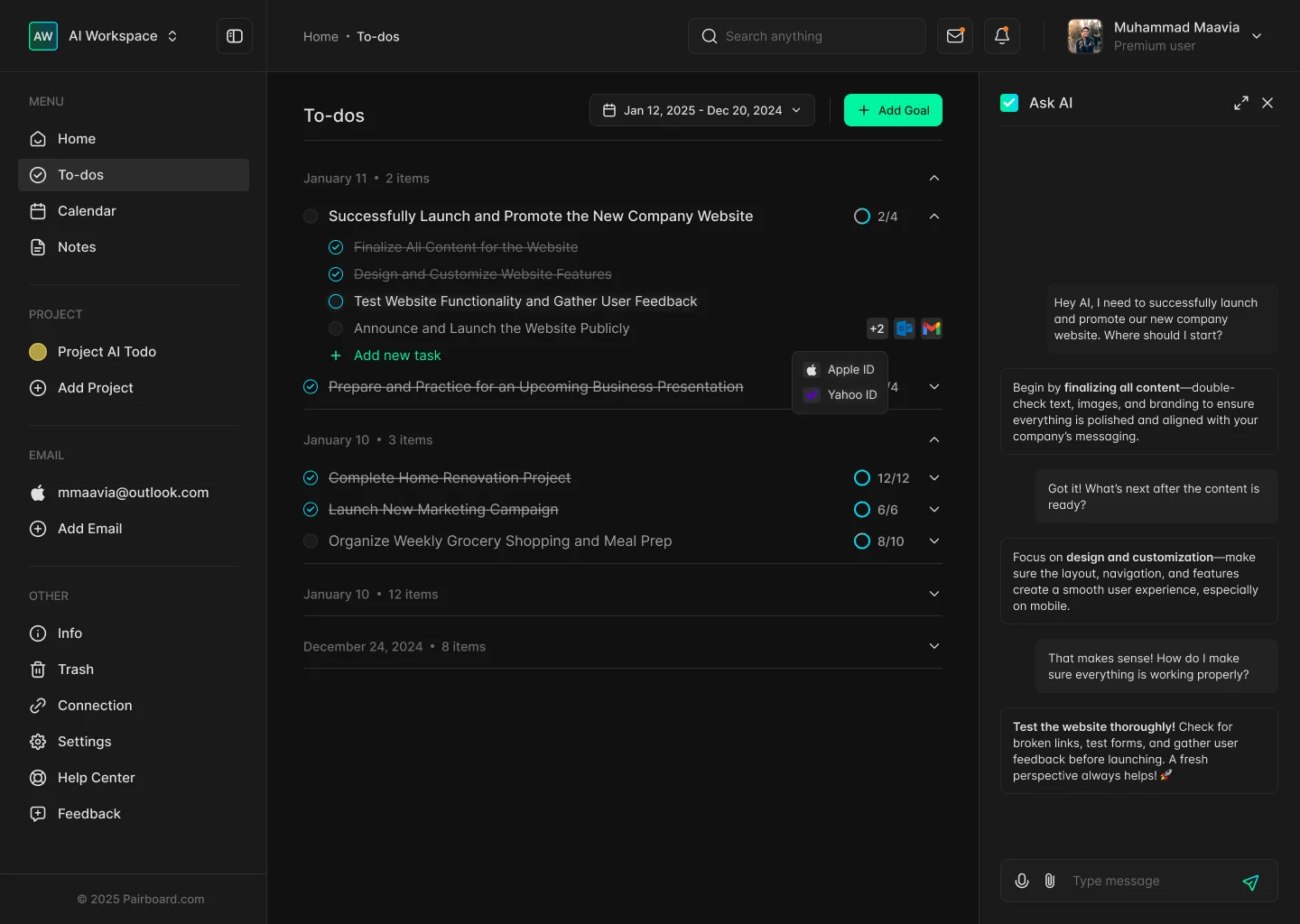
Side panel, not a modal
The list stays visible while the AI helps.
Answers that point to tasks
Replies put the next task in bold.
Voice and files
Mic and attachment inputs in the composer.
Finish the task without leaving the task.
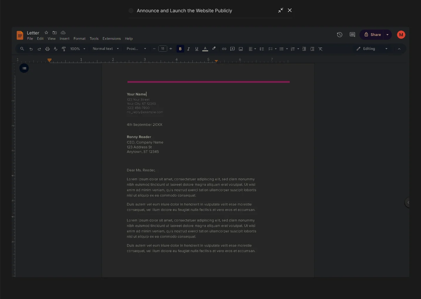
A task opens in a side panel. If it needs an email or a document, users write it right there instead of switching apps.
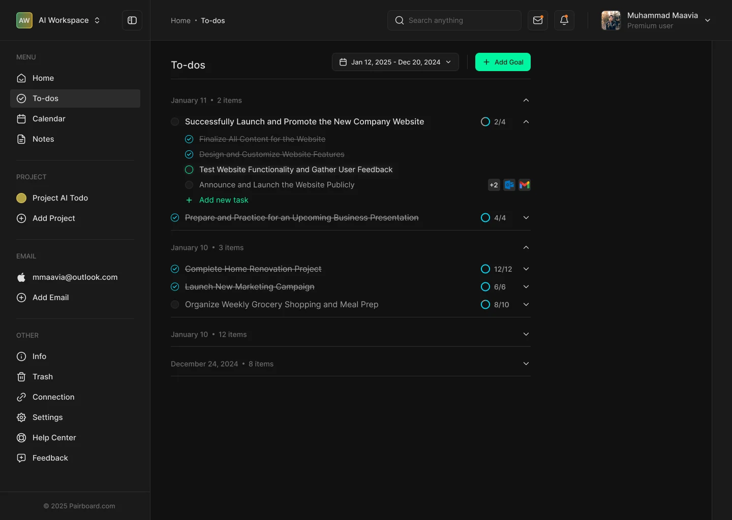
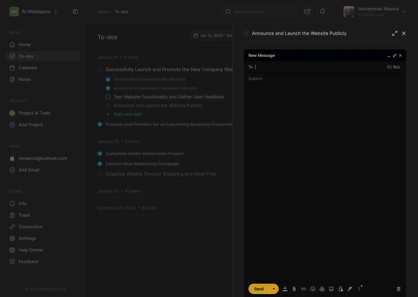
Scroll sideways for more screens.
Info
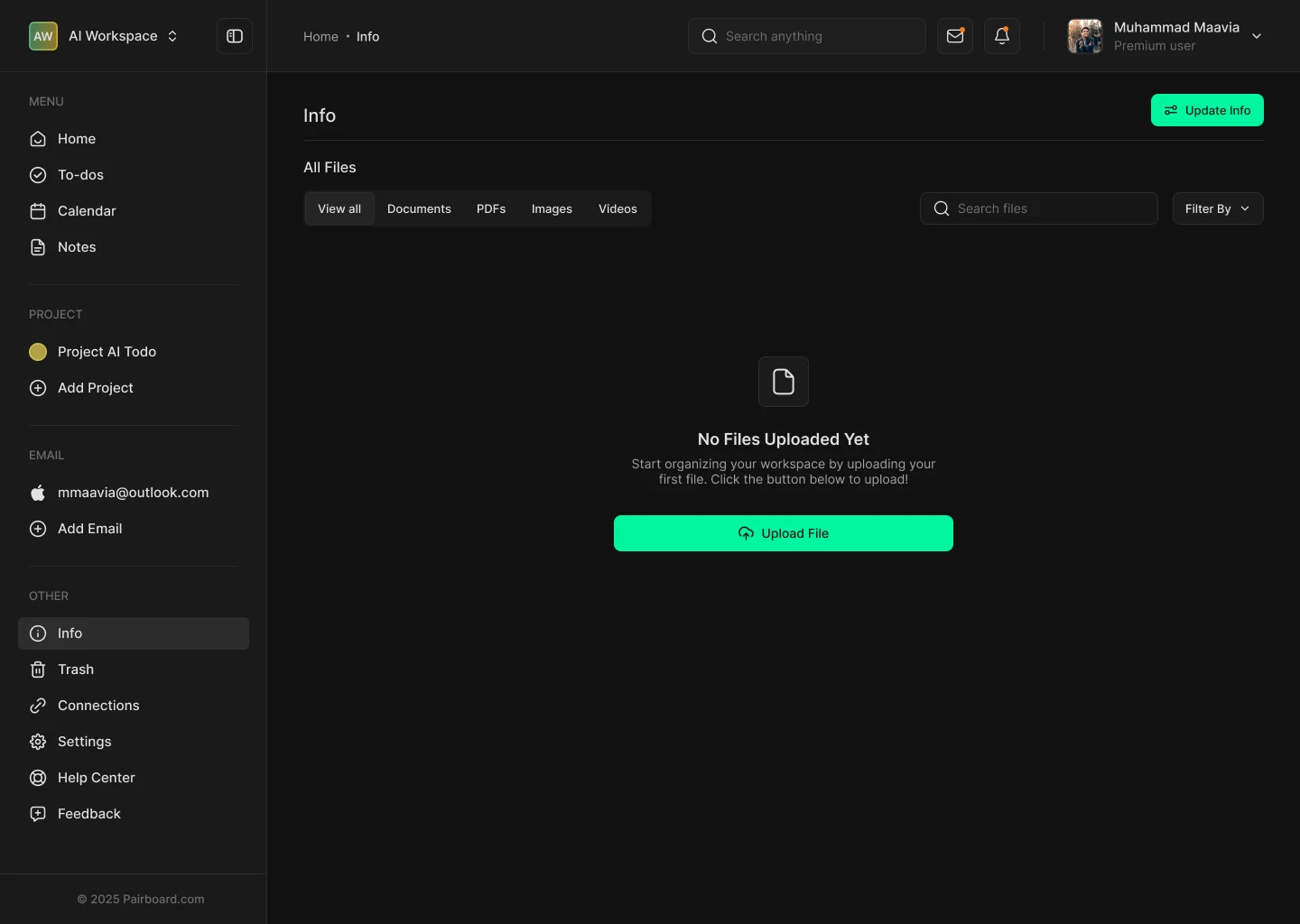
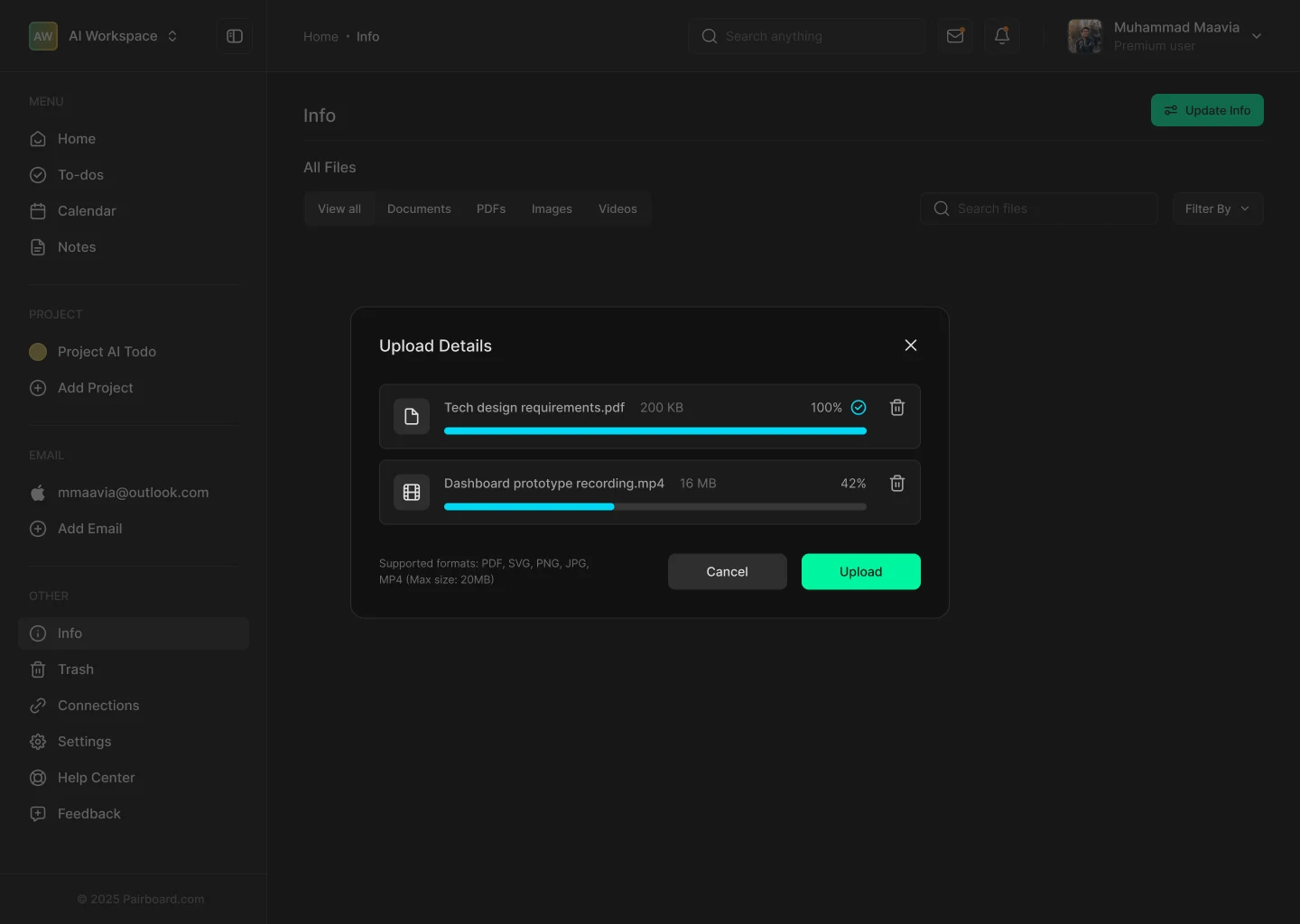
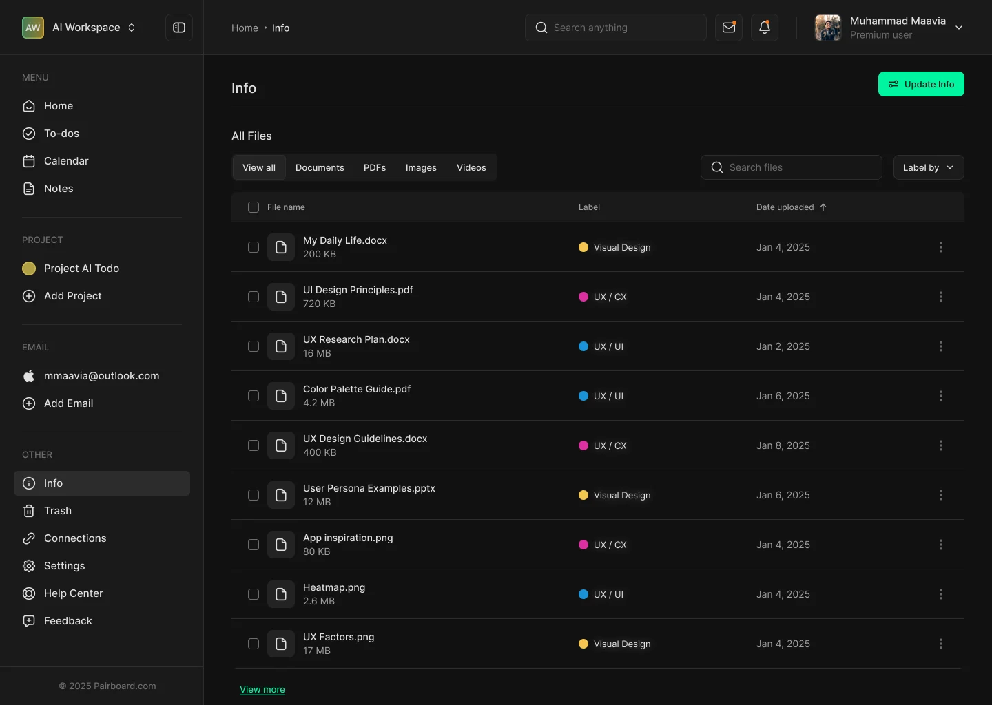
Your files, labeled and in reach. Info is the shared file space. Users upload documents, sort them into folders and add labels, so the right file is always next to the right task.

Scroll sideways for more screens.
Empty state with one action
“No files uploaded yet”, and one Upload button.
Labels you can scan
Visual Design, UX/UI, UX/CX: a color dot for each.
Folders when it grows
Counts and sizes on every folder card.
Twelve tools, one switch each.
Connections is where Pairboard listens. Each tool has one sentence explaining what the AI will do with it, a Connect button and an on/off switch. Disconnecting always asks first.

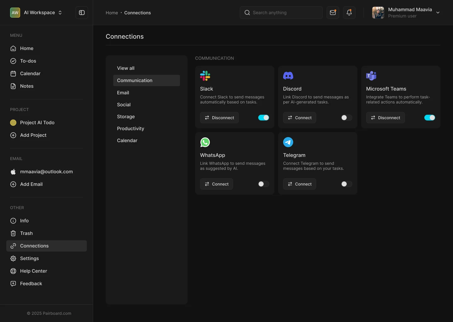
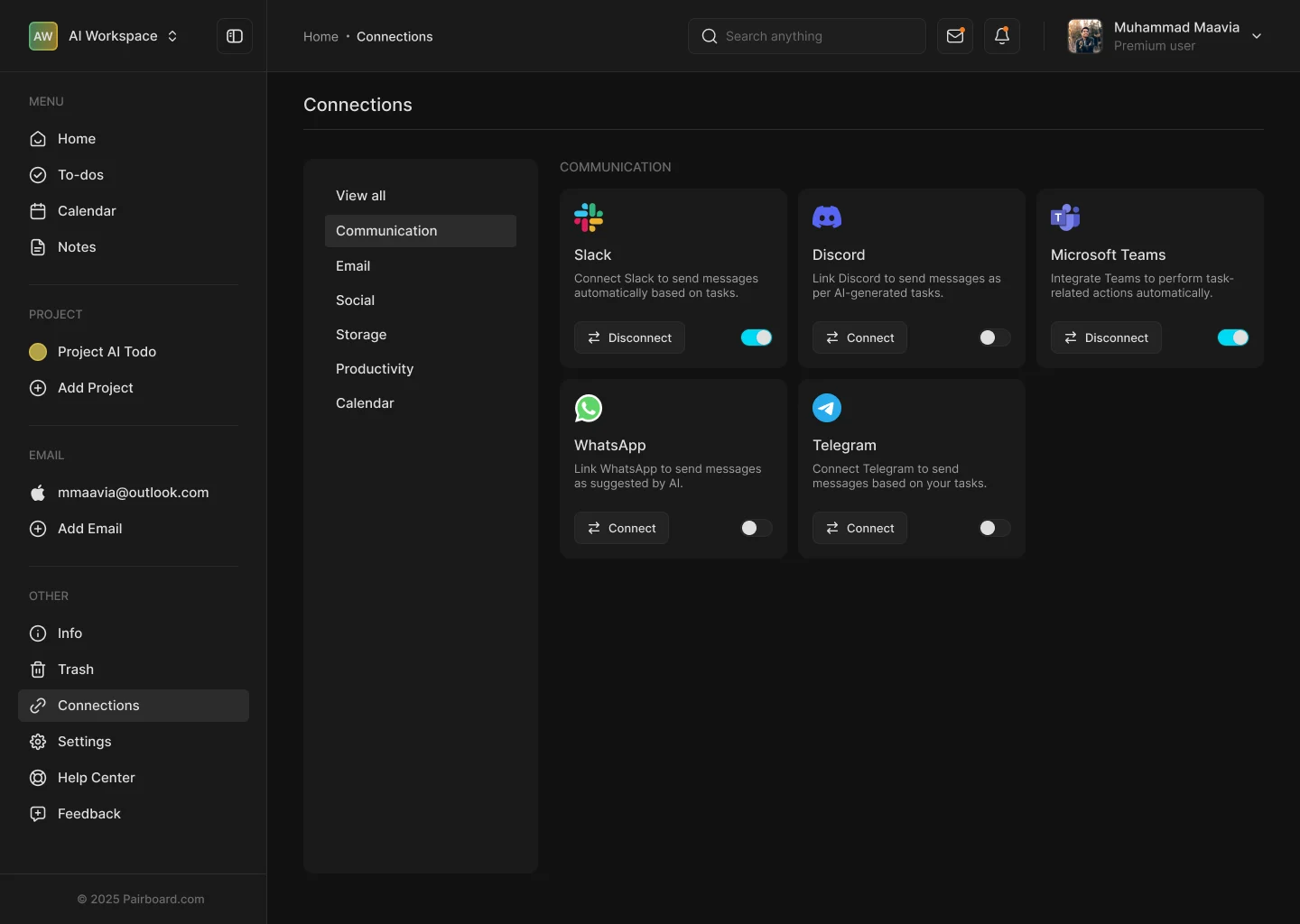
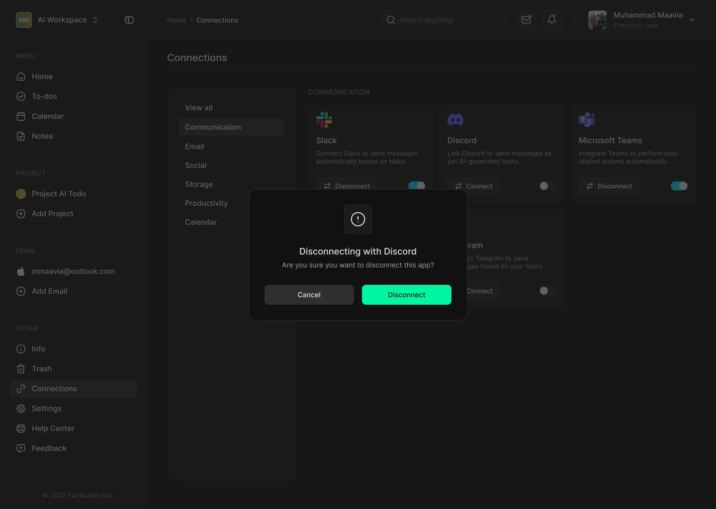
Scroll sideways for more screens.
One line of “why”
“Connect Slack to send messages automatically based on tasks.”
Pause, don’t lose
A switch pauses a tool without disconnecting it.
Categories
Communication, email, social, storage, productivity, calendar.
From AITodo to Pairboard.
The product started life under the working name AITodo, with a bright mint log-in and a plainer dashboard. As the brand took shape, the name became Pairboard, the screens went dark and calm, and green was saved for action.
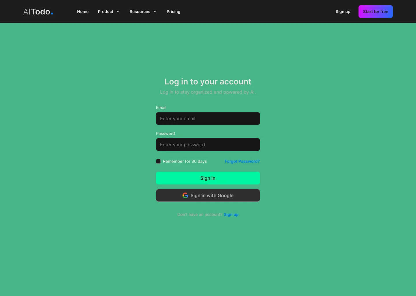

A name with “ai” inside
Pairboard kept the AI promise without sounding like a feature.
Dark, then one accent
Green moved from backgrounds to buttons and progress.
Familiar first
The sidebar stayed; only the details changed.
One kit for the site and the product.
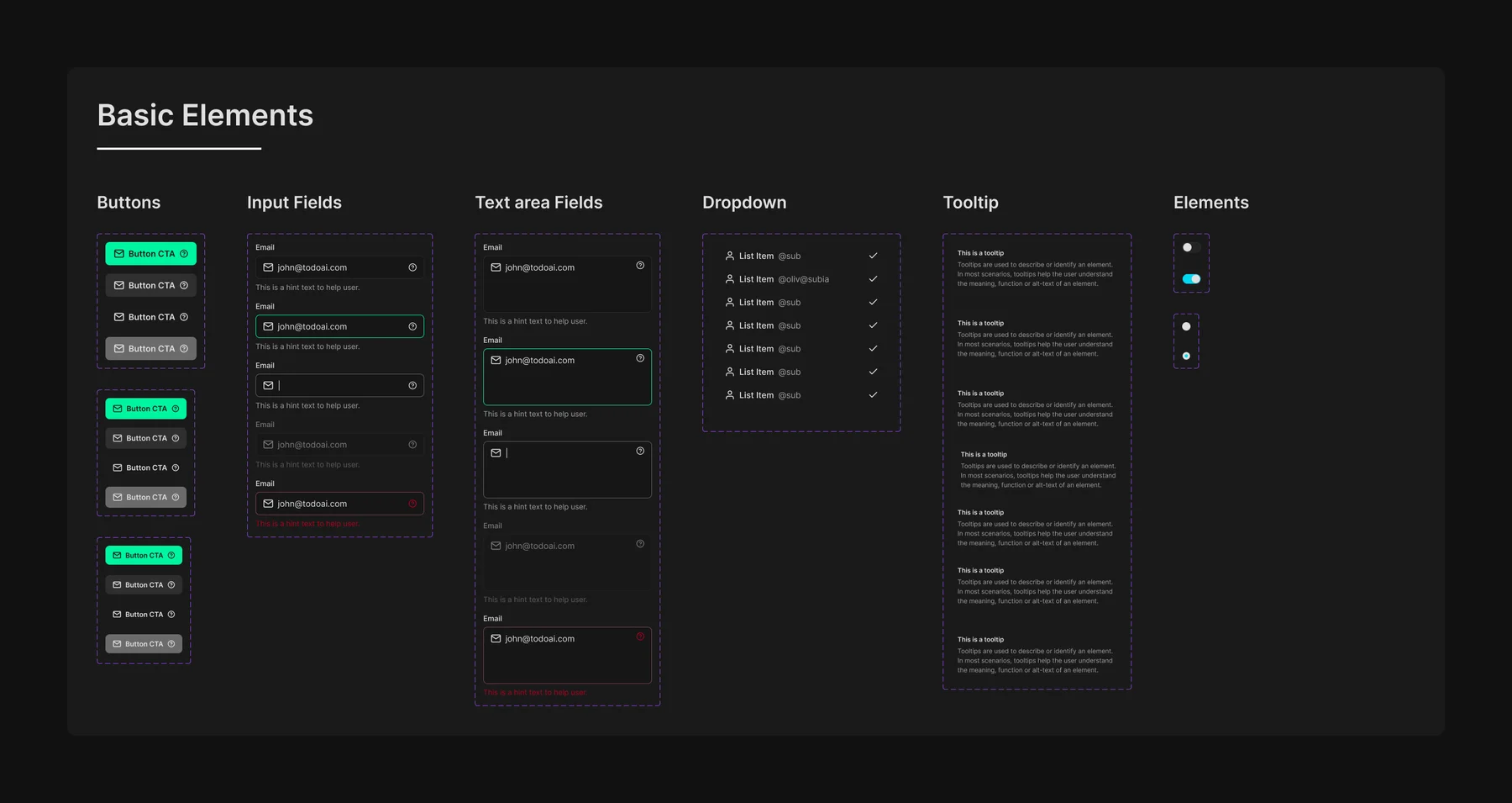
The same buttons, fields and icons power the marketing website and the app, which is how both shipped inside a month.
Live, solo, and under a month.
Brand, website and product, designed by one person, live at pairboard.com and used by 500+ people.
month from brief to live product
2025product screens and states
Design filetools in the Connections hub
Design fileusers on Pairboard
Reported by the teamDesign the brand inside the product
Choosing the palette next to real screens kept the green for meaning, not decoration.
Let the website borrow the UI
Real components made the landing page honest and faster to build.
Measure the AI choice
Track how often people pick “Let AI generate tasks” over writing them.
Pairboard is live.
See the website, or the original Behance post.
Screens show demo data. Brand, website and product designed by Muhammad Maavia, 2025.
Leave a like
A quick human check keeps likes honest. One like per visitor.