ARC
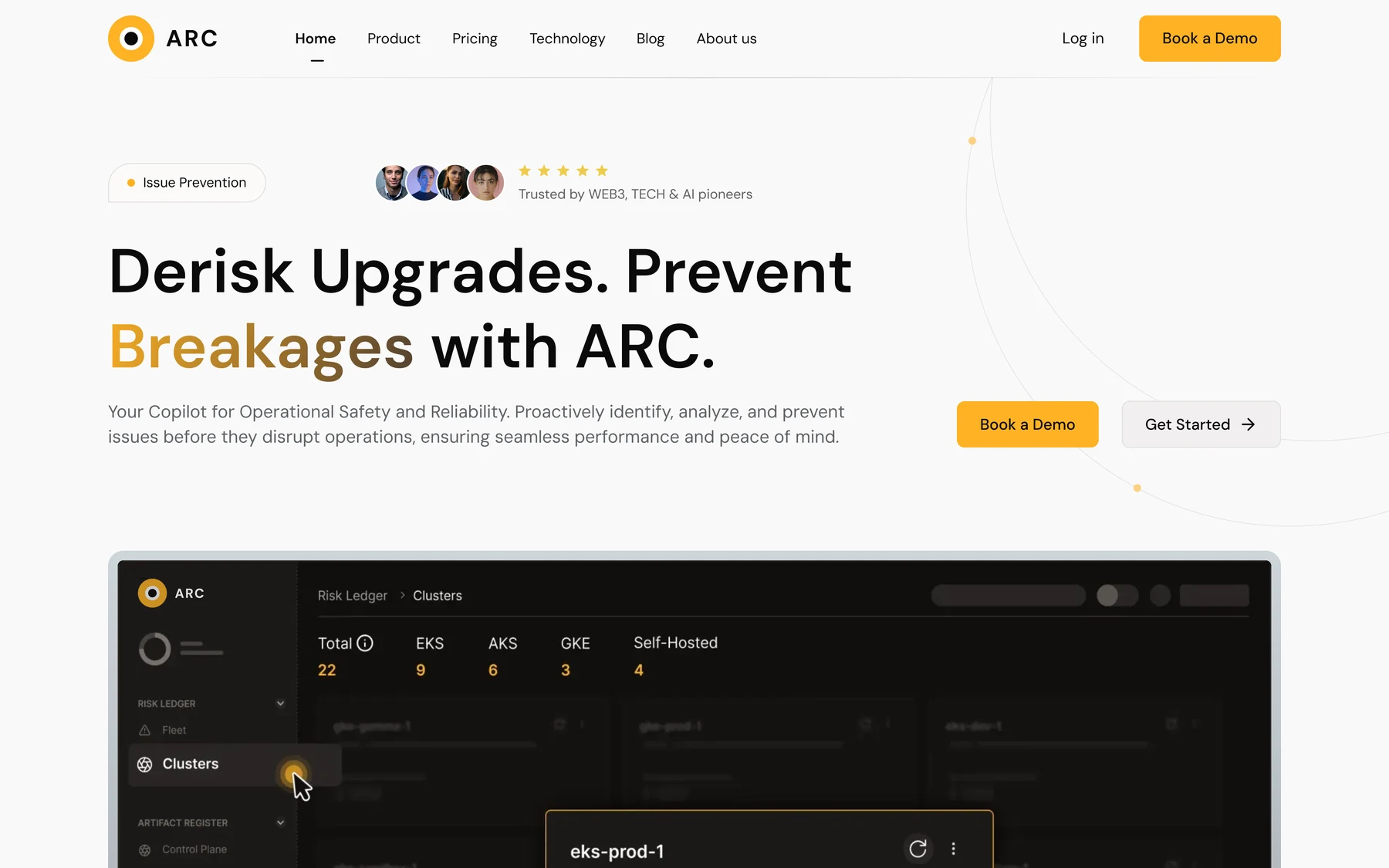
Derisk upgrades. Prevent breakages.
Arc.io is a Kubernetes availability platform that helps businesses identify and address risks before they disrupt operations. I designed its landing page.
Complex infrastructure, explained simply.
With real-time insights and pre-verified upgrade plans, Arc.io ensures safe upgrades, efficient performance and enhanced visibility across your systems.
risks before they disrupt operations.
safely, with pre-verified plans.
every system, with real-time insights.
One scroll, from promise to proof.
The page moves in five beats, each with its own section and call to action.
Promise
Headline, two calls to action
HeroProof
Product UI, logos, team stats
DashboardValue
Three benefits, surcharge table
BenefitsTrust
Testimonials, a success story
Social proofDepth
Add-ons, news, final CTA
ResourcesLead with the promise, show the product.
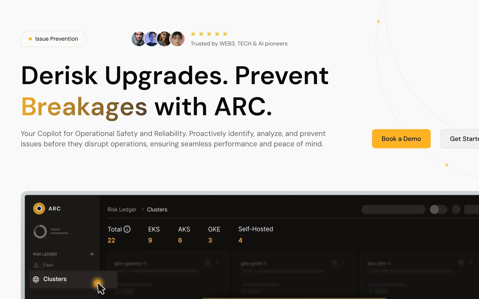
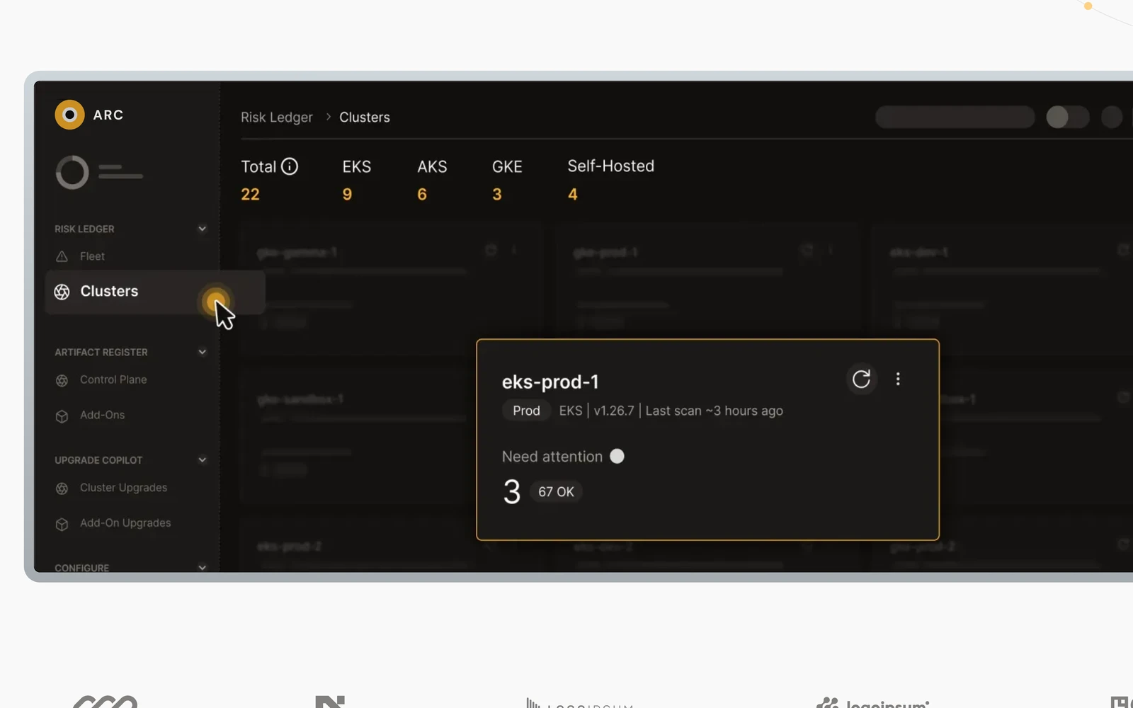
The headline names the outcome; the product’s own Risk Ledger sits right under it, so visitors see what ARC does before reading more.
One clear promise
“Derisk Upgrades. Prevent Breakages,” with the key word in brand gold.
Two paths
Book a Demo for buyers, Get Started for hands-on teams.
Product as proof
A cluster view with an alert card, right under the headline.
Benefits you can scan, costs you can feel.
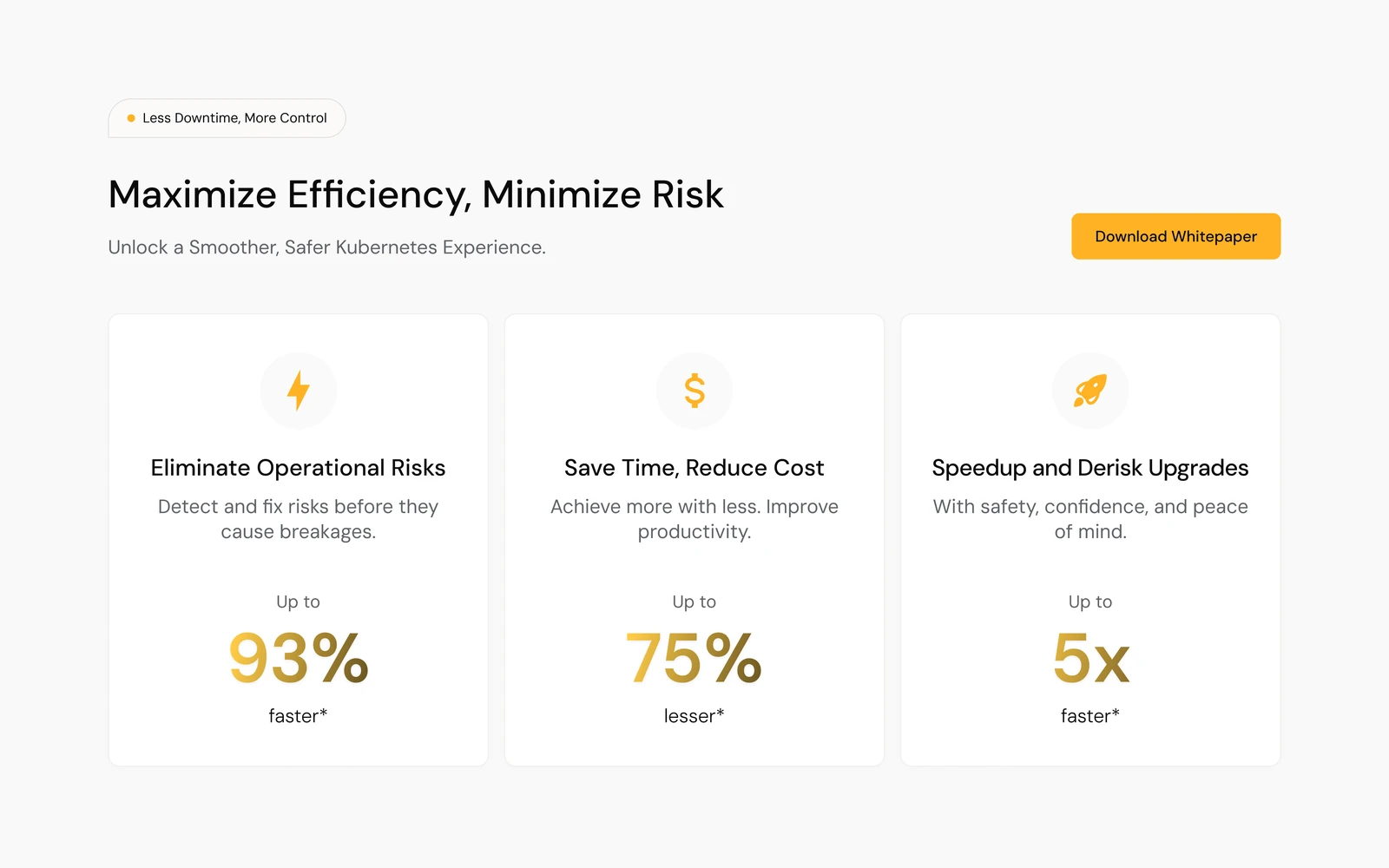
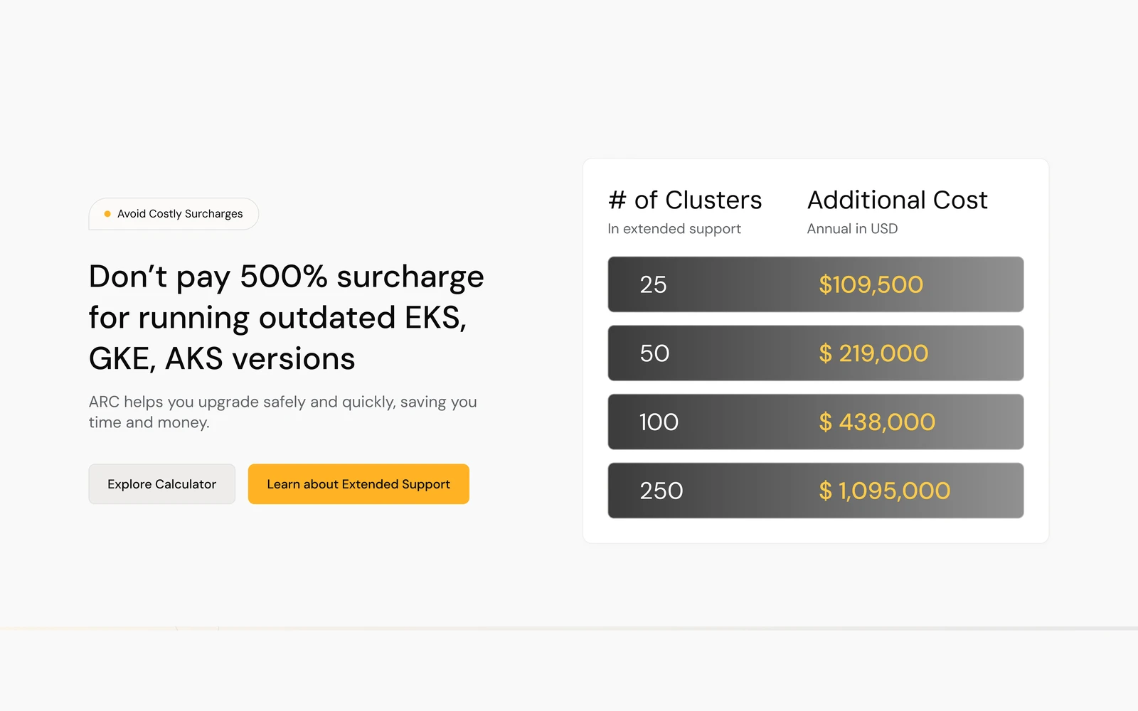
Three benefit cards answer “why ARC,” and a table makes the cost of running outdated EKS, GKE and AKS versions concrete.
Three cards, one pattern
Icon, title, one line and a big figure.
A table, not a paragraph
Clusters against annual cost, so the number does the talking.
Two calls to action
Explore Calculator and Learn about Extended Support.
The percentages, prices and stats on the page are ARC’s own marketing content.
Proof from people, then a full story.
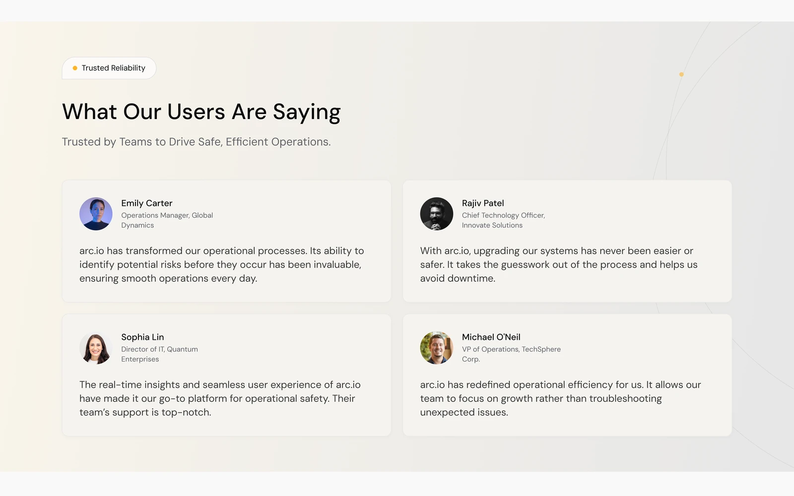
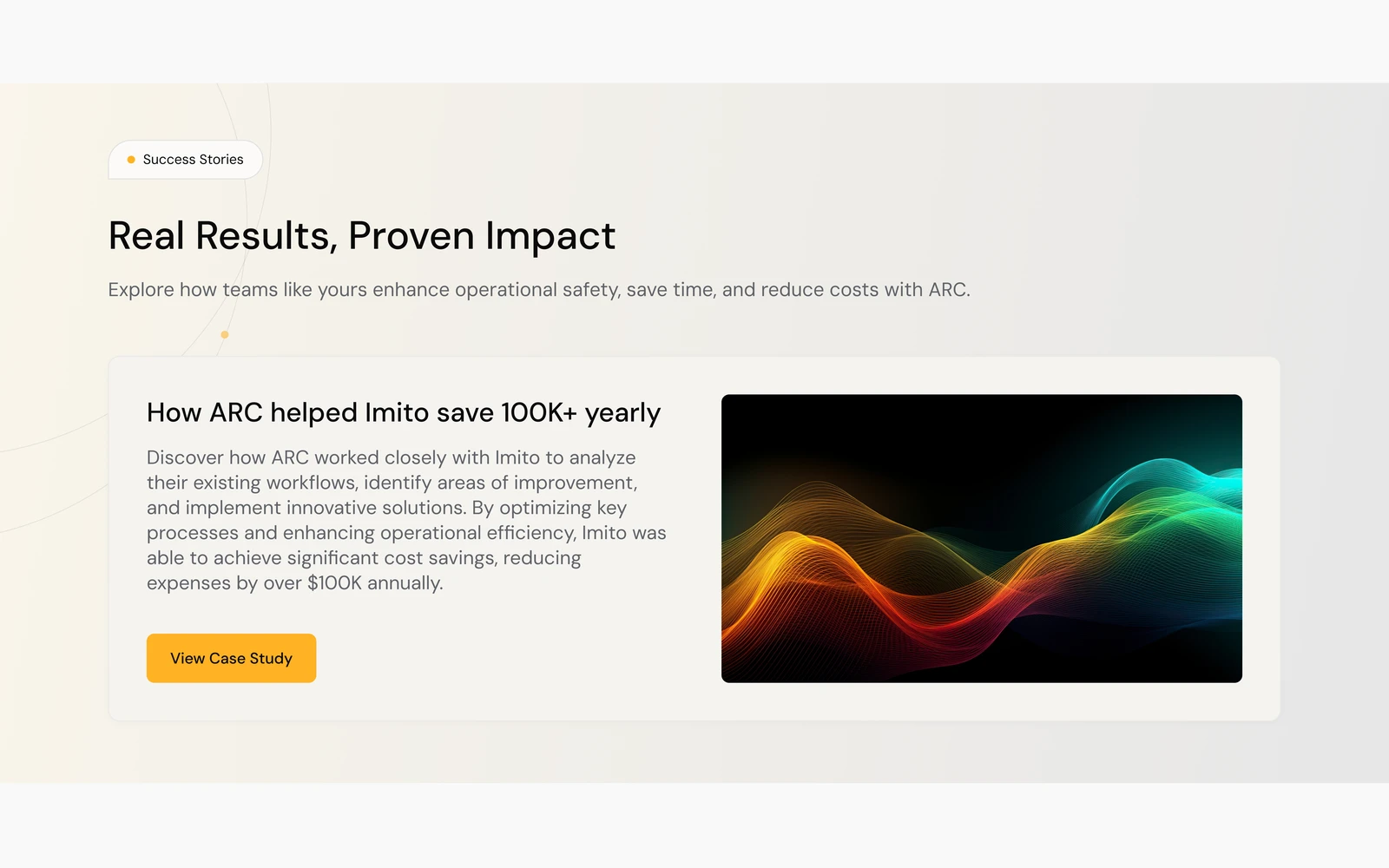
Four short testimonials build trust quickly; a success story card links to the longer case study.
Faces and titles
Each quote carries a photo, name and role.
One featured story
A single card, an image and a View Case Study button.
Warm bands
Social-proof sections sit on a warm off-white band.
For the evaluators: add-ons and news.
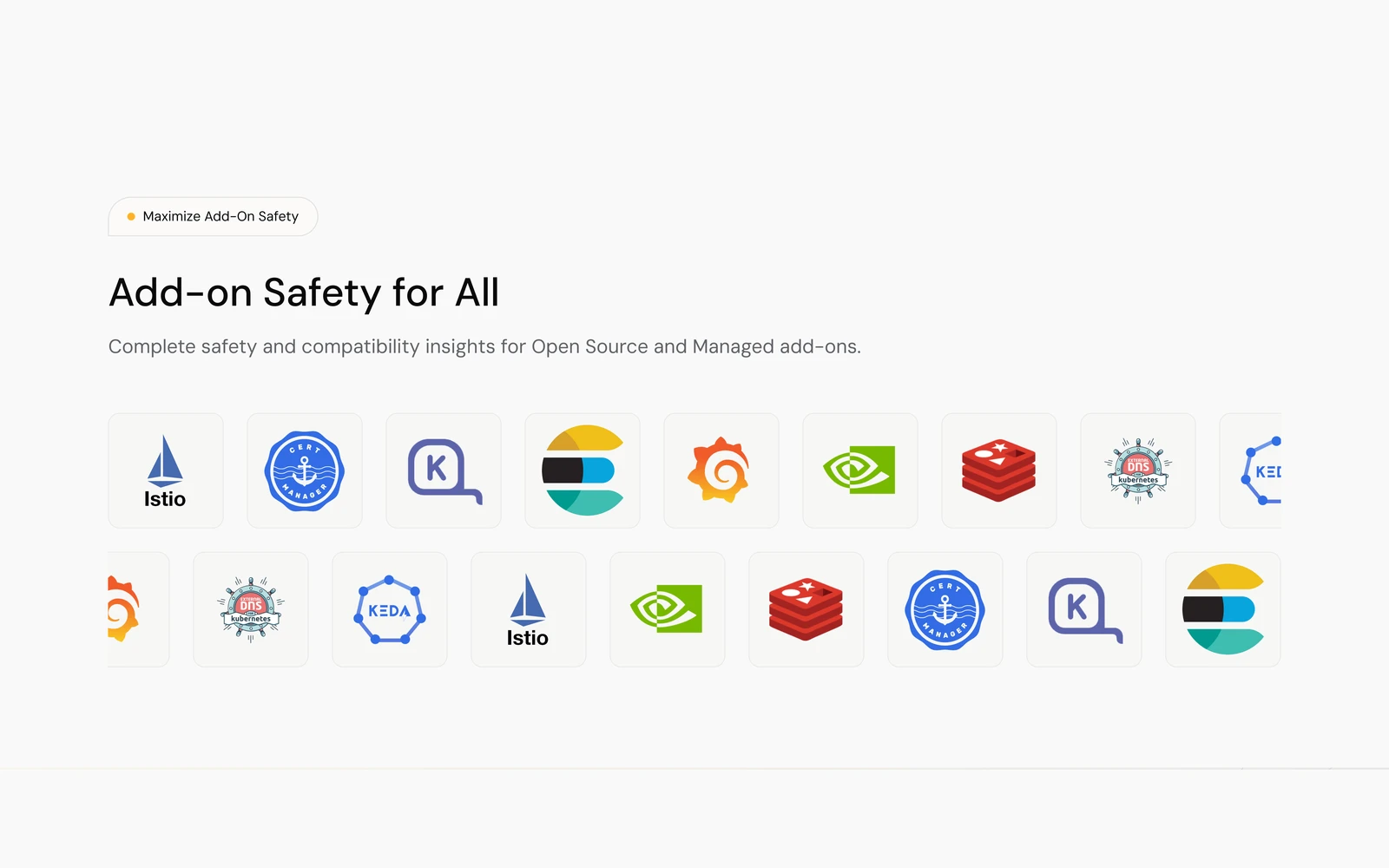
Technical buyers get the detail they look for: add-on compatibility and recent articles, ending on one last call to action.
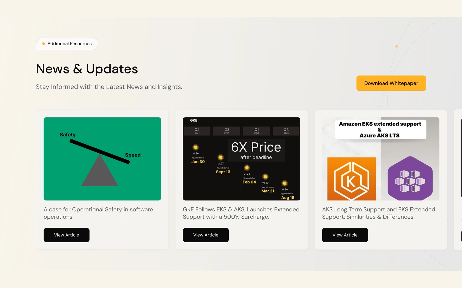
Technical, but approachable.
A warm neutral base, one gold accent for every call to action, and dark product UI for contrast.
Clean, modern and consistent: one geometric family for headings and text.
Every section opens with a small pill tag over the heading, so the long page reads in chapters.
The landing page, top to bottom.

Scroll inside the frame to see the full page.
See it on Behance.
The original post, with the full landing page.
Testimonials, client names and figures shown on the page are ARC’s own marketing content, not design results. Designed by Muhammad Maavia, 2024.
Leave a like
A quick human check keeps likes honest. One like per visitor.