Zarina Shamim Trust
Let’s educate and empower girls.
Zarina Shamim Trust runs scholarships and a computer center for girls in Lahore. As the only designer, I redesigned its website, now live, so families, donors and scholars can find programs, stories and ways to give, in a calmer, more modern design.

A nonprofit website that inspires action.
The trust needed one place that explains its mission, shows the girls it supports, and makes giving simple. The old site had the content, but buried it.
want to know who can apply for a scholarship, and how.
want proof of impact and an easy way to give.
wants its mission, projects and news in front of everyone.
Modern, intuitive and mission-first.
Enhance the experience
A clearer, more intuitive interface for every visitor.
Modernize the design
A visually appealing refresh of the trust’s online presence.
Showcase the mission
Put the mission and the girls it supports front and center.
Nine pages, one path to giving.
I organized the site around what each visitor comes for. Every page ends on the same call to action, “Let’s educate and empower girls”, so giving is never more than one click away.
- HomeVision, mission, projects, news
- About usAchievements, reports, team
- Scholarship programWho, how, success stories
- Scholarship awardsCeremonies by year
- Success storiesScholars, with video
- News & eventsBlog and detail
- DonateSponsor a student, bank details
- ContactMap and message form
Six ways to say “Enabling & Empowering”.
The hero carries the whole message, so I explored it the most: split layouts, a full-bleed photo, a video-led version and a framed photo with a slider.
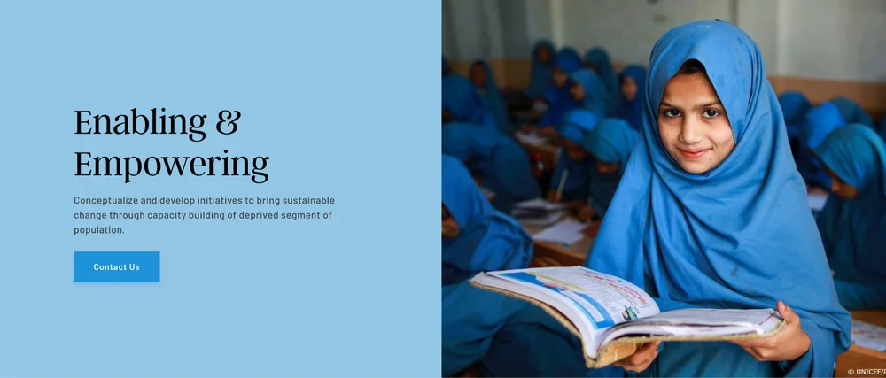


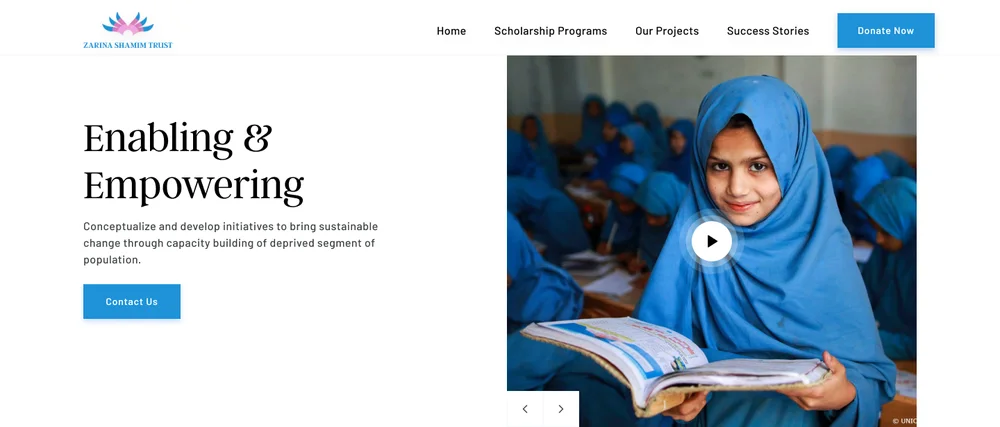

Real girls, and the message on a soft panel
None of the six went live as-is. The final hero leads with a large, warm photo of the girls the trust supports, with the serif headline and Donate button on a soft frosted panel over its edge. The photo carries the emotion; the panel keeps the message and the call to action readable.
From a busy first pass to a calmer final.
My first home page put a donation form, four value cards, project progress bars and the blog all on one screen. The final version gives each idea room, leads with the girls and keeps one clear path to giving.
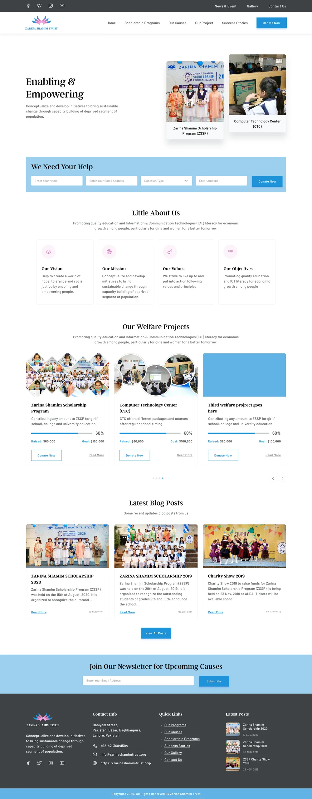

Scroll inside each frame to compare the full pages.
Programs, stories and proof of impact.
Each page answers one question. The scholarship pages show who is supported and how, success stories put faces to the numbers, and news keeps donors up to date.
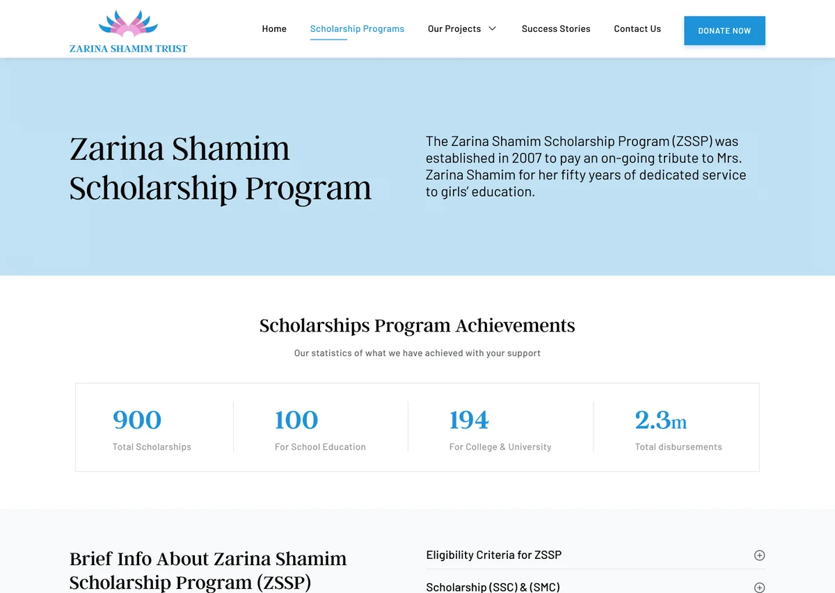
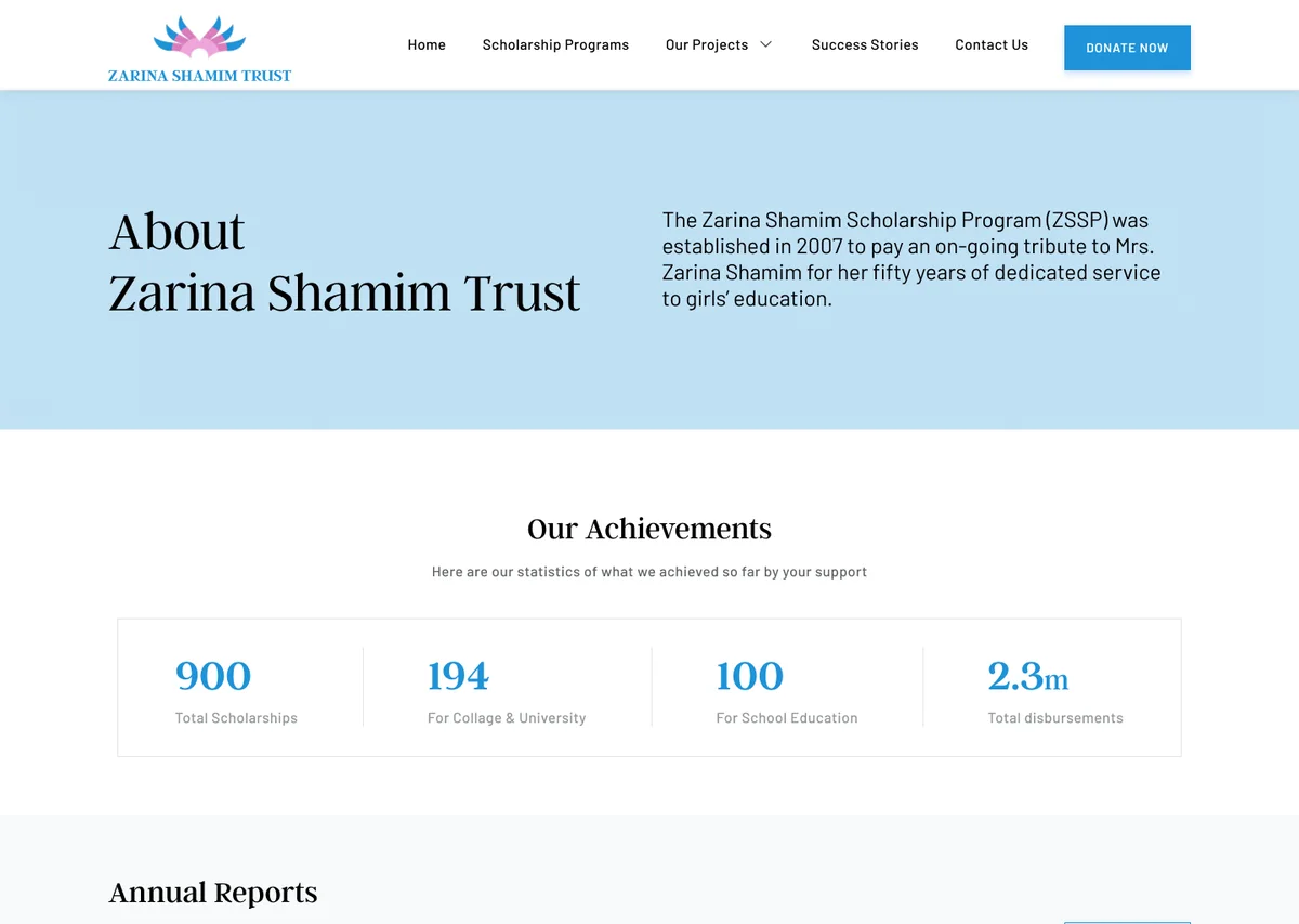

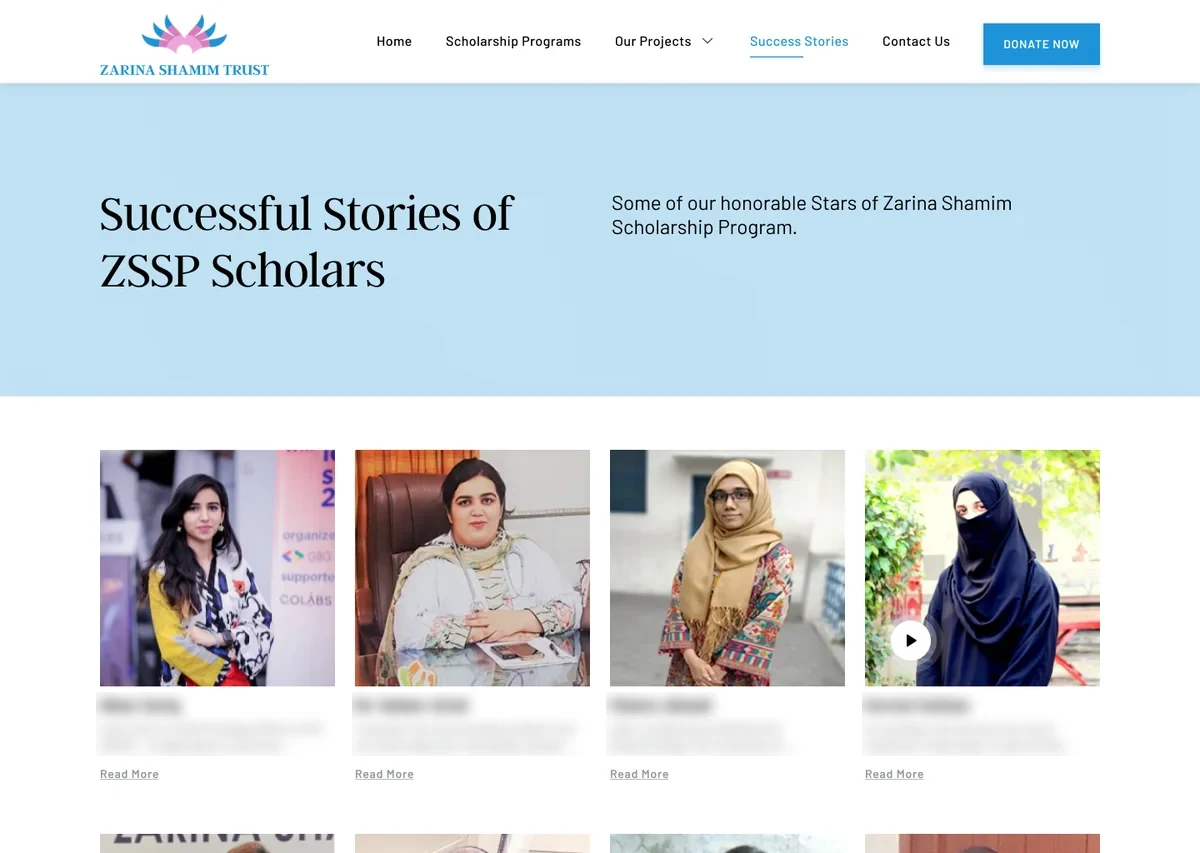
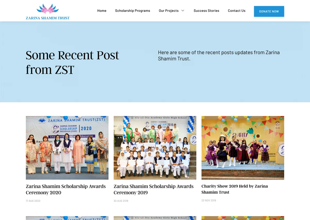
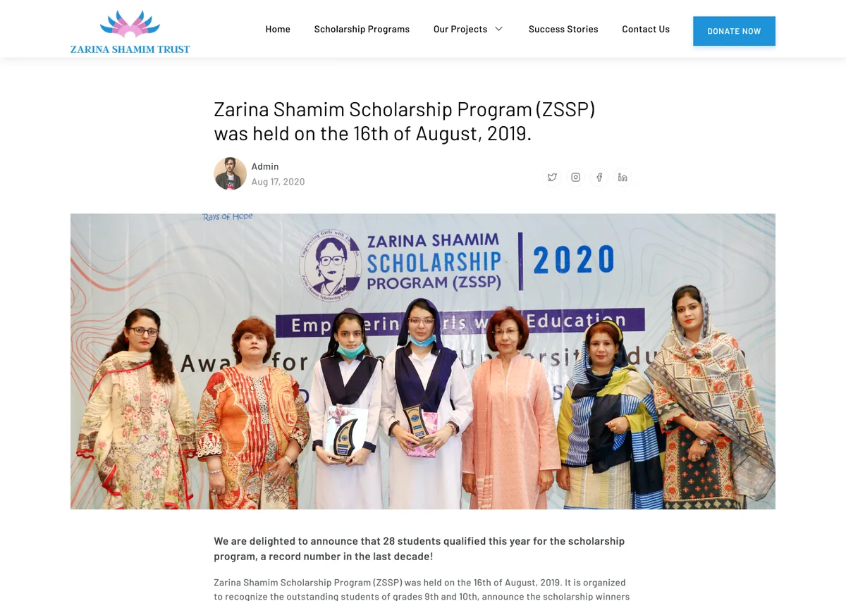
Scroll sideways for more pages.
Numbers up front
Achievements like 900 scholarships, in large type, on the program and about pages.
Faces, not lists
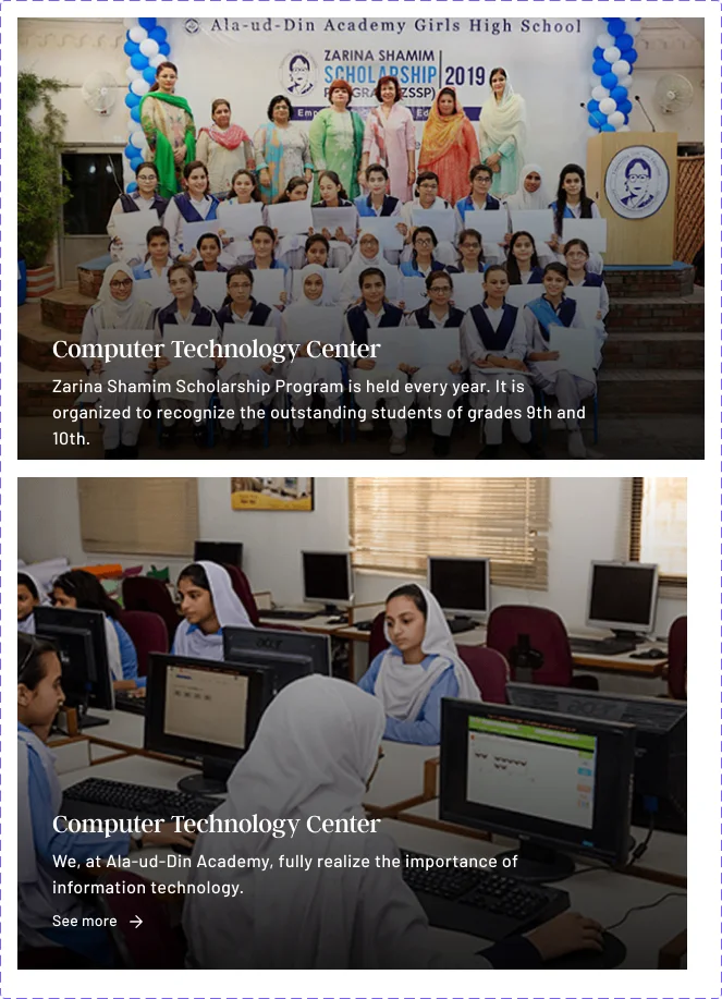
Success stories as photo cards, each opening a video story.
One footer call
“Let’s educate and empower girls” on every page.

Donating, made simple to follow.
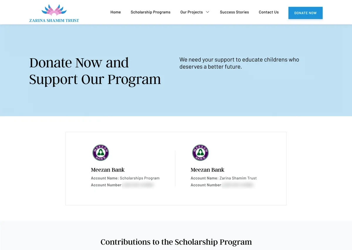
The trust accepts bank transfers, checks and online payments, so the Donate page lays the options out step by step, with sponsorships for school or college students as expandable sections.

Warm, trustworthy and human.
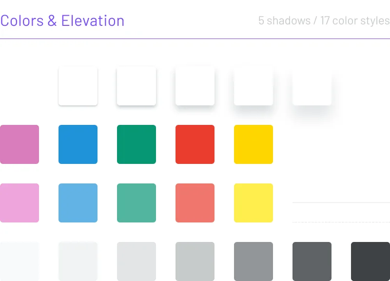
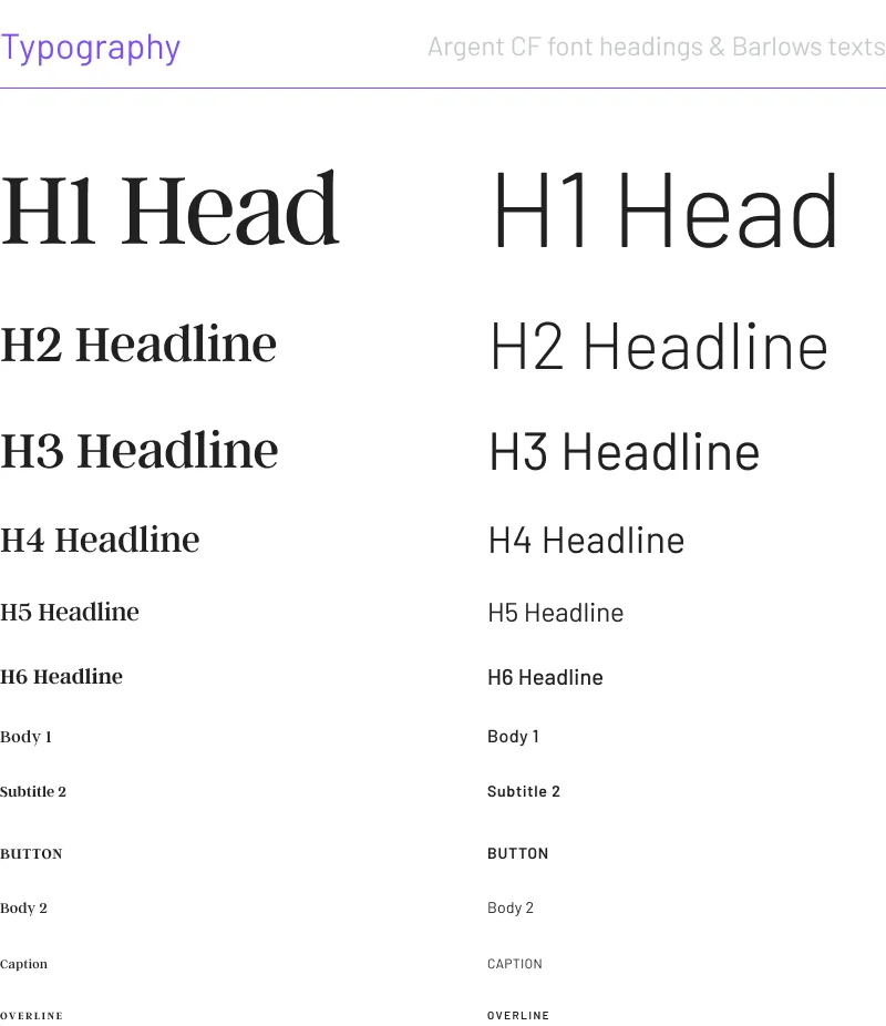
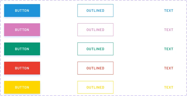
A serif for headlines and a clean sans for reading, a five-color palette taken from the trust’s lotus logo, and reusable cards for projects, awards and the team.
Argent CF for headings and Barlow for text, each with a full scale from a 96px headline to a 10px overline.
- Argent CFHeadings
- BarlowBody text
The new homepage, top to bottom.
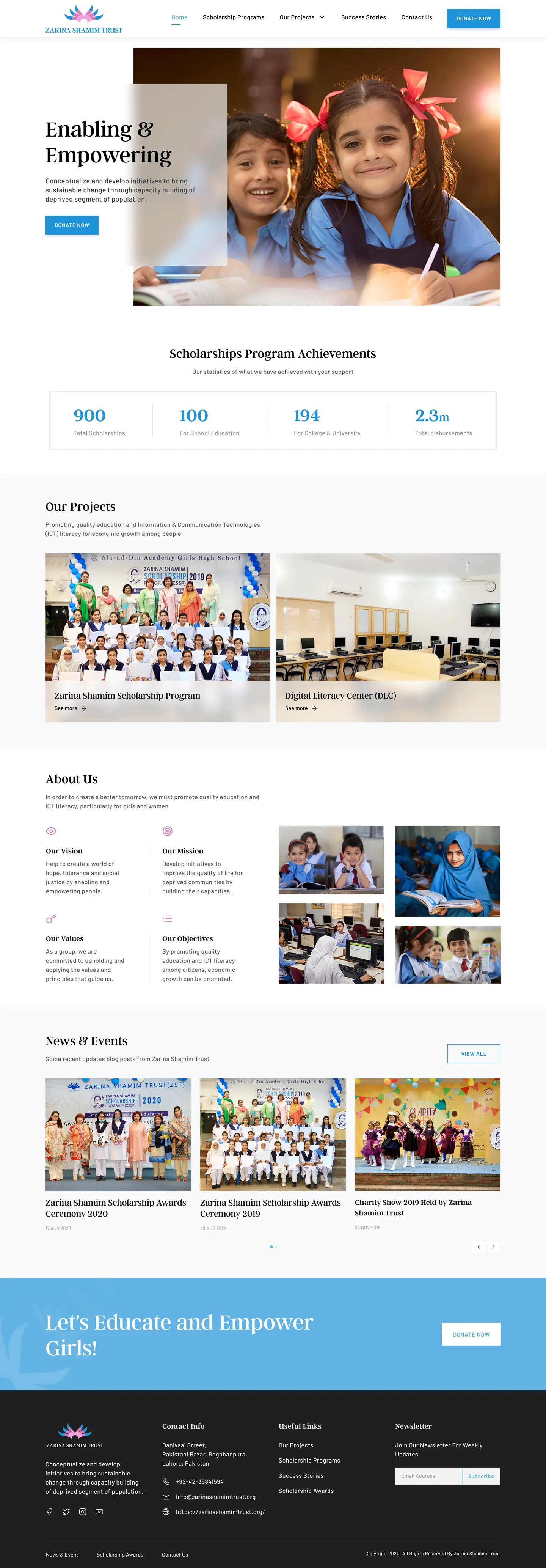
Scroll inside the frame to see the full page.
Lead with people
For a nonprofit, a real photo does more than any headline.
One idea per section
The first pass said everything at once; the final says it in order.
Test the donation path
Watch real donors find and complete a donation, and simplify from there.
Thanks for reading.
The redesign is live. Visit the site, or see the original post on Behance.
Designed by Muhammad Maavia.
Leave a like
A quick human check keeps likes honest. One like per visitor.