

Booking a ticket, without the doubt.
Ticketwise is an online ticketing platform for B2B and B2C: organizers publish events and sell tickets, and people book seats for events they love. In a self-initiated five-day sprint, I tested why three people struggled to book in one ticketing app, then redesigned the purchase flow.

Ticketwise is an existing ticket-booking app. I wanted to know whether the experience itself was the barrier, so I tested it with three people, then redesigned it with a clearer UI and UX.
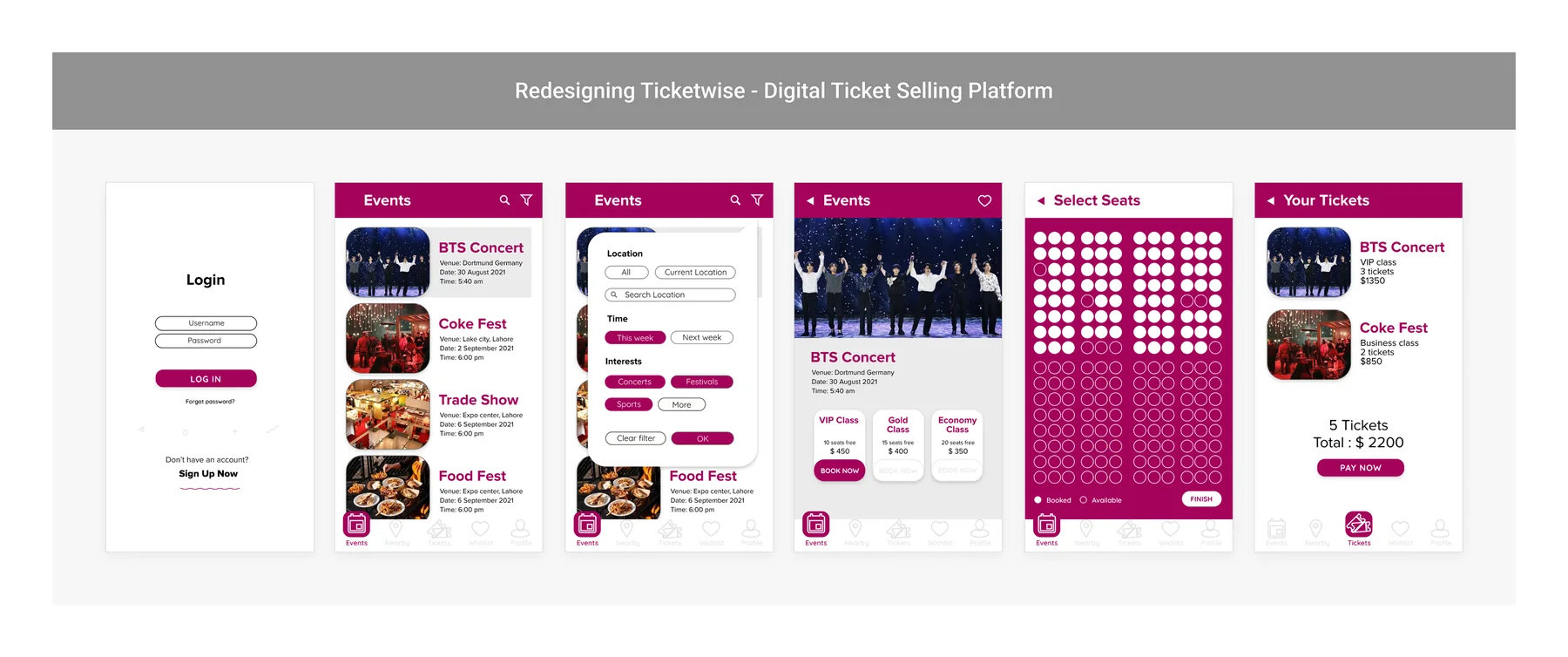
Card payments, low-tech users and few incentives to go digital are common barriers to booking online. I planned interviews and usability tests to see whether the app itself was one of them, and what would convince people to book online.

I set the process before touching a screen, and looped between sketches and low-fi until the purchase flow held up.
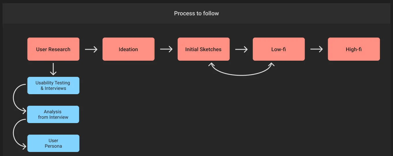
Usability tests, interviews, analysis, personas.
Ideas from research, competitors and UX practice.
The purchase journey, step by step.
Paper concepts, then eight wireframes.
28 screens and a design system in Figma.
I ran in-person, qualitative usability tests with three participants on 15 and 16 September 2021, 20 to 40 minutes each, measuring task success. Two had never used a ticket booking app before.
| Question | P1 | P2 | P3 |
|---|---|---|---|
| Were you able to complete the booking from start to end? | Yes | Yes | No |
| Is the information clear enough to book without doubts? (1–5) | 2 | 1 | n/a |
| How was your experience while booking a ticket? | It was OK | Easy to understand | Didn’t make any booking |
| Would you like to suggest any improvements? | Tags on seats | Attached | Payment by hand |
| What do you think of the layout of the overall app? | OK | Needs UX/UI improvements | Layout needs to be better |
| Would you use Ticketwise to book a ticket again? | I will think | Yes | No |
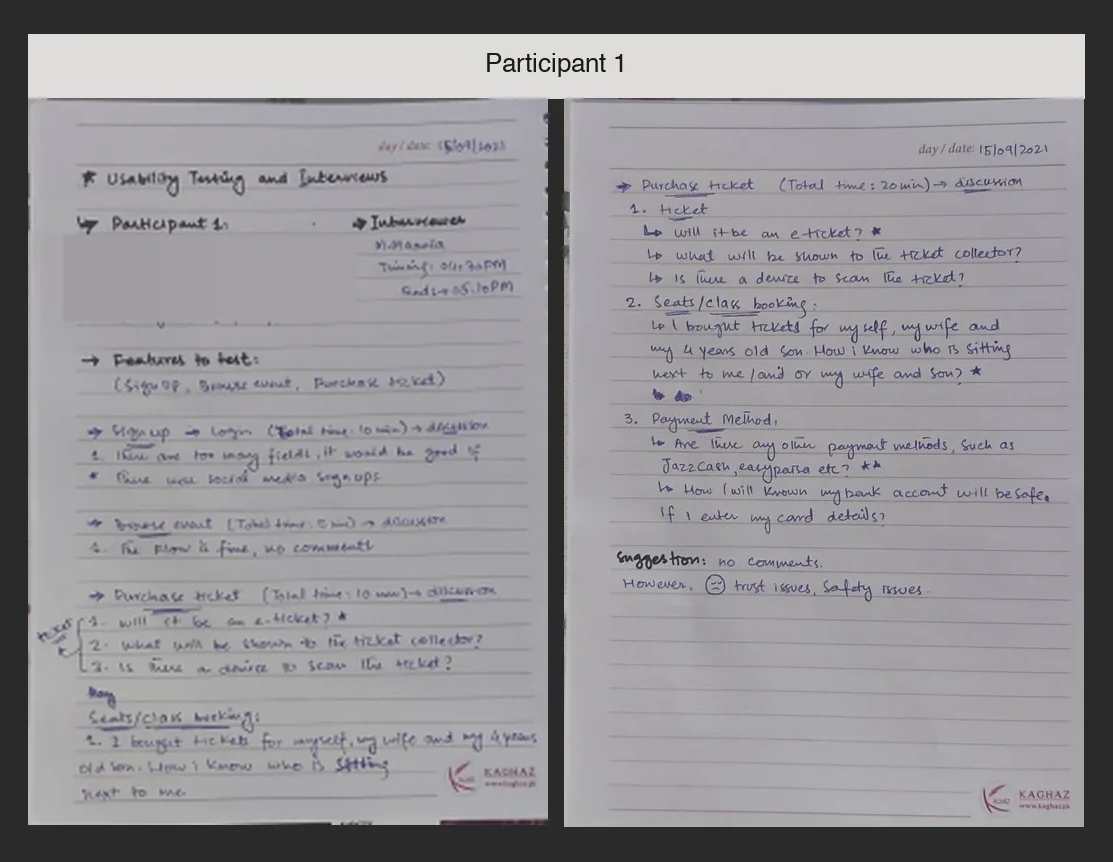
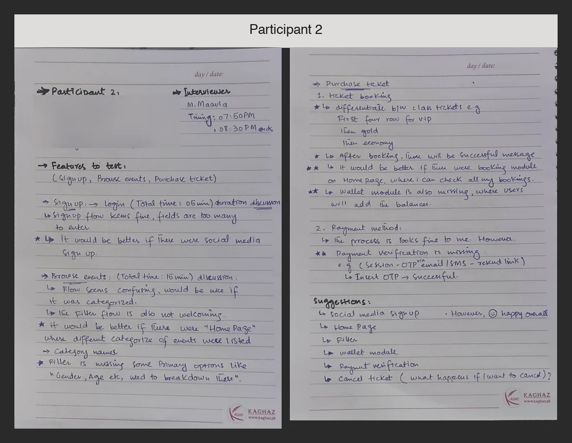
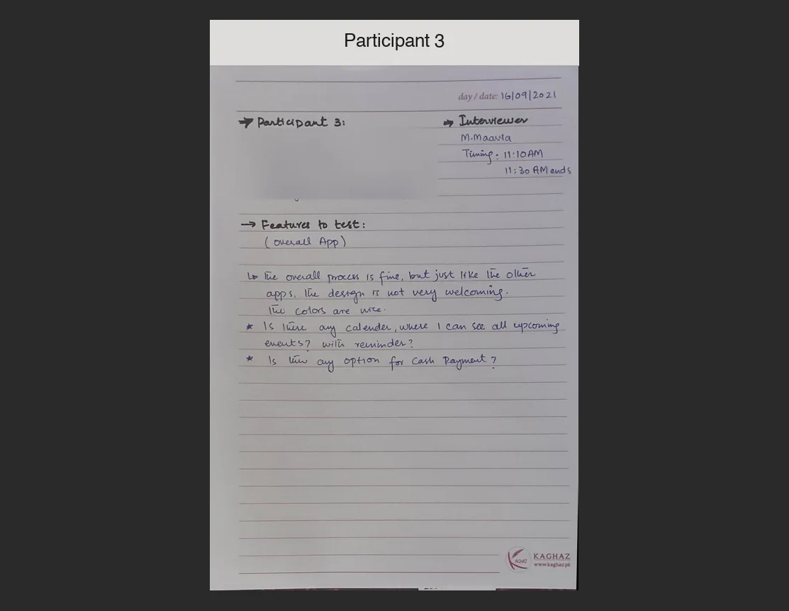
“There are too many fields; it would be good if there were social sign-ups.”
“It would be better if there was a home page where different categories of events were listed.”
“How will I know my bank account is safe if I enter my card details?”
Field notes from each session; personal details are blurred. Participants anonymized as P1–P3. The test measured the existing app, before the redesign. Quotes are edited from the session notes.
Three themes came up across the sessions.
Participants were uncomfortable entering personal information, such as account numbers, into an app they had never heard of.
Several features were missing from the booking flow, making the experience hard to use.
Popular local methods like JazzCash and Easypaisa were missing, which participants found highly inconvenient.
After synthesizing the research, I created personas to keep users’ needs and frustrations in front of every design decision.
Student · MS Arts and Design · Islamabad
“I love attending music concerts and watching movies in cinemas with friends and family.”
Kinza spends most of her time with friends and attending different concerts.
Student · MBA · Islamabad
“I love to watch movies on the big screen in the theater with friends.”
Adeel spends most of his time with friends and loves to watch every new movie in cinemas.
I generated as many improvements as I could, then kept the ones that answered a finding from the sessions.

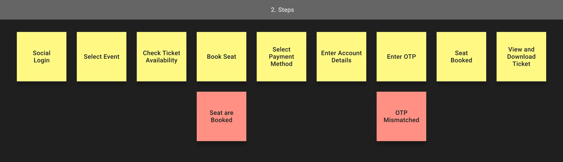
Before wireframing, I mapped the whole job of buying a ticket: the activity, the steps in order, and the details each step needs. Two steps can fail, so the failure cases were mapped too.
From social login to downloading the e-ticket.
“Seats are booked” and “OTP mismatched” got their own states.
Seat class and type, payment gateway, number and email, OTP.
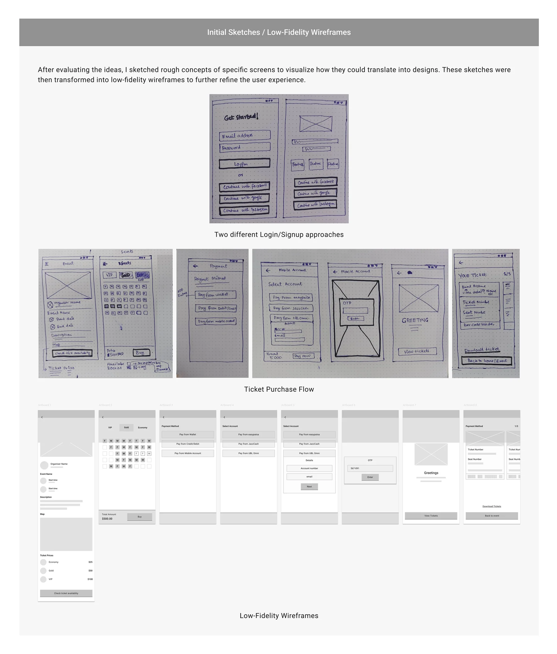
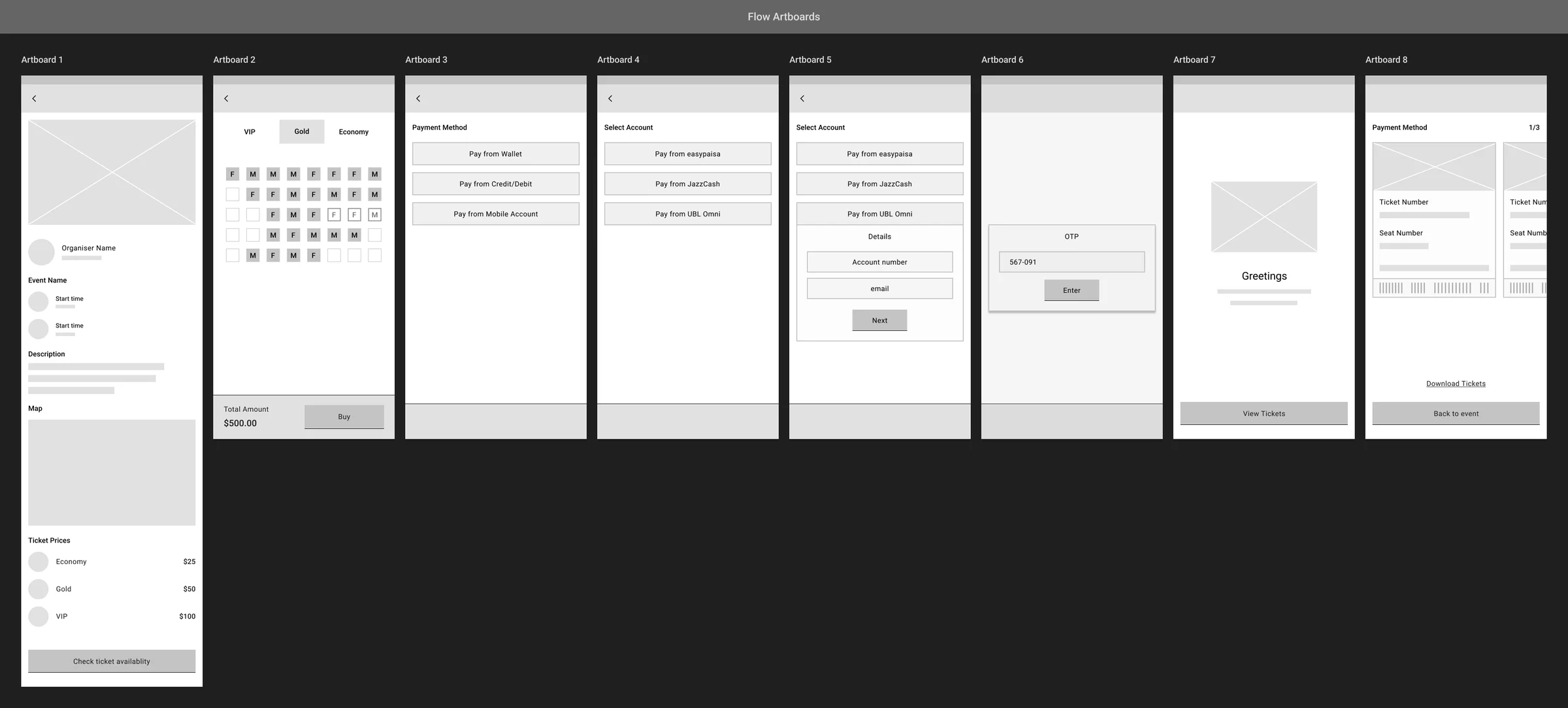
I sketched two login and sign-up approaches and the ticket purchase flow on paper, then turned the purchase flow into eight low-fidelity artboards.
My first high-fidelity pass put a solid magenta header on every screen. In the final version, screens turned white and magenta was kept for actions and selected states, so event photos and seat states stand out.

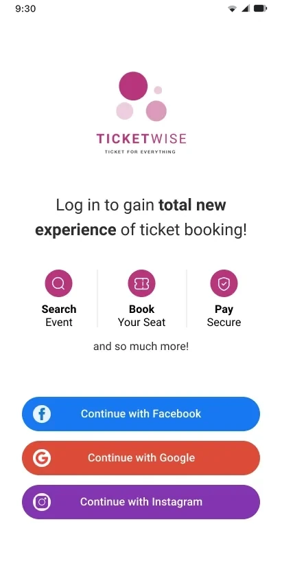
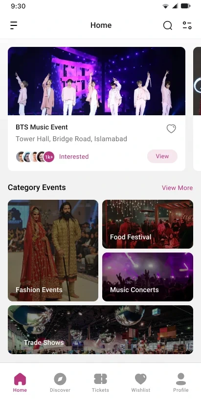
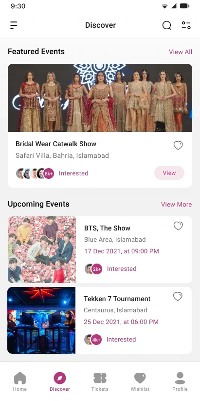
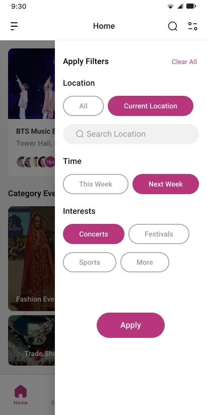
Sign-up was the first complaint in testing, so the redesign uses social sign-up only. Home opens on featured events and categories, with filters for location, time and interests.
Facebook, Google or Instagram, no form to fill.
Fashion, food, music and trade shows on the home screen.
Current location, this week or next, concerts or sports.
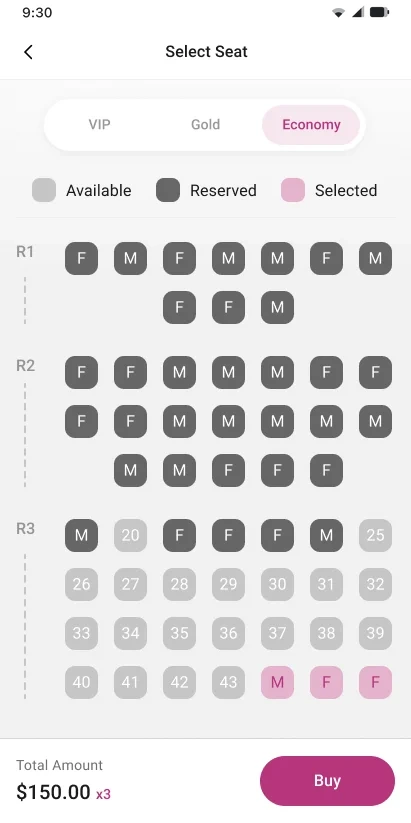
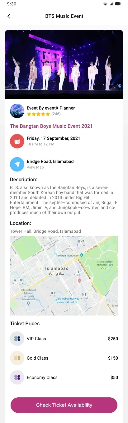
Each event page shows the organizer, time, place on a map and ticket prices. Seat selection uses tabs for VIP, Gold and Economy, with every seat marked available, reserved or selected.
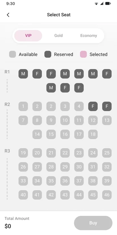
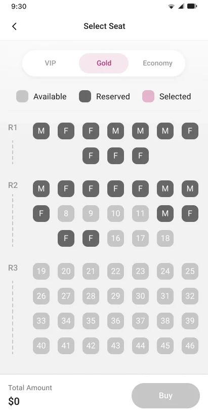
A participant asked for “tags on seats”, and another worried about who would sit next to their family. Seats are tagged M or F, so people can book next to someone they are comfortable with, and the total updates as each seat is picked.
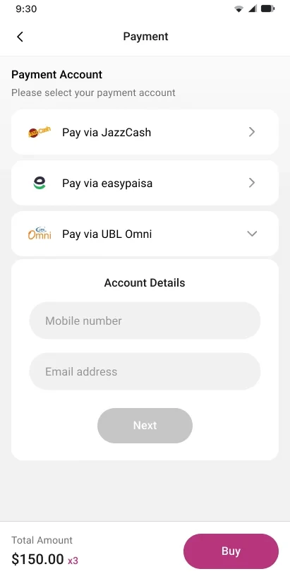
Two key findings were trust and missing payment methods. Checkout now offers JazzCash, Easypaisa and UBL Omni next to cards, and asks for an OTP before anything is charged.
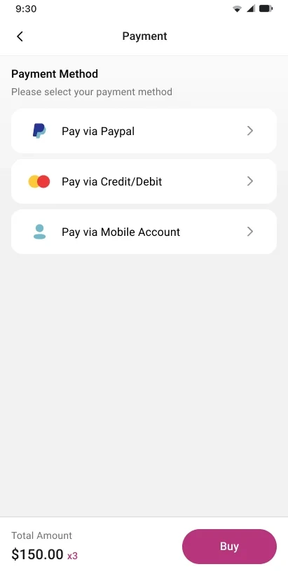
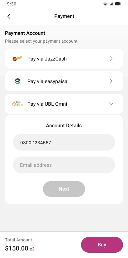
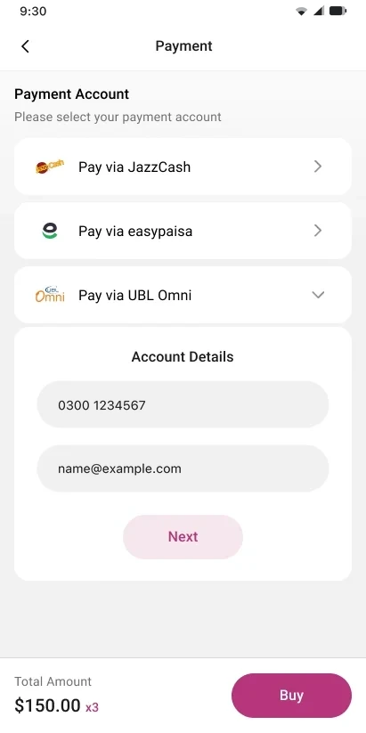
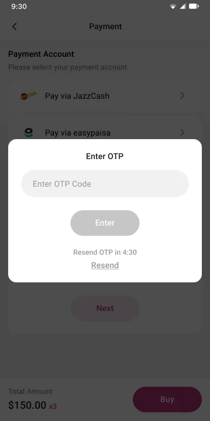
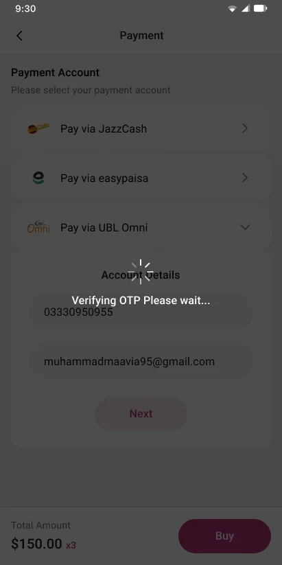
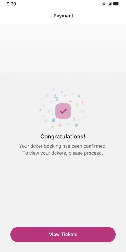
Participants didn’t trust an unknown app with their account details. Familiar wallets plus a visible OTP step and a “verifying” state show that nothing happens without their confirmation.
Kinza’s frustration was a lost paper ticket. Every booking becomes an e-ticket with seat numbers, date and a barcode, ready to download, next to a wishlist and a simple profile.
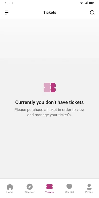
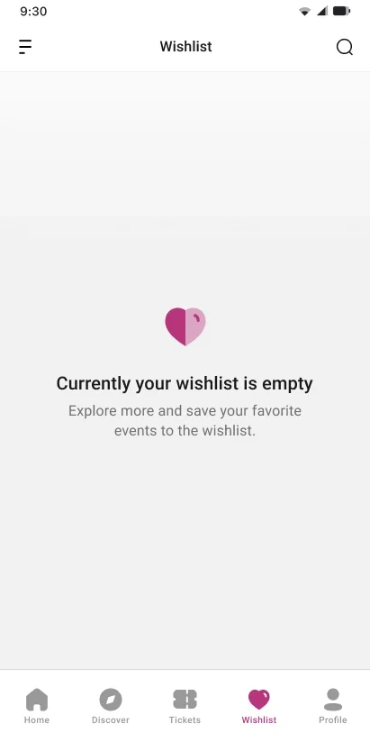

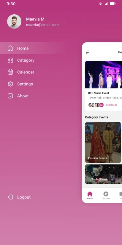
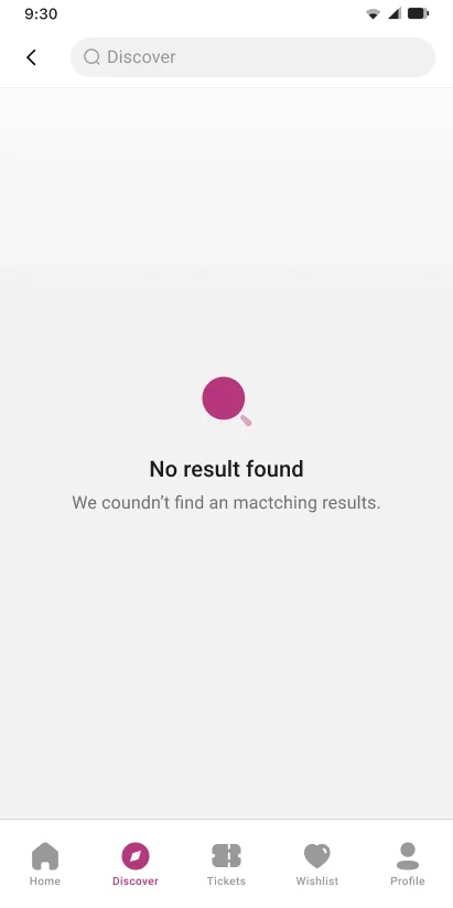
How each finding from the sessions shows up in the final design.
Social sign-up only, in one tap
Home with categories, filters and nearby events
Familiar wallets, OTP and a “verifying” state
JazzCash, Easypaisa and UBL Omni
Downloadable e-tickets with a barcode
M and F tags with clear seat states
A ten-step pink scale and a gray scale, Roboto with the Material type scale, and components for seats, cards, payments and tickets.
Roboto with the Material type scale, from a 96px headline down to a 10px overline.
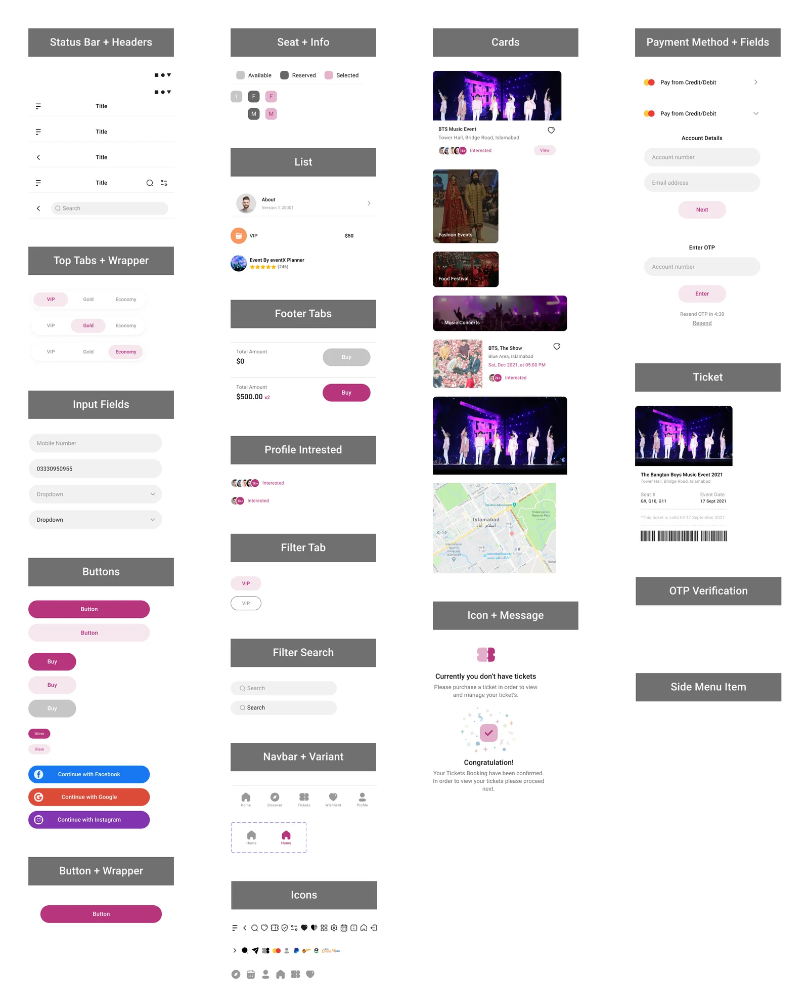
A five-day research and redesign sprint. The redesign was not usability-tested again within those five days, so the numbers below describe the research and the design, not results after launch.
usability sessions, 20 to 40 minutes each
15–16 Sep 2021could not finish a booking in the old app
Usability teststeps in the user story map, plus 2 failure states
Design filehigh-fidelity screens
Design fileSecurity worries showed up as hesitation in the flow, so the fix had to be in the flow too.
Familiar wallets were the clearest ask in testing.
Repeat the same four tasks with new participants and compare completion and time.
See the original case study on Behance.
Screens show demo events. Participants are anonymized. A self-initiated case study. Research and design by Muhammad Maavia, September 2021.
A quick human check keeps likes honest. One like per visitor.