Hysab Kytab
Personal finance, in your own language.
A personal finance app from Pakistan for tracking expenses, budgets and saving goals in English, Roman Urdu or Urdu. Working with a co-designer who led the research, I designed the UI and UX across 175 screens. It is live on the App Store and Google Play.
All your money in one place, in your own language.
Make tracking money feel easy for people who have never used a finance app, without holding back people who want budgets, goals and reports.
want to log a cash expense without learning finance.
want budgets, saving goals and real insights.
need to track money lent, events and foreign spend in one place.
Most adults in Pakistan have no bank account.
In 2021, only about one adult in five had an account. Many people earn and spend in cash, keep track in their heads, and have never opened a finance app. To work here, an app had to start with cash, speak a language people read every day, and grow into budgets later.
of adults in Pakistan had an account, against 76% worldwide
World Bank Global Findex, 2021gap between men and women owning an account
World Bank Global Findex, 2021understand Urdu, though only about 9% speak it at home
Census 2023, via ISSRAWhat that meant for the design
Cash is an account
A cash wallet sits next to bank accounts from day one.
Read it your way
English, Roman Urdu or Urdu, chosen before anything else.
Two speeds
A simple start for first-timers, depth for people who want it.
Sources: World Bank Global Findex 2021; ISSRA, Pakistan’s linguistic landscape.
Two designers, one clear split.
Built in my final months at IDEATE Innovation, 2021. My co-designer led the research; I turned the findings into flows, every screen and state, and the design system behind them.
Brief
Audience, problem and scope, with the team.
TeamResearch
Insights and direction.
Co-designerStructure
Sitemap: four tabs, a plus button, a side menu.
MeFlows
15 flows, every empty, error and success state.
MeHigh fidelity
Iterated up to V.5: 175 screens.
MeSystem & handoff
264 components, icons and color styles.
MeHow every flow was built
The research belongs to my co-designer, so it isn’t shown here. This case study covers the UI/UX work I owned.
Three people, three ways to handle money.
My co-designer ran the research. To show who each decision was for, I reconstructed three proto-personas from the problem and from the features we shipped.
Ayesha, 22, student
Paid in cash, texts in Roman Urdu
Shipped asBasic dashboard · Quick Add · Roman Urdu
Bilal, 34, professional
Salary in one bank, card in another
Shipped asExpert dashboard · Budgets · Insights
Nasreen, 45, runs the home
Lends to family, plans a wedding
Shipped asEvents · Person accounts · Urdu
Proto-personas are reconstructed for this case study, not taken from interviews. The original research belongs to my co-designer.
Four goals, one rule behind each.
Every decision in the chapters that follow maps back to one of these.
Speak the user’s language
RuleLanguage comes before sign-in
Start simple, grow with you
RuleBasic or Expert, switch any time
Log it in seconds
RuleAmount first, details optional
Never a dead end
RuleEvery empty state has a next step
Four tabs and a plus, everything else one level down.
I organized the 15 flows around what people do every day, and put every kind of “add” behind one button. Tools people use less often live in the side menu.
- DashboardAccounts · Expenses · Transactions · Budgets · Reminders
- InsightsIncome vs expense · category breakdowns
- + AddExpense · Income · Transfer · Person
- AccountsBank · Cash · Person
- ChatbotAdd a transaction by conversation
- History
- Budget
- Savings
- Events
- Category
- Reminder
- Travel Mode
- Settings
- About · Help
- Expert Mode · Edit Dashboard
Daily things, one tap
Dashboard, insights, accounts and chat in the bottom bar.
One door for “add”
Expense, income, transfer and person all start at +.
Rare things, tucked away
Travel Mode, categories and reminders in the side menu.
A first month, from cash to control.
How a new user moves through the app, and which part of the product carries each step.
Set up
Language, sign-in, dashboard
OnboardingFirst entry
A cash expense in seconds
Add transactionOrganize
Banks, cash and people
AccountsPlan
A grocery budget, a saving goal
Budgets & goalsCourse-correct
An 80% warning, a category breakdown
Budgets · InsightsAn illustrative journey, used to check that every step has a screen and a way forward.
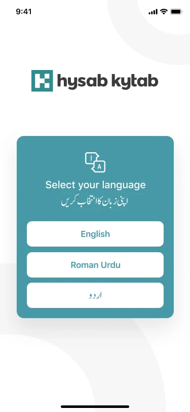
Language first, then the right dashboard.
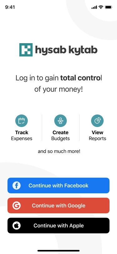
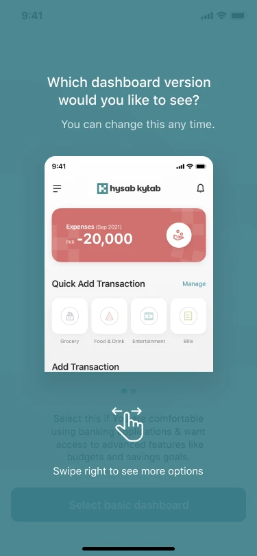
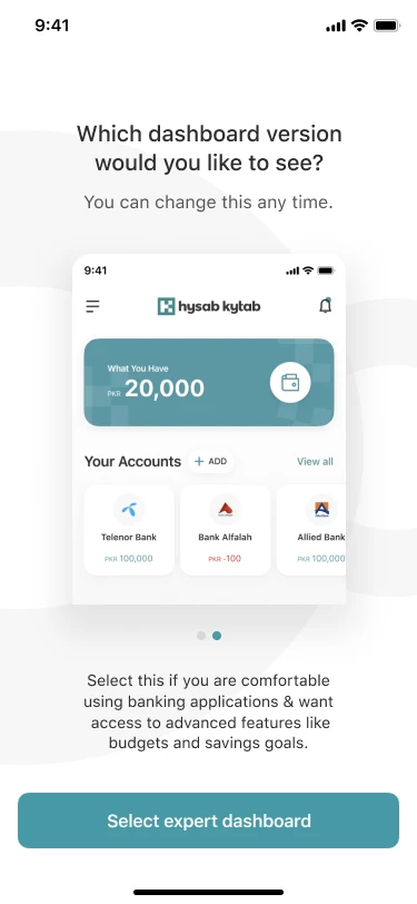
The very first screen asks for a language: English, Roman Urdu or Urdu. Then users pick the dashboard that fits how comfortable they are with money apps.
Three languages, one tap
English, Roman Urdu, and Urdu in Nastaleeq script.
Social sign-in only
Facebook, Google or Apple: no new password to remember.
Pick your depth
Basic for first-timers, Expert for budgets and goals. Changeable later.
Flow · intro to first expense
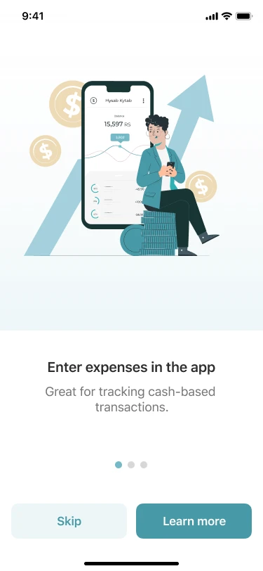
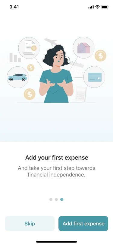
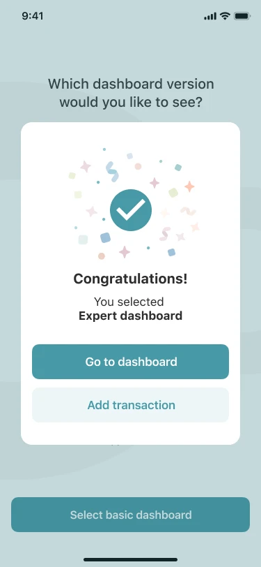
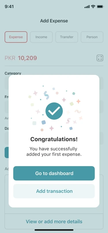
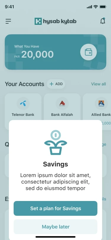
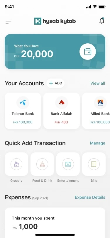
Two dashboards, one app.
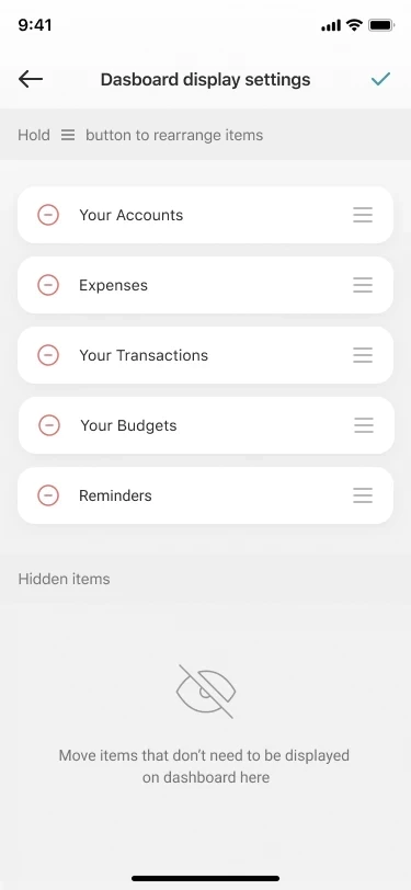
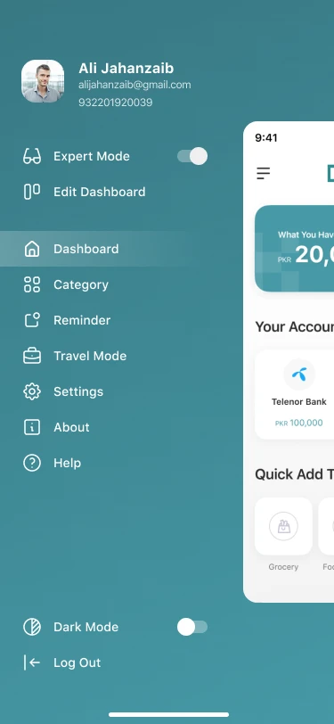
Basic leads with this month’s spending and quick-add shortcuts. Expert adds balances, accounts, budgets and reminders. Both can be rearranged.
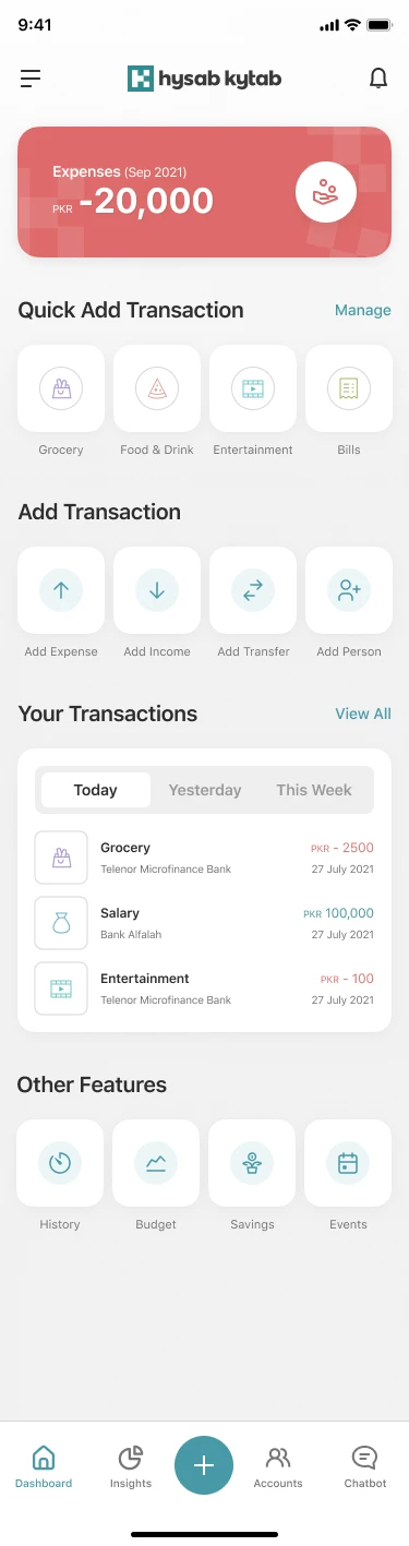

Spending first
Basic opens on one number: what you spent this month.
Quick Add
Grocery, food, bills: one tap starts a pre-filled entry.
Your layout
Hold and drag to reorder; hide what you don’t need.
Two dashboards, not one in-between
One dashboard would either overwhelm first-timers or hide budgets from experienced users. Letting people choose during onboarding, and switch any time from the menu, meant neither group had to compromise.
Amount first, everything else optional.
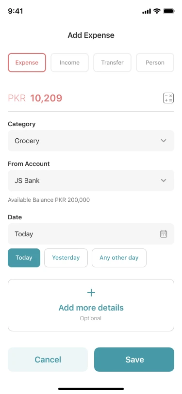
One sheet handles four kinds of money movement. Users type the amount, pick a category and account, and save. Labels, location, receipts and repeats wait behind “Add more details”.
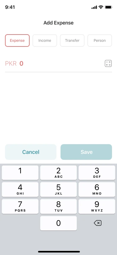
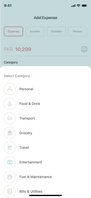
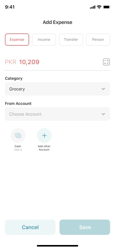
Four types, one sheet
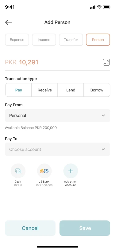
Expense, Income, Transfer and Person share one layout.
Smart defaults
Today, Yesterday or any other day, as chips.
Depth on demand
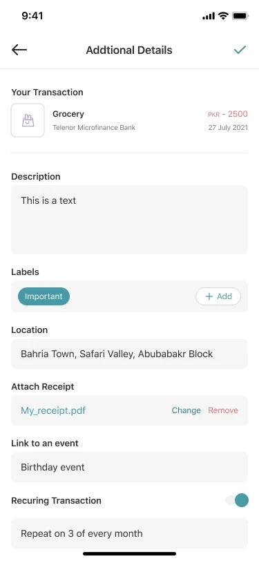
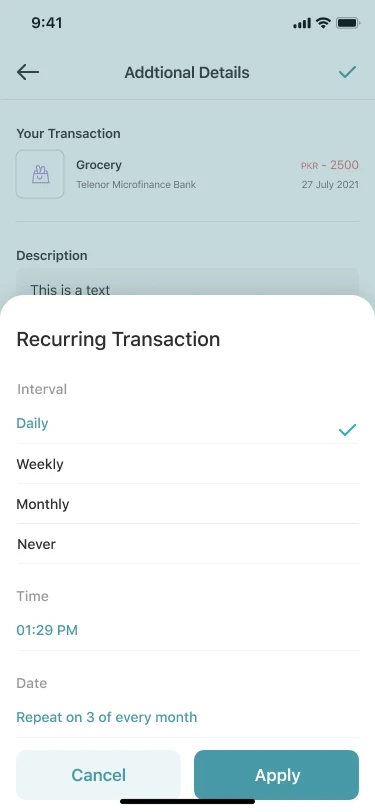
Labels, location, receipt, event and repeat are optional.
Task flow · from + to saved
The keypad opens first
The amount is the one thing people always know, so the form opens on a big keypad. Category and account follow as large tap targets, and everything else waits behind “Add more details”.
Flow · details, repeats and people
Chatbot
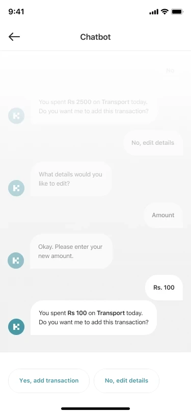
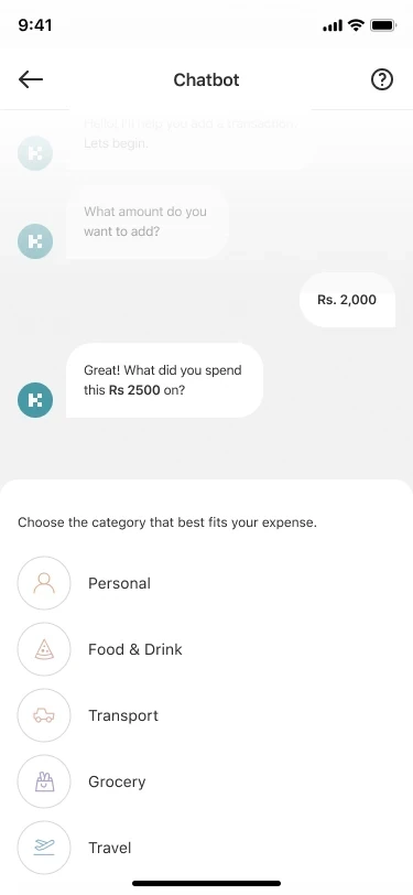
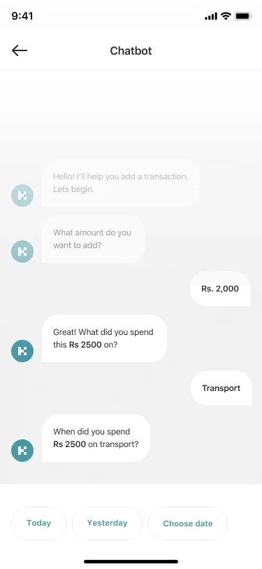
Or just talk it through. For people who find forms intimidating, the chatbot asks one question at a time: how much, on what, and when. It then confirms the transaction in a single sentence.
One question at a time
Amount, category, date: never a full form.
Answers as chips
Categories and dates are tappable replies.
Confirm in plain words
“You spent PKR 100 on Transport today.”
Where the money went, month by month.
Insights compare income and expense for each month, then break spending down by category. Every bar and slice opens the transactions behind it.
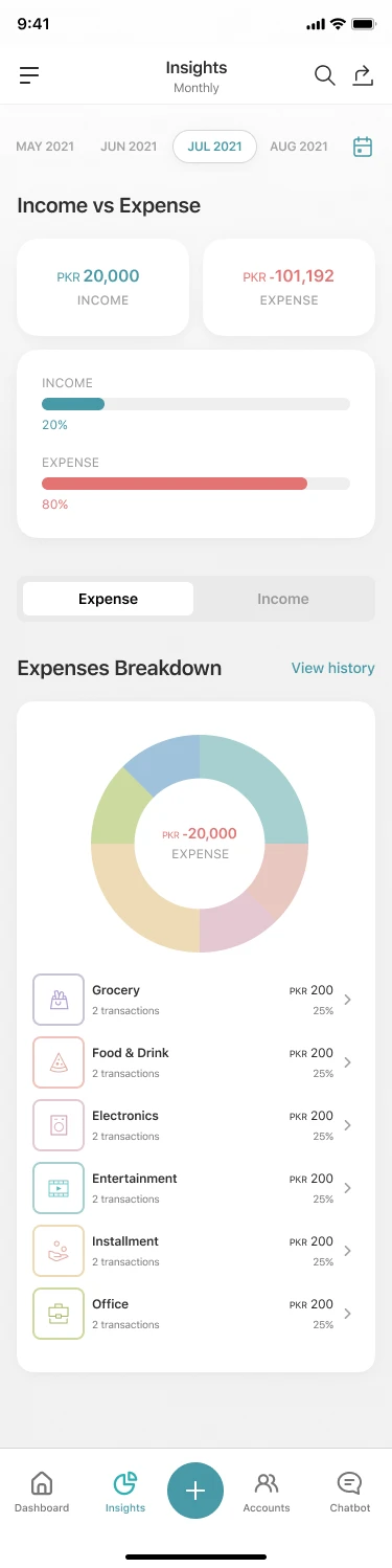
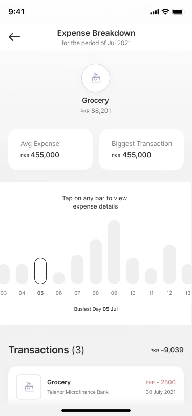
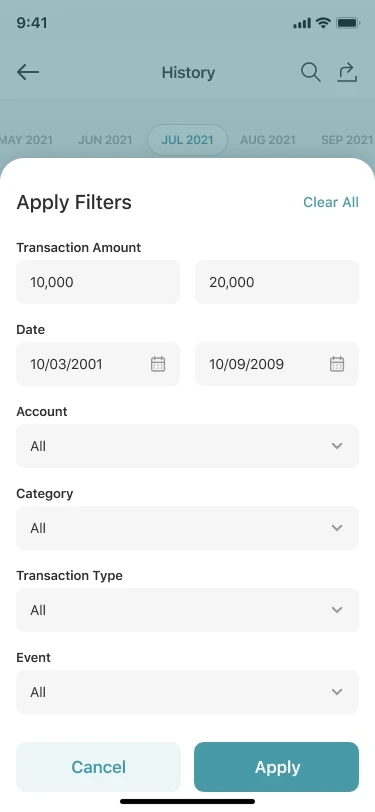
Month tabs everywhere
The same month scroller in insights, history and budgets.
Tap to drill down
Busiest day, average and biggest transaction per category.
Find anything
Filter by amount, date, account, category, type or event.
A warning before it’s too late.
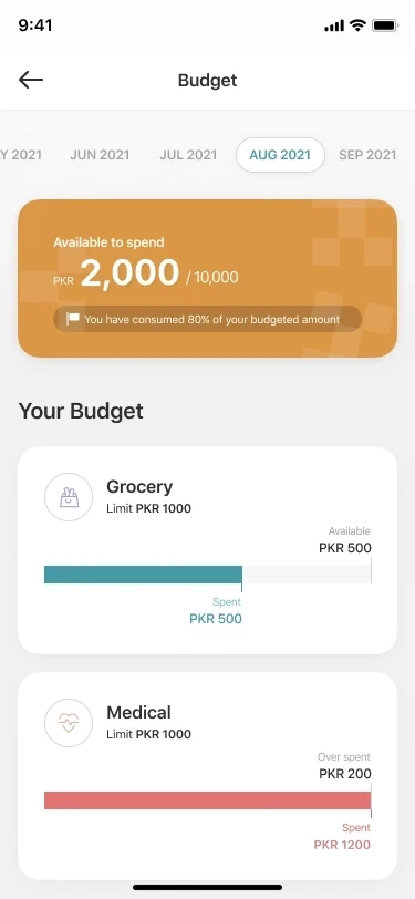
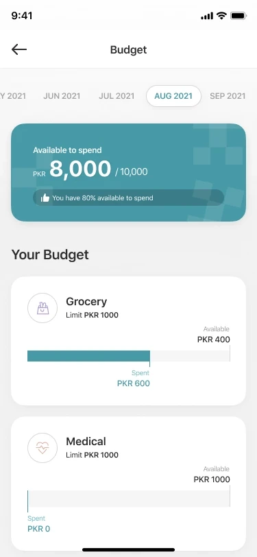
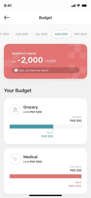
Budget cards change color as spending grows, and the message changes with them, from “80% available” to “Oops, you have over spent!”. Saving goals use the same pattern in reverse.
Budgets
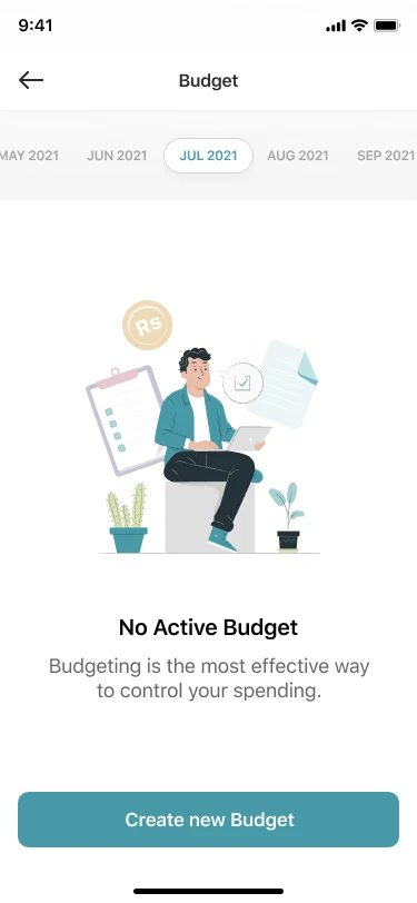
Color carries the state
Teal, amber and red, each with its own message.
Monthly or ongoing
Set a budget for one month or keep it running.
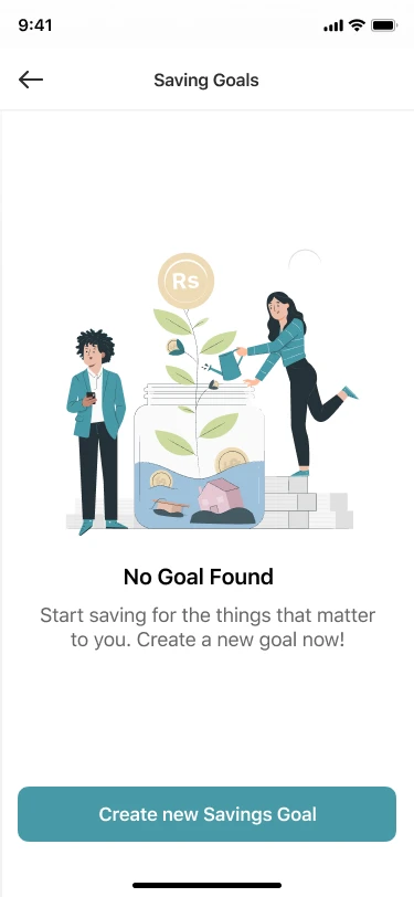
Goals celebrate
Progress per goal, then an “Achieved” shelf.
Saving goals
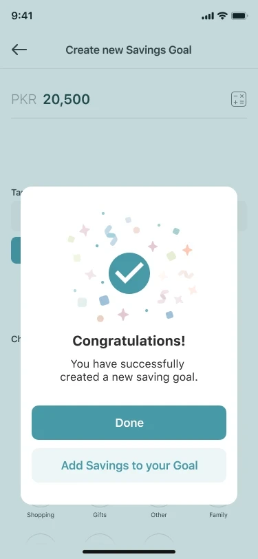
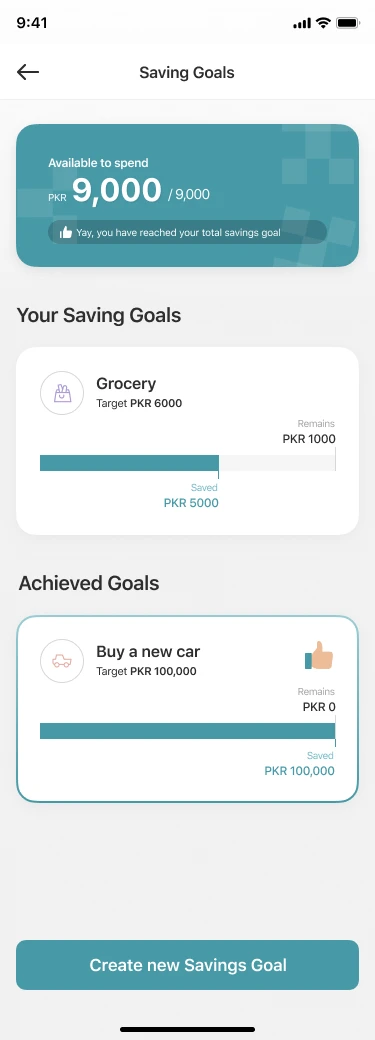
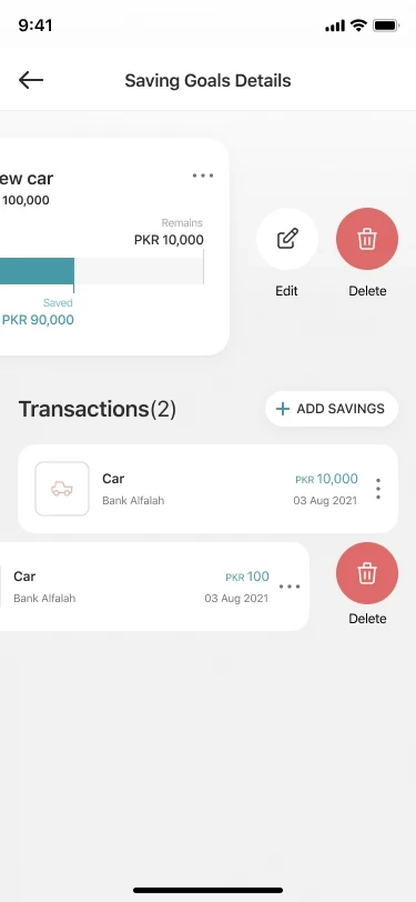
Trips, events and bills, all in context.
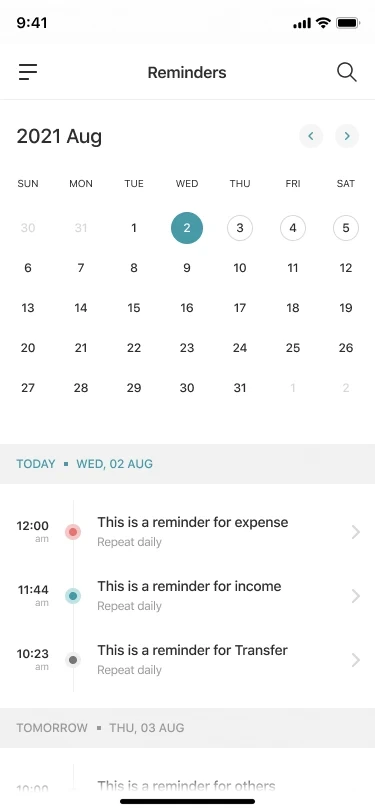
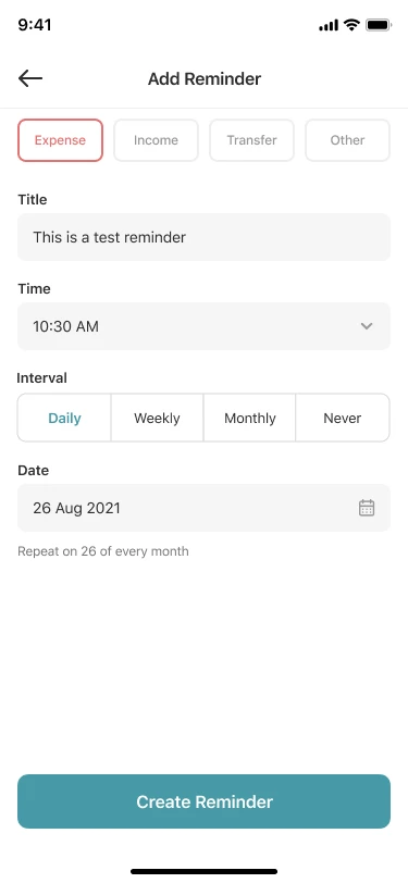
Real spending doesn’t follow the calendar month. Travel Mode converts foreign spending at a set rate, Events group a wedding or a birthday, and Reminders keep bills on time.
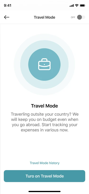
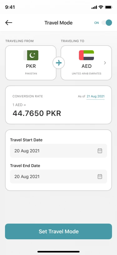
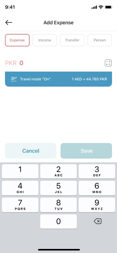
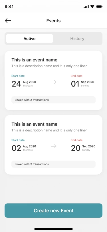
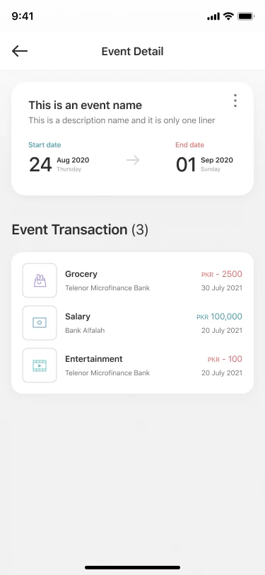
Travel Mode
PKR to AED with the rate and date shown on every entry.
Events
Link transactions to an occasion and see its total cost.
Reminders
Expense, income or transfer reminders, daily to monthly.
Accounts
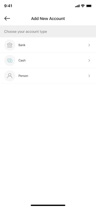
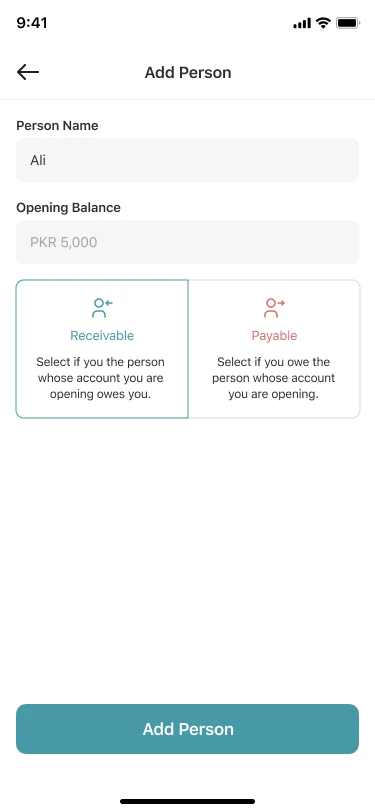
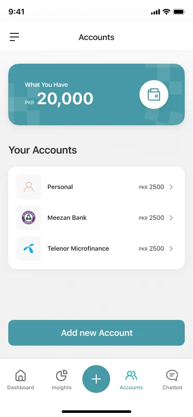
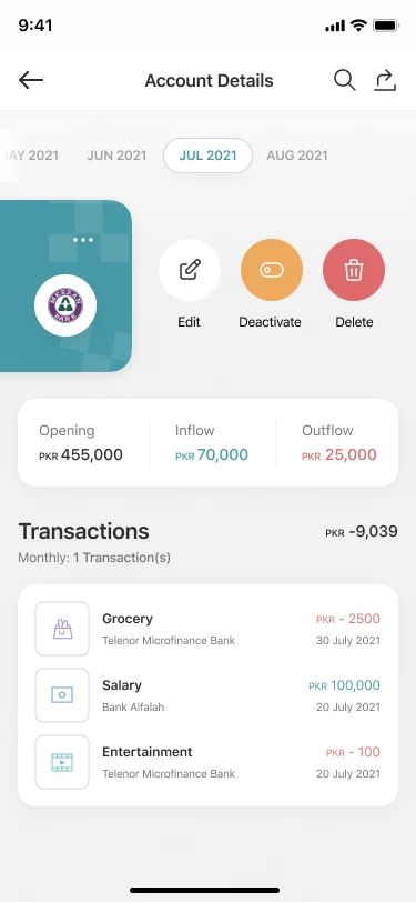
Banks, cash and people, side by side. Users add bank accounts, cash wallets and people they lend to or borrow from. Each account shows its opening balance, inflow and outflow.
Three account types
Bank, cash and person, each with its own form.
Who owes whom
Receivable or payable, explained in one line each.
Pakistani banks built in
Meezan, Alfalah, Allied, Telenor Microfinance and more.
From an early kit to V.5, and still live today.
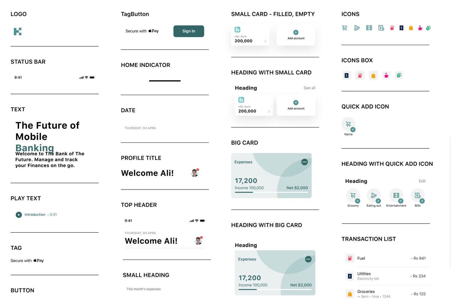
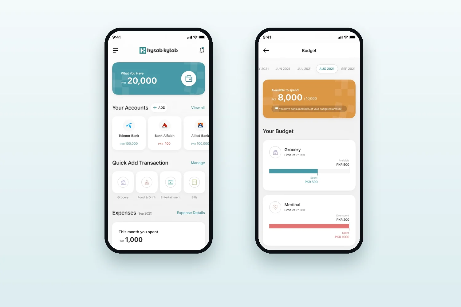
The system went through several rounds. An early component board used a darker teal and heavier cards; by V.5 the palette was lighter, the numbers bigger and the cards flatter. The live app keeps the same structure today.
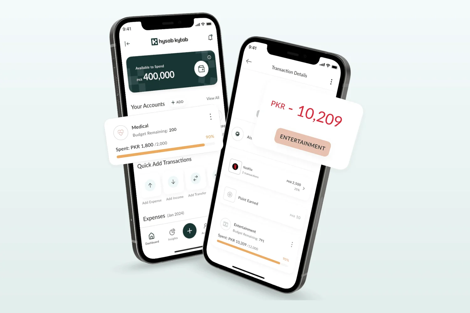
Lighter, so numbers lead
The heavy cards gave way to one strong balance card.
Greeting out, money in
The dashboard opens on “What you have”, not “Welcome”.
Structure that lasted
Years later, the live app still uses the same layout.
Early board and V.5 from the design file; live app from hysabkytab.com.
A calm teal system, built for long lists of numbers.
A teal-led palette with soft category colors, one type family, and 264 components behind all 175 screens.
Empty & success states
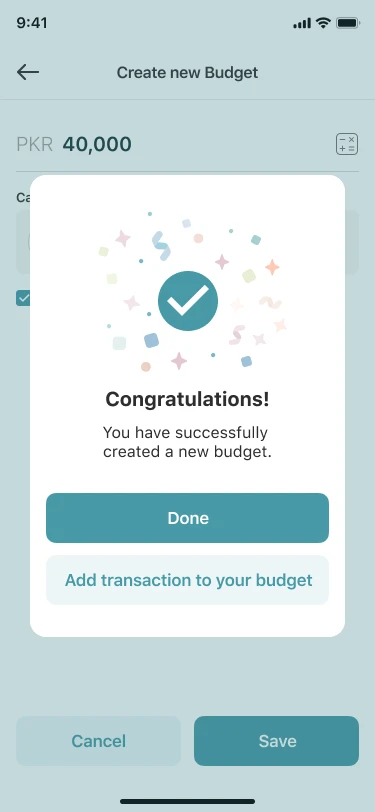
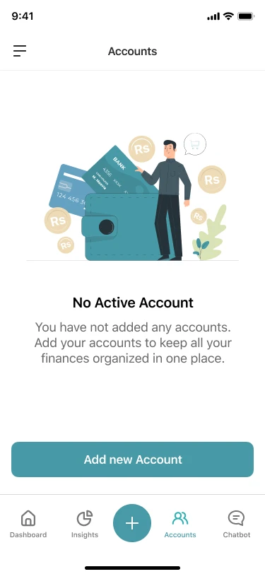
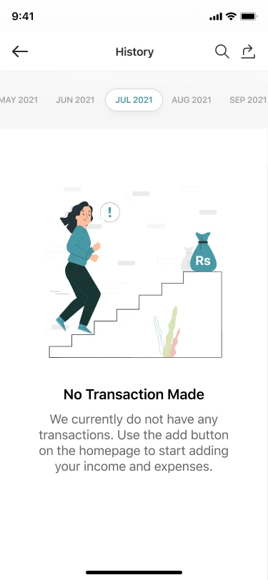
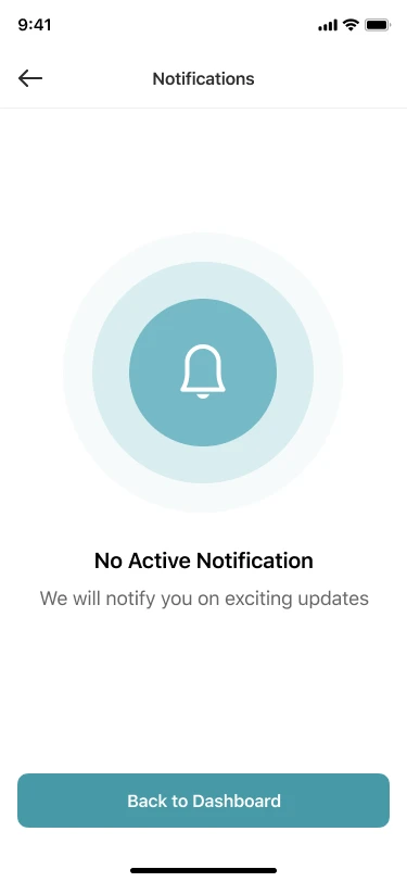
No dead ends, and a thank-you for every save. Every empty screen has an illustration, one line of why it matters and one button to start. Every save confirms what happened and offers the logical next step.
Empty states
Success states
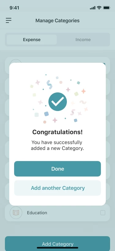
State inventory · 175 screens across 15 flows
Counted from the High Fidelity V.5 page of the design file.
Design system
SF Pro Text for every Latin-script screen, from 32px balances down to 9px chart labels. Urdu is set in Jameel Noori Nastaleeq.
- 20,000Balance · Semibold 32
- Your AccountsSection · Semibold 20
- GroceryList title · Medium 14
- Telenor Microfinance BankMetadata · Regular 12
- اردوUrdu · Nastaleeq
Eight soft category colors keep icons easy to tell apart without competing with the teal brand.
Live, used, and designed end to end.
Every number has a source. Usage figures are published by Google Play and the company, not design-only.
Live today
Live on iOS and Android, and still recognizably built on this structure. Hysab Kytab is live on the App Store and Google Play, and its website now offers the same money tools to banks. The product has grown since 2021, but the balance card, accounts row, Quick Add, budget bars and transaction cards all carry on from this work.
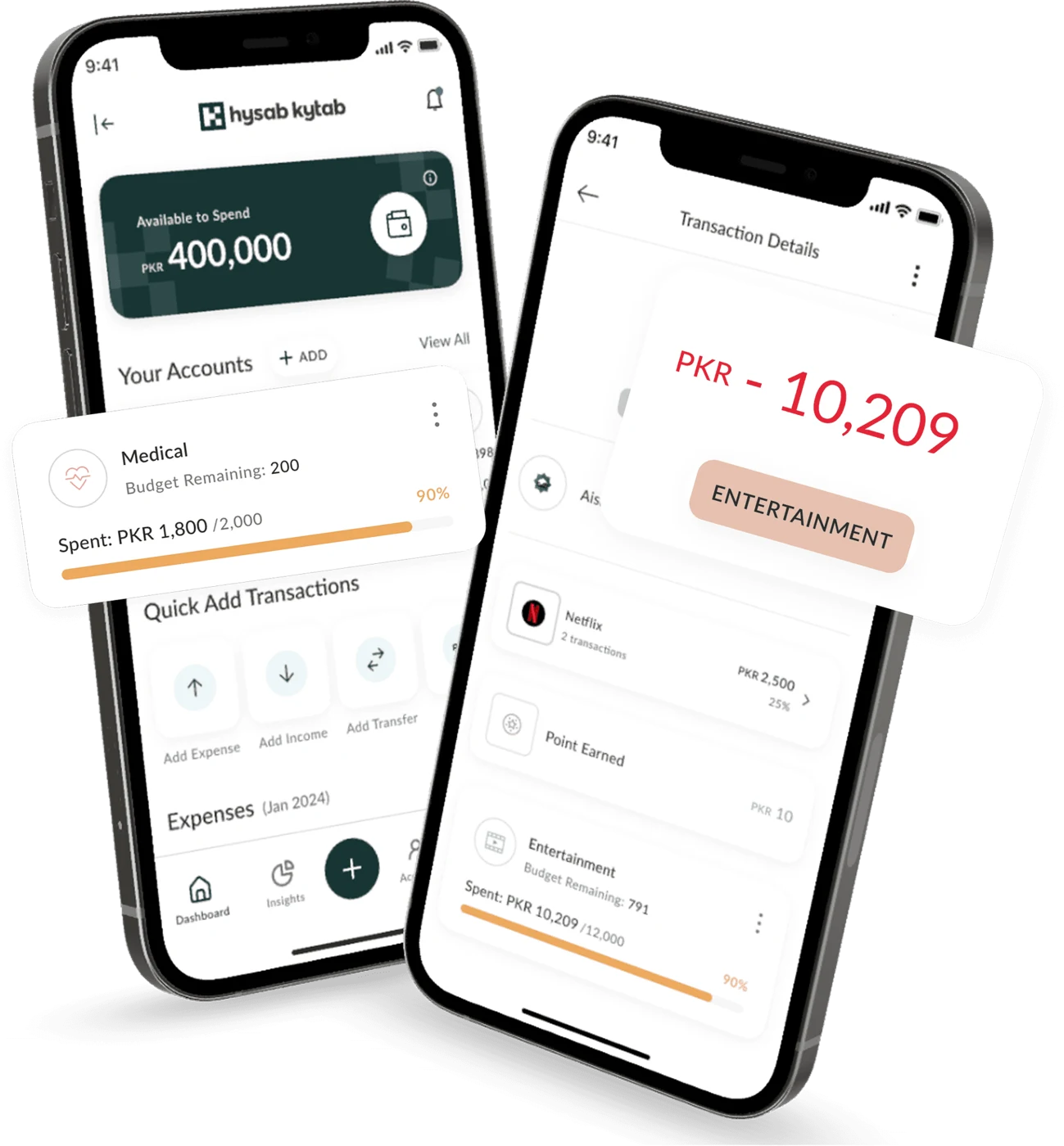
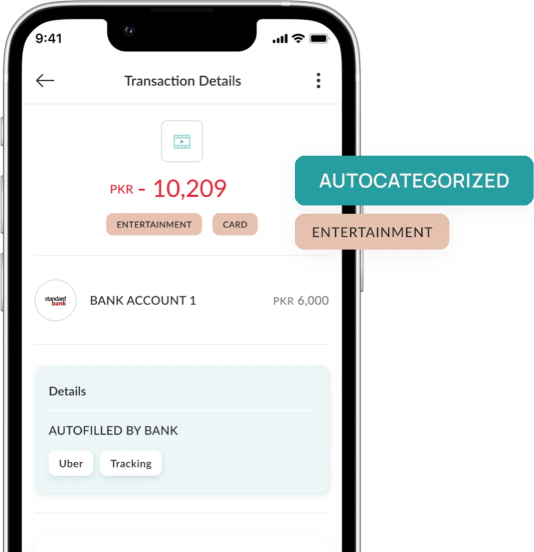
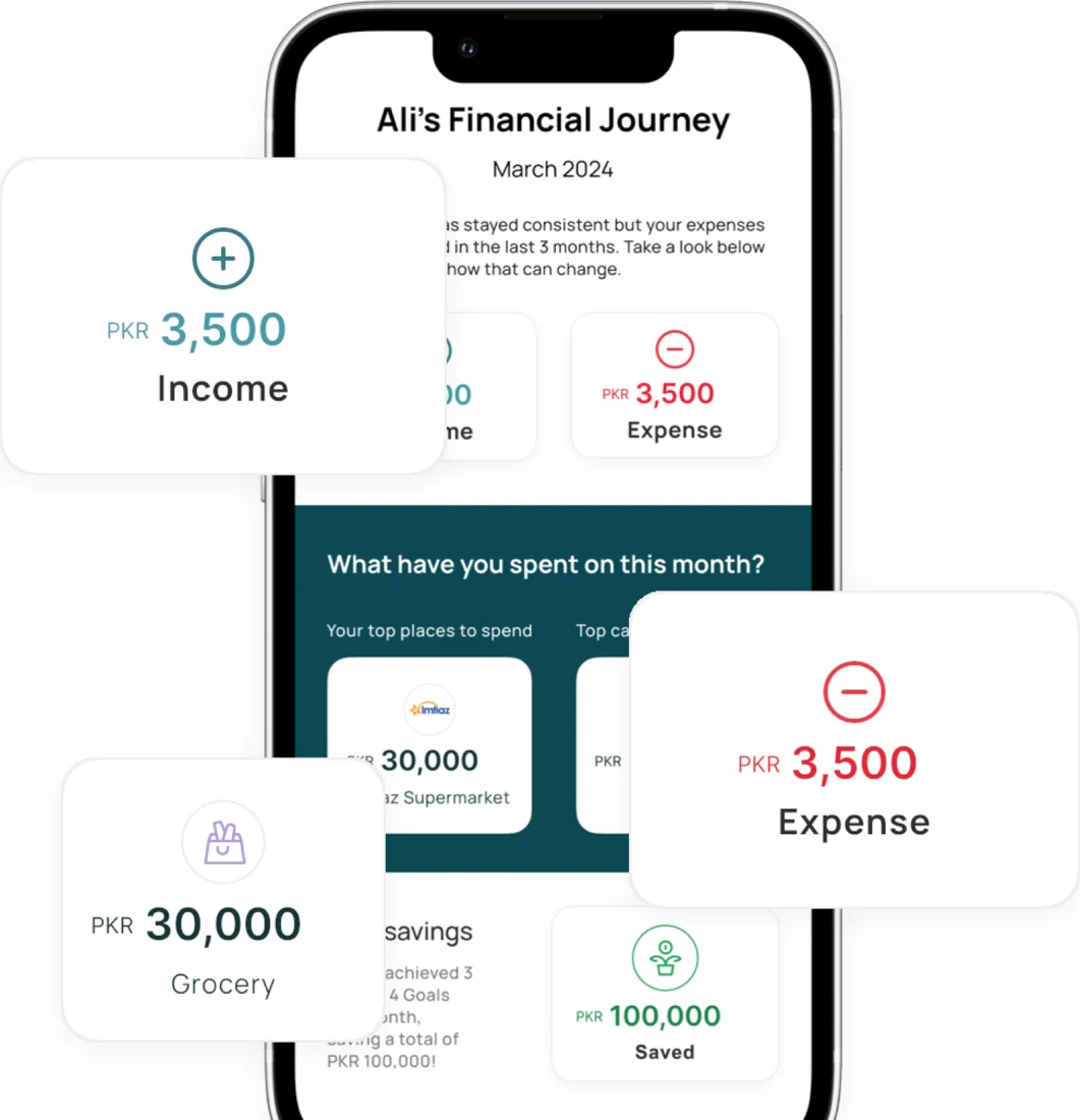
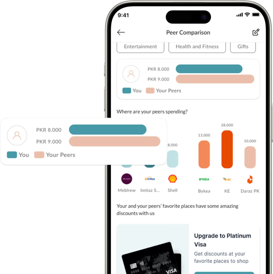
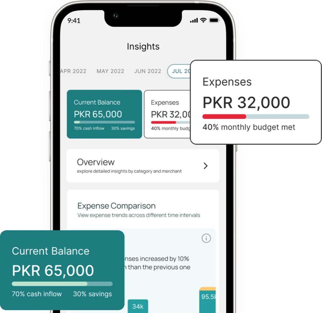
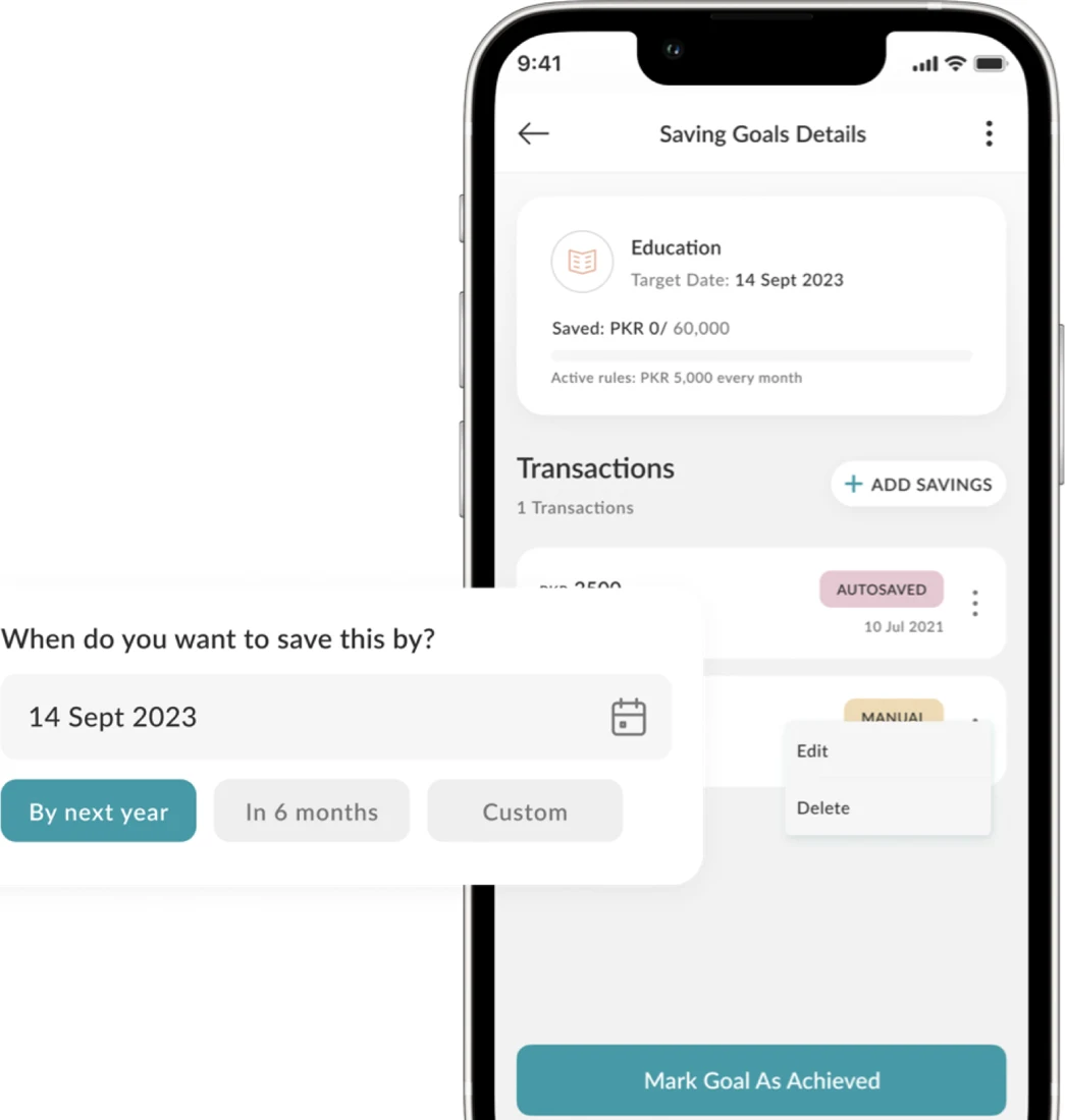
Product visuals from hysabkytab.com, Oct 2026. The live product has been extended by the Hysab Kytab team since 2021.
Outcome
Google Play downloads
Google Play · Oct 2026transactions tracked
Company-reported · hysabkytab.comscreens and states, dev-ready
High Fidelity V.5 · 2021languages: English, Roman Urdu, Urdu
Design fileChoice beats compromise
Two dashboards let each audience start where they feel comfortable.
Empty states are onboarding
The first time a user sees a feature, it is usually empty.
Test the chatbot early
Measure whether chat entry is faster than the form for first-timers.
Live on iOS & Android.
See Hysab Kytab in the stores, or visit the website.
Screens show demo data; names and balances are fictional. UI/UX by Muhammad Maavia at IDEATE Innovation, 2021; research led by a co-designer.
Leave a like
A quick human check keeps likes honest. One like per visitor.