Alkira
Crafting a unified identity.
Alkira’s previous brand kit was very limited. Version 2.0 of its brand guidelines is one clear system for the logo, color, type, icons, UI elements and patterns.
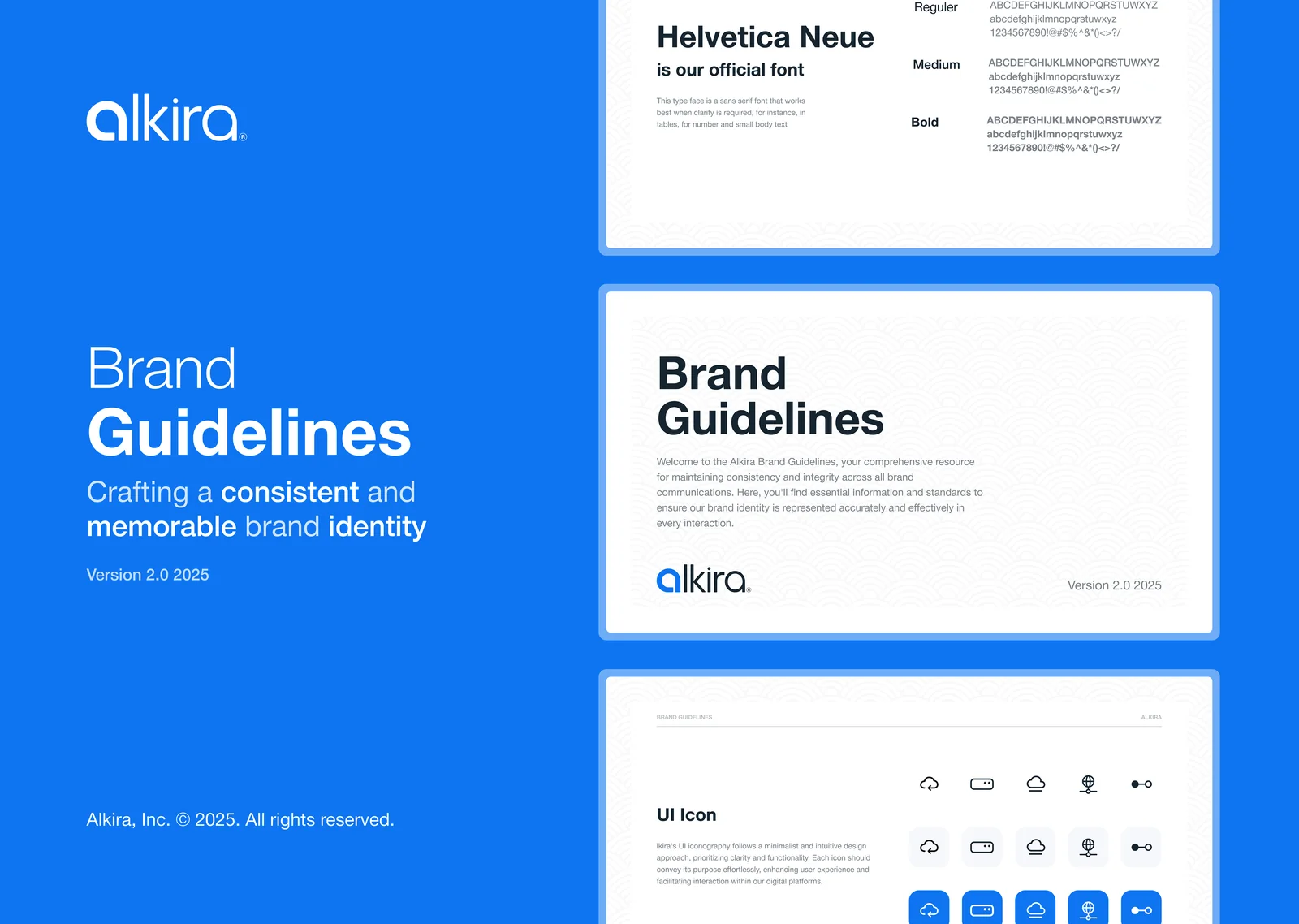
Network infrastructure on-demand for the era of cloud and AI.
The guidelines give every team one source of truth, so the brand looks and feels the same on the web, in the product and in marketing.
Xgrid’s main client, one designer.
Alkira is a networking company. I was the only designer on the account, so every piece of Alkira design went through me.
Social media
Posts and visuals for Alkira’s social channels. See the case study.
Website
Pages and updates for Alkira’s website.
Tools
Screens for the tools Alkira offers.
Brand guidelines
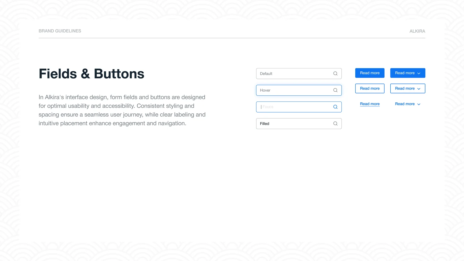
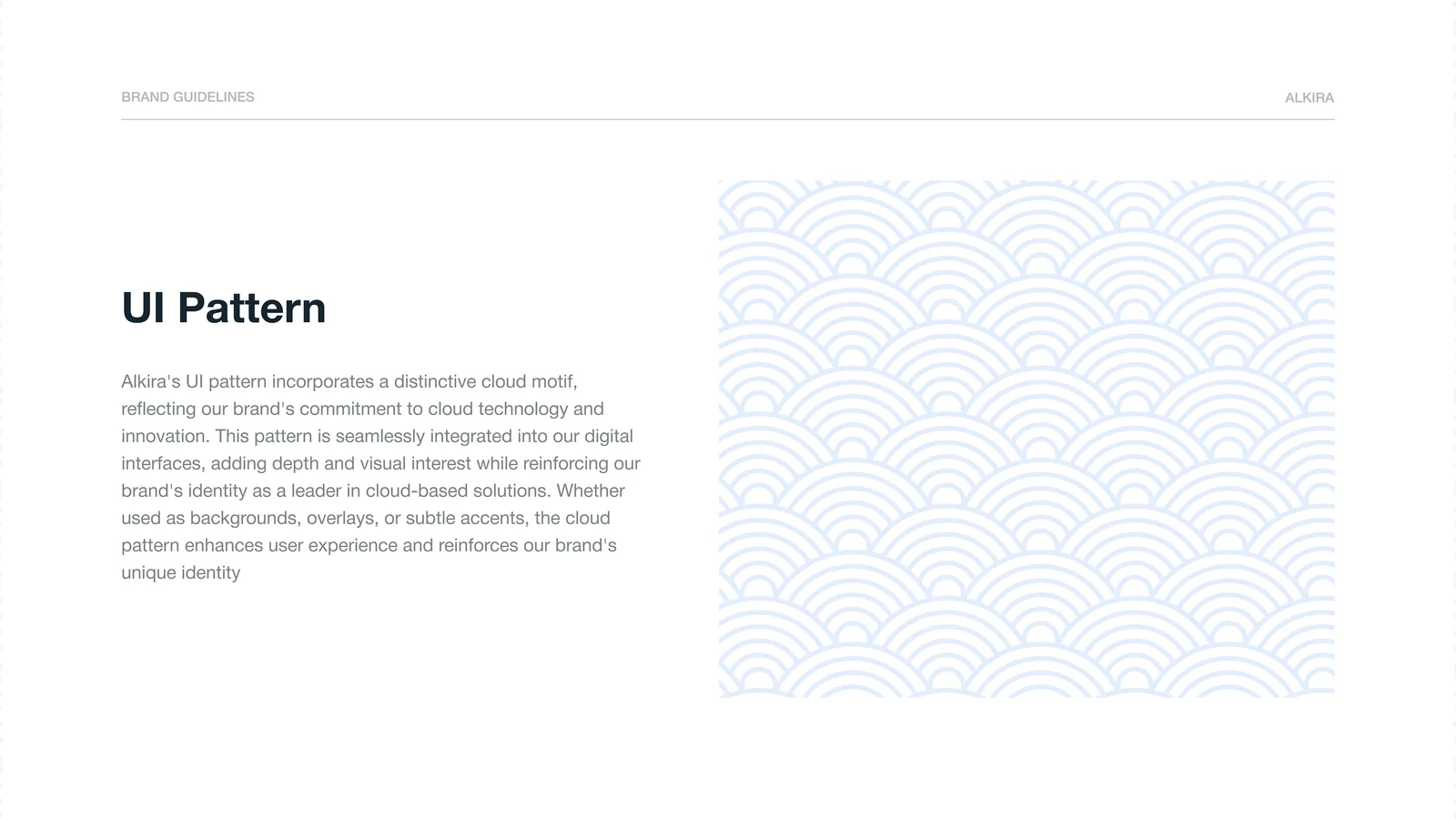
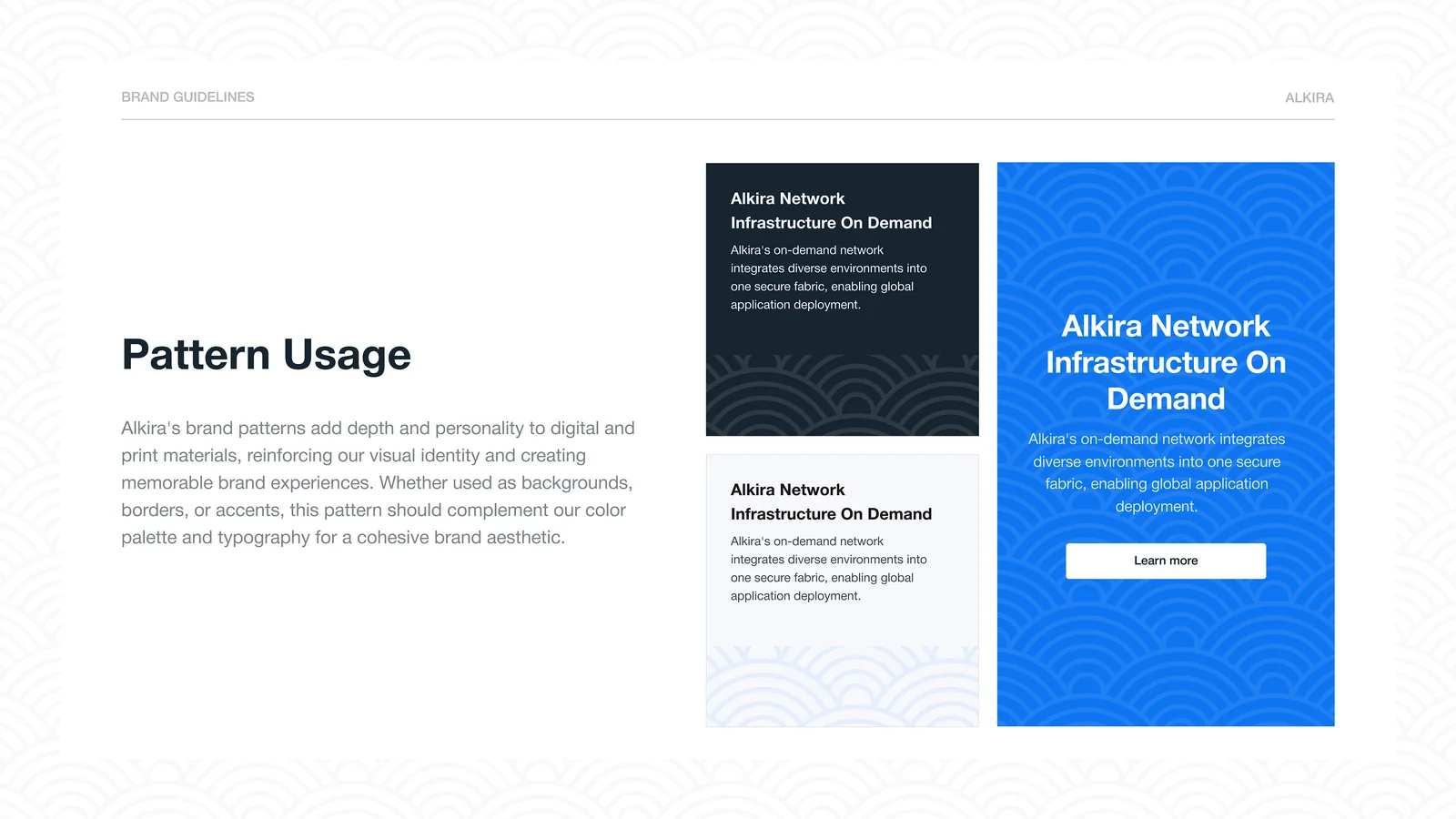
With work spread across social, web and tools, version 2.0 put it all on one system, so every piece looks like Alkira.
More from my time at Xgrid: Xgrid.co Revamp · Heuristic Evaluation · Project X
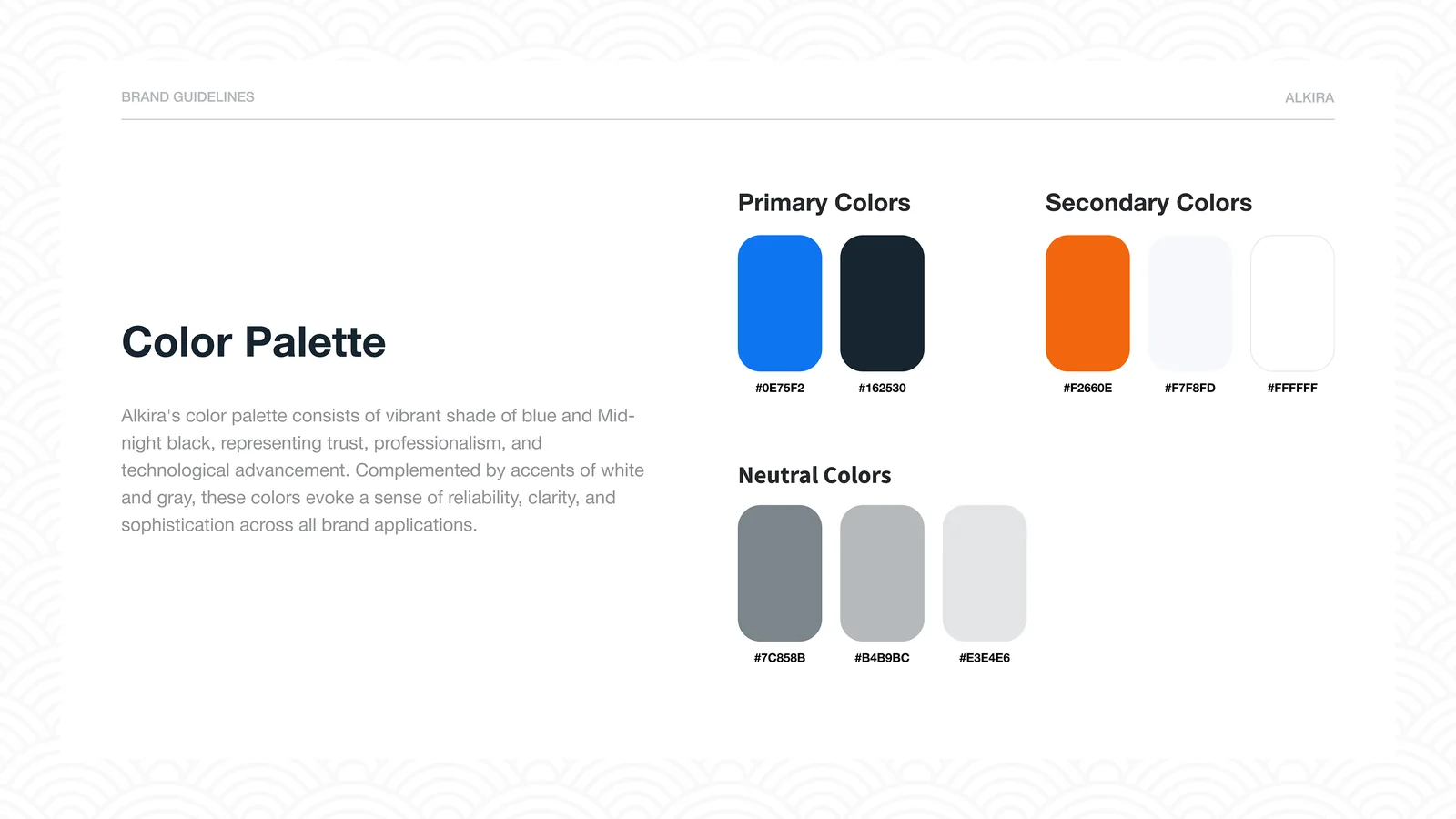
A confident blue, a warm accent.
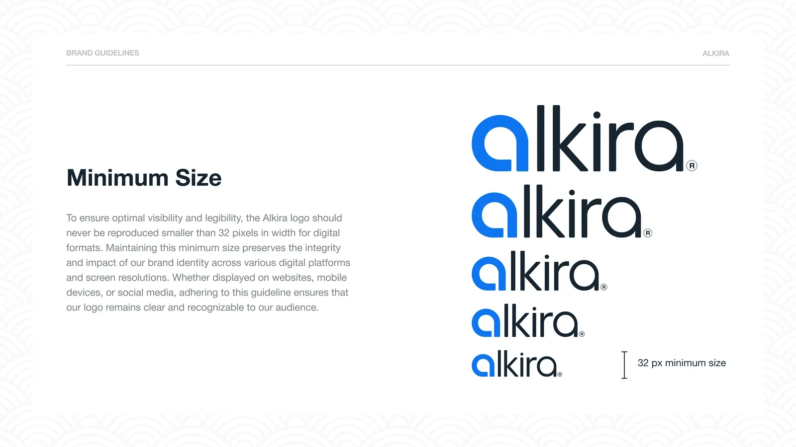
One neutral family keeps the brand clear in product UI and marketing alike. The logo has a 32px minimum width for digital use.
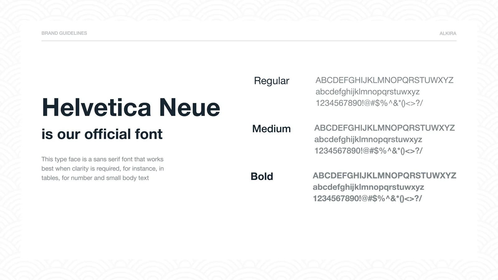
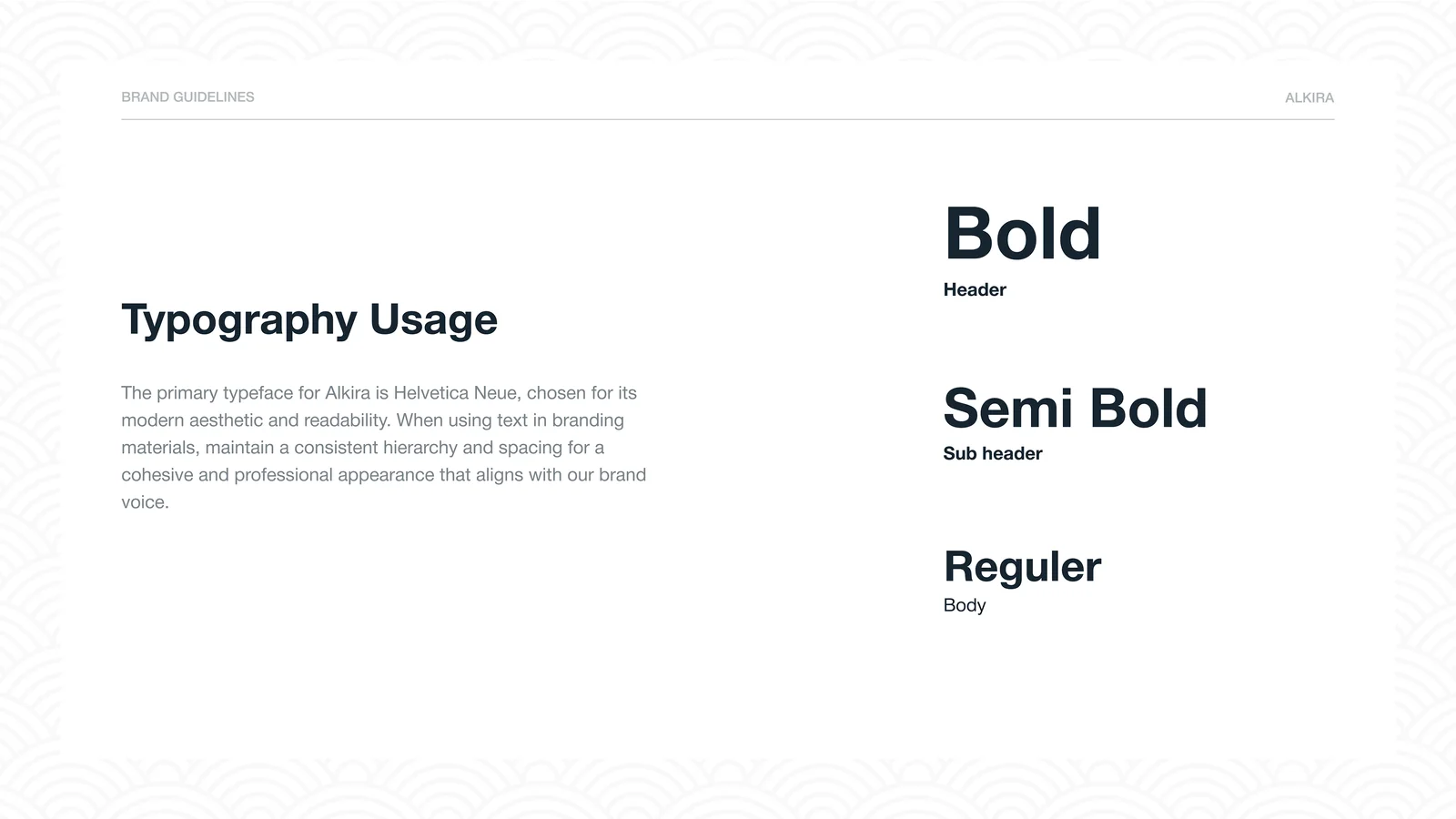
- Helvetica NeueHeadings & text
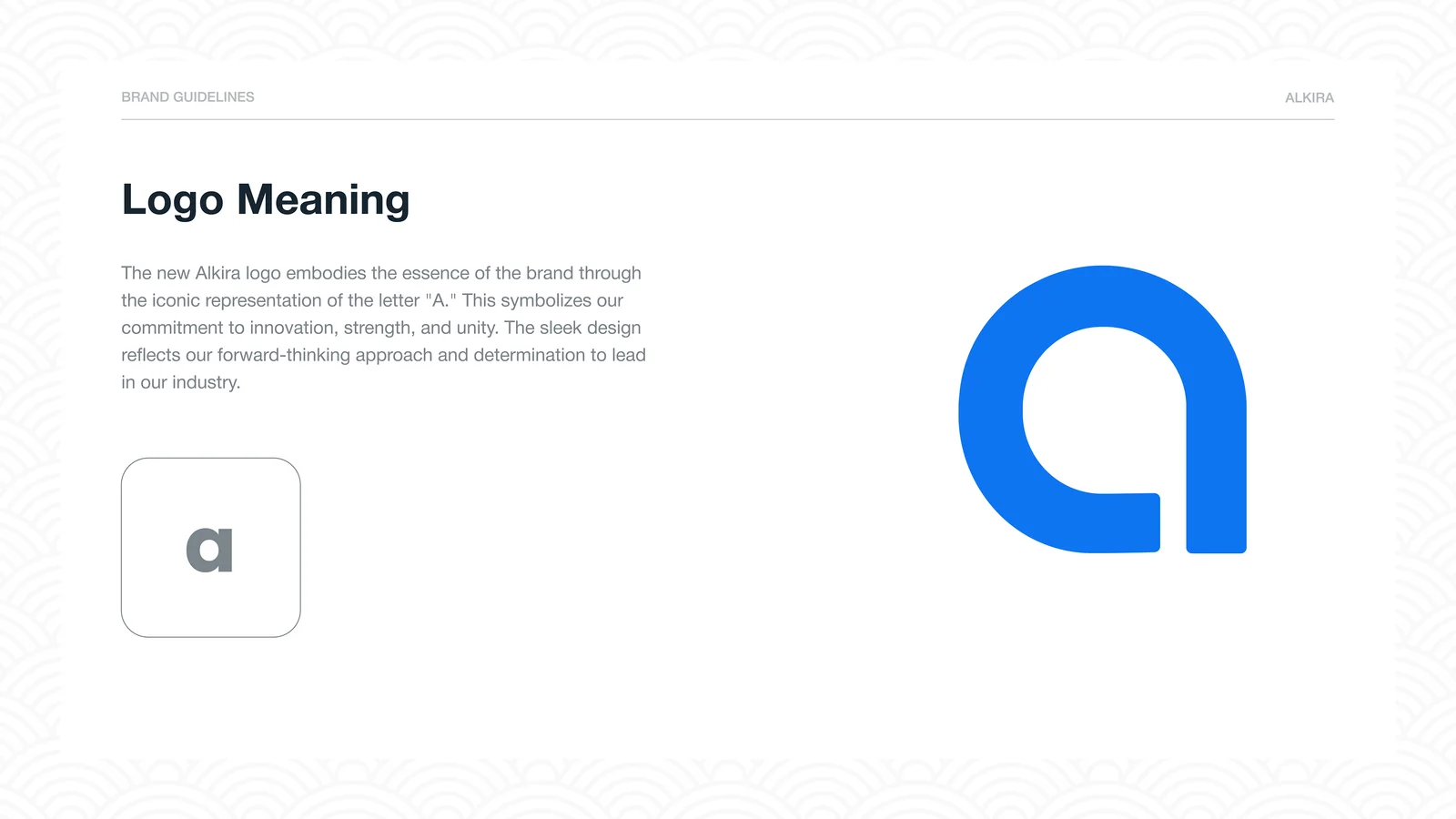
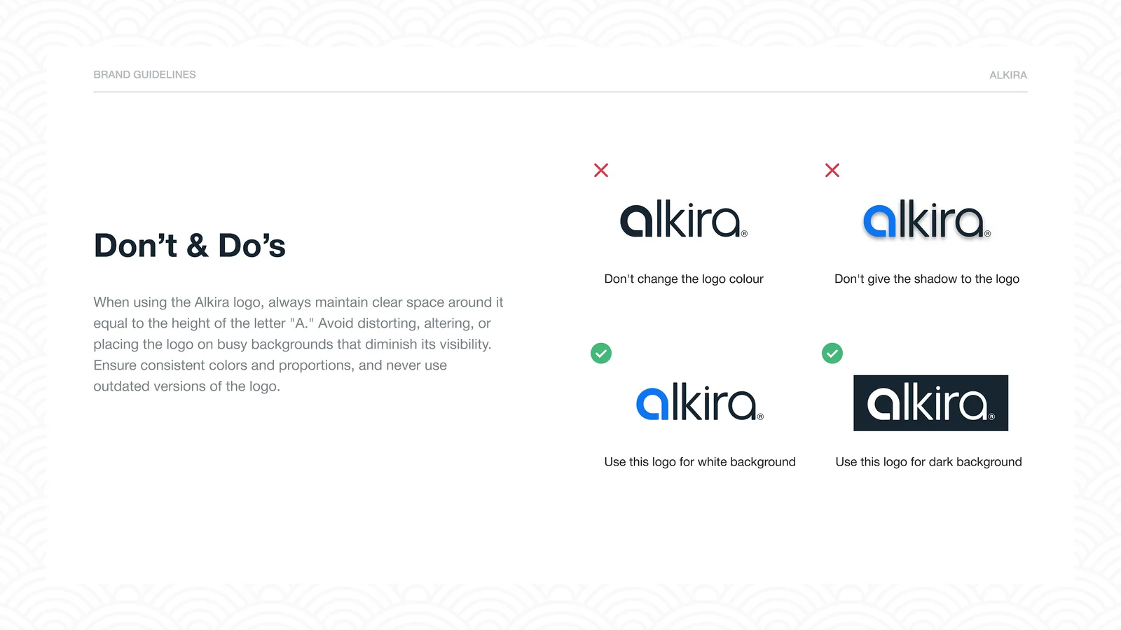
Every rule, slide by slide.

Thanks for reading.
See the full guidelines on Behance.
Designed by Muhammad Maavia.
Leave a like
A quick human check keeps likes honest. One like per visitor.