Xgrid.co Revamp
A modern dark mode for Xgrid.
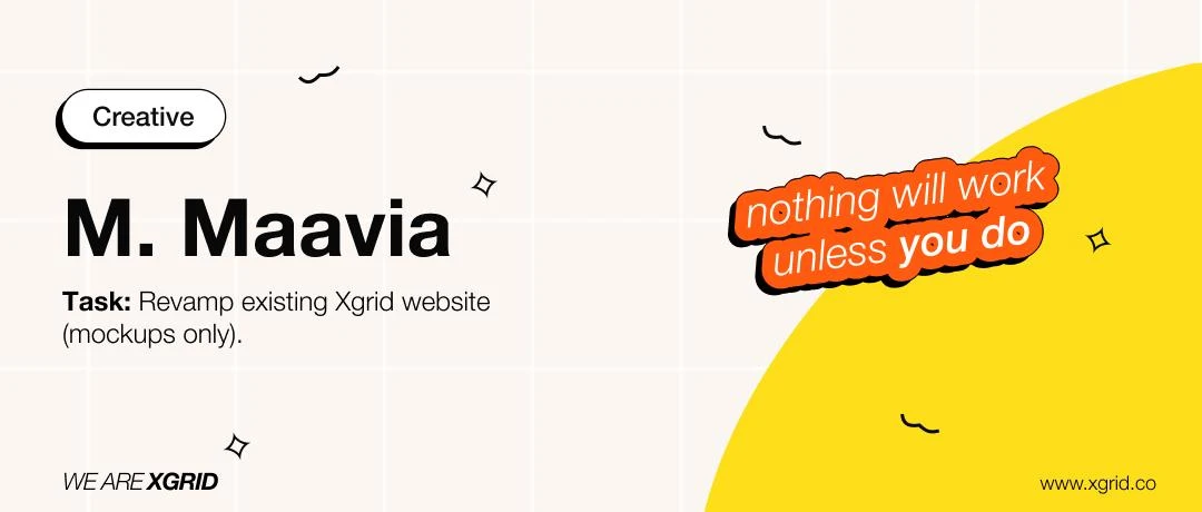
I redesigned the Xgrid.co homepage as a concept, in a dark theme. It began as an internal design challenge, and my entry won the Creative award.

A homepage in a dark theme.
A mockups-only concept: the homepage as a clear sequence of hero, client logos, services, testimonials and FAQ, in a dark theme.
Leading design at Xgrid.
As UX Lead I ran Xgrid’s design team and its own website, alongside UX strategy for enterprise clients including Cisco and Alkira.
Design team
Mentored a team of 4 designers.
Website workshop
Ran a design workshop for this redesign with up to 8 designers and marketing stakeholders.
UX audit
Ran UX audits, including a heuristic evaluation of the Xgrid homepage.
Creative award
My redesign won the Creative award in Xgrid’s internal design challenge.
More from my time at Xgrid: Heuristic Evaluation · Alkira · Project X
A confident voice on dark.
Poppins sets a confident headline voice; Inter keeps long service copy easy to read on dark backgrounds.
- PoppinsHeadings
- InterBody text
The new homepage, top to bottom.

Scroll inside the frame to see the full page.
A design challenge, and a Creative award.
Xgrid ran an internal challenge with one brief: revamp the existing company website, mockups only. This redesign was my entry.
Thanks for reading.
See the original post on Behance.
Designed by Muhammad Maavia.
Leave a like
A quick human check keeps likes honest. One like per visitor.