Heuristic Evaluation
Turning a leaky homepage into a prioritized backlog.
A UX audit of the Xgrid homepage using Nielsen’s heuristics and a competitive analysis, then triaged by severity and effort into a backlog the team could ship.
The homepage was a leaky bucket.
The Xgrid homepage is the primary engine for B2B lead generation, but navigational friction, accessibility gaps and a confusing visual hierarchy were leaking visitors before they reached the lead form.
From opinions to a structured audit.
The goal was to move from subjective opinions to a structured, repeatable audit. I evaluated every homepage section against Nielsen’s heuristics, benchmarked competitors, then triaged each finding by severity and ease of fix.
Heuristic evaluation
Every section checked against Nielsen’s heuristics.
Competitive analysis
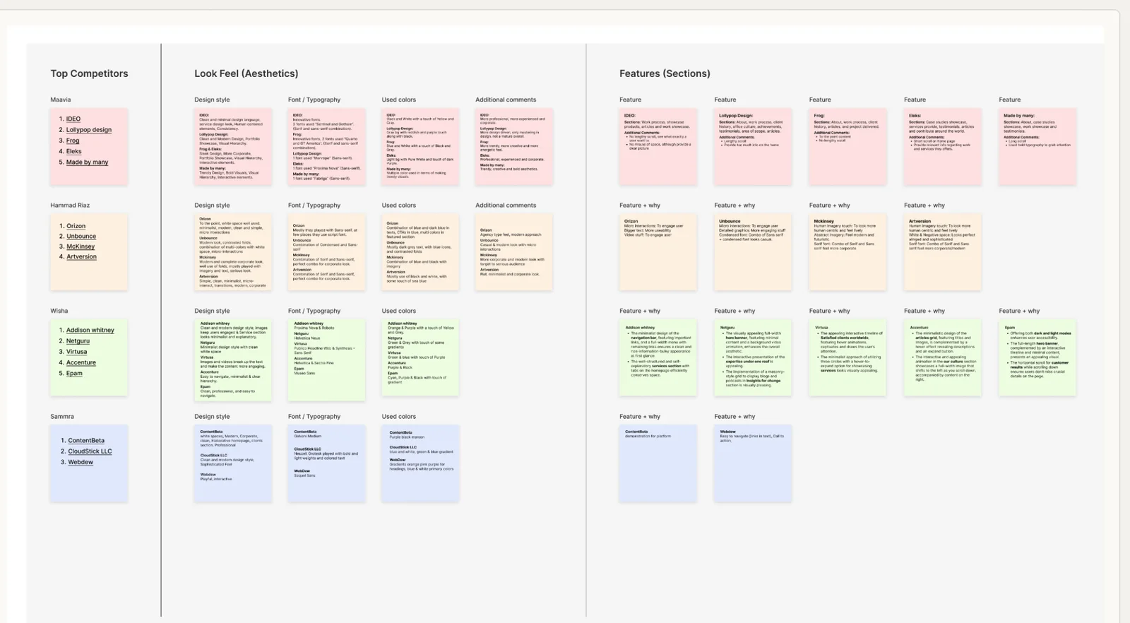
A matrix of 17 competitors across 4 comparison tracks.
Severity × effort
Severity S0–S4 and ease-to-fix E0–E4 for every issue.
Prioritized backlog
High, medium and low, ready for the team.

I ran this audit as UX Lead at Xgrid. More from that time: Xgrid.co Revamp · Alkira · Project X
One week, one clear picture.
Usability issues logged
Heuristics violated
High-priority quick wins
Competitors benchmarked
In enterprise B2B, a confused user is a lost lead.
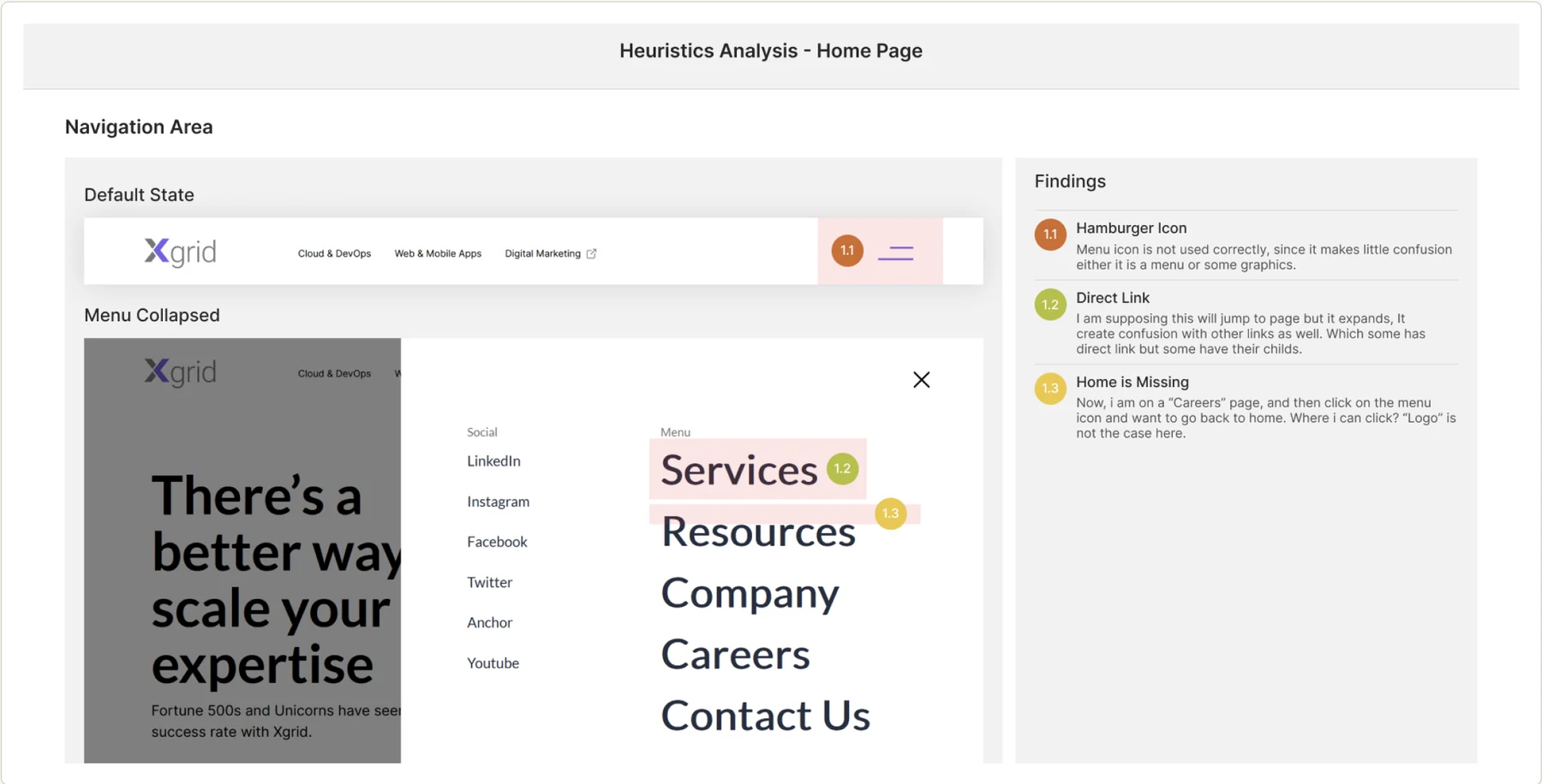
Core navigation (the hamburger icon and a missing Home state) was breaking the basic heuristic of mapping between the system and the real world. Primary brand color on non-interactive text made it look clickable, so visitors tried to click it.
Findings 1.1–1.3, annotated directly on the navigation area of the live homepage.
Heuristics violated
Ambiguous menu icon
The hamburger reads as decorative rather than a menu trigger, with no visual cue that distinguishes it from graphics.
No way back to Home
From an interior page, neither the logo nor the nav offers a Home state: a basic wayfinding failure.
Primary color used as emphasis
Brand-color text appears on non-clickable copy in three places, reading as a broken link.
Inaccessible carousels
Testimonial and badge carousels lack discoverable controls, hiding content the user never gets back to.
17 products, patterns worth adopting.
11 of the 17 products benchmarked contributed at least one adoptable pattern.

Patterns adopted from
Competitor research by Muhammad Maavia, Hammad Riaz, Wisha and Sammra.
From audit to prioritized backlog.
Every finding carries a priority tag derived directly from its Severity × Effort score.
High priority · ship now
11%Medium · next sprint
26%Low · backlog
63%1.2 Direct link inconsistency
Some nav items expand, others link directly, with no visual distinction. S3 · E1
1.3 Home state missing
No path back to the homepage from an interior page. S3 · E1
- 2.1 Hero headline lacks context
- 3.1 Key info hidden behind a wait state
- 3.4 Achievement cards read as static
- 5.3 Testimonial nav needs prominence
- 7.1 Case studies unreadable in place
12 cosmetic & consistency items
Primary-color text used as plain emphasis, inconsistent CTA styling, minor decorative obstacles and carousel-badge visibility.
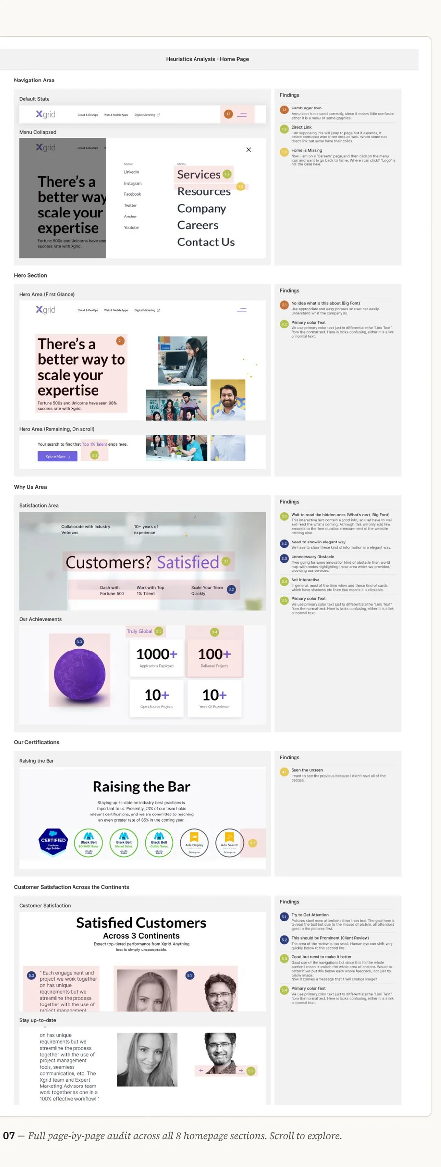
Page by page, section by section.

Scroll inside the frame to see the full page.
What I’d do differently.
Pair severity scores with real behavioral data (heatmaps, funnel drop-off) before finalizing priority. Right now severity is expert judgment, not measured behavior.
Loop in an engineer earlier to sanity-check Ease-to-Fix scores. Effort estimates are still a designer’s guess until dev weighs in.
Ship the two quick wins, then re-test the wayfinding tasks with real users to close the audit → validation loop.
Turn this into a repeatable audit template, so the next client pitch doesn’t start from zero.
“This is the method I would reuse when auditing a client’s product before a pitch.”
Thanks for reading.
See the original case study on Behance.
Co-owned with Hammad Riaz on Behance.
Leave a like
A quick human check keeps likes honest. One like per visitor.